

 by Tom Gurney
Tom Gurney BSc (Hons) is an art history expert with over 20 years experience
Published on June 19, 2020 / Updated on August 29, 2026
Email: tomgurney1@gmail.com / Phone: +44 7429 011000
Why A Shipwreck off Hastings Matters
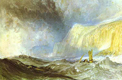
A Shipwreck off Hastings is one of Turner's most concentrated watercolour dramas: a capsized vessel, cast-off mariners, storm-dark water and a Sussex coast reduced to a theatre of survival. The National Gallery of Ireland identifies the work as a watercolour of about 1825, with white highlights, touches of gum arabic and scraping out on cream wove paper, measuring 18.9 by 28.5 centimetres.[1] Its scale is modest, but its emotional field is large. Turner presses a marine disaster into a small sheet without reducing its violence.
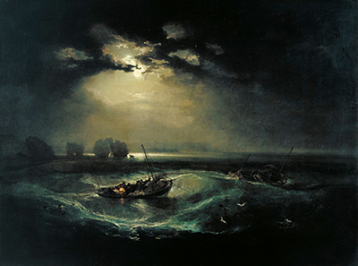
The picture matters because it shows how Turner could make watercolour carry the weight of shipwreck imagery usually associated with major oils. His 1805 The Shipwreck is a large exhibition painting; A Shipwreck off Hastings is far smaller and made in a different medium. Yet the later watercolour is not slight. It uses compression as a weapon. Boat, bodies, cliff, town and sea are drawn together so tightly that the viewer cannot settle into scenic distance. The accident feels immediate, not because the work is large, but because the space is so severely contracted.
The National Gallery of Ireland's description emphasises mariners cast adrift from a capsized craft, heavy water driven by underlying swell, waves overtaking the crew, and the dramatic effect of rich colour and strong tonal contrasts.[1] Those facts give the work its core identity, but they do not exhaust it. The sheet also belongs to Turner's long engagement with Hastings, Sussex patronage, print publication, and the conservation history of Henry Vaughan's Turner collection. It is both a disaster image and a survival of a particular collecting culture: fragile paper protected by a bequest that shaped how generations have been allowed to see it.[2][4]
The work therefore sits at several crossroads. It is a Hastings subject, but not the same as Turner's Hastings from the Sea. It is a shipwreck subject, but not the same as his oil The Shipwreck. It was later translated into prints, but the watercolour remains materially distinct from the engraved Wreck off Hastings. It belongs to the Vaughan Bequest, but its visual urgency resists the polite calm often associated with winter displays of watercolours. Turner gives the viewer no stable rescue story. He gives fragments of human struggle inside weather that has become nearly unanswerable.
At a Glance
- ArtistJoseph Mallord William Turner
- TitleA Shipwreck off Hastings
- Datec.1825
- MediumWatercolour with white highlights, gum arabic and scraping out
- SupportCream wove paper
- Dimensions18.9 × 28.5 cm
- CollectionNational Gallery of Ireland
- Object numberNGI.2411
- ProvenanceHenry Vaughan Bequest, 1900
- Probable contextA design associated with Ports of England
Contents
- Why A Shipwreck off Hastings Matters
- Turner and the Marine Imagination
- Object Identity and Medium
- A Small Sheet With Large Weather
- Hastings in Turner's Imagination
- Publication Ambition
- Shipwreck, Place and Human Scale
- The Vaughan Bequest
- Watercolour Technique and the Sea
- From Watercolour to Engraving
Turner and the Marine Imagination
Turner's authority as a sea painter was not an isolated late achievement. The National Gallery's artist record describes a career that joined watercolour, oil and engraving, grounded in Royal Academy training and in a topographical tradition that Turner pushed towards far more ambitious ends.[16] The sea offered him a subject in which that whole training could be tested. It required drawing, weather memory, knowledge of boats, command of light, and a willingness to let human action become small inside the scale of nature.
Exhibitions devoted to Turner and the sea have stressed the breadth of that lifelong engagement, from early Academy marine pictures to experimental late seascapes.[15] A Shipwreck off Hastings belongs to the middle of that arc. It is later than the disciplined early oils and earlier than the dissolving storms of the 1840s. Its forms remain recognisable enough to tell a disaster story, but its handling already gives weather the power to break ordinary description. It is not an illustration of the sea added to a narrative; the sea is the narrative's engine.
This matters because Turner did not treat marine painting as one fixed genre. Fishing, Channel passage, harbour trade, naval memory, shipwreck, smuggling, steam and coastal labour each demanded a different visual grammar. A calm harbour could become a study of commerce and light; a naval picture could become a meditation on national memory; a wreck could become a test of human scale. The Hastings watercolour is compact, but it gathers several of these grammars. The coast is local, the wreck is bodily, the medium is delicate, and the storm is more than scenery.
The result is a work that refuses a comfortable hierarchy between oil and watercolour. Turner could give watercolour the exploratory speed of travel notation, but he could also make it bear public seriousness. In A Shipwreck off Hastings, the medium's delicacy does not soften the subject. It sharpens it. The vulnerability of paper and wash becomes an analogue for the exposed people in the waves. Looking at the sheet, the viewer understands that fragility is not an incidental property. It is the subject carried into material form.
Object Identity and Medium
The correct object title is A Shipwreck off Hastings. The National Gallery of Ireland records Turner as the artist, gives the date as circa 1825, and identifies the support and handling as watercolour and white highlights with touches of gum arabic and scraping out on cream wove paper.[1] The work entered the Gallery through Henry Vaughan's 1900 bequest and carries the object number NGI.2411.[1] These details are unusually important because Turner made several Hastings and shipwreck works, and because later prints after the design use related but not identical wording.
The material description tells us how to look. Watercolour gives the image its moving darkness and transparency; white highlights and scraped light interrupt that darkness with sudden flashes. Gum arabic can deepen or intensify passages, giving wetness and emphasis, while scraping out allows Turner to recover brightness from a darkened field.[1][13] The storm is not built only by drawing waves. It is made by conflict between absorbed wash, heightened surface, exposed paper and abrupt tonal contrast.
The sheet's dimensions, less than thirty centimetres wide, also matter.[1] Turner cannot rely on expansive scale. He has to force the drama through density, rhythm and contrast. In a small watercolour, a single pale accent can change the balance between life and disappearance. A broken edge of foam can become a visual signal as urgent as a figure. The eye moves quickly because the work is compact, but it also hesitates because details flicker at the border of legibility.
The cream wove paper is not a passive ground. Turner's paper choices and watercolour methods often determine the way light survives within the image.[13][14] Here, the support helps the storm retain brightness even where the subject is dark. That brightness is not decorative. It makes the wreck more terrible. Foam, spray and strained bodies appear for an instant and are almost swallowed again. Turner turns the material fragility of watercolour into a pictorial equivalent of human fragility at sea.
A Small Sheet With Large Weather
The drama of A Shipwreck off Hastings depends on the opposition between compact size and vast force. The image has no leisurely foreground. There is little room for a viewer to stand back imaginatively and examine the disaster from safety. The sea crowds forward. The capsized craft and scattered mariners occupy a perilous band of action, while the coast and cliffs do not offer simple refuge. Instead, the setting becomes another pressure on the scene.[1]
Turner had long understood that a marine picture can be most frightening when structure starts to fail. A vessel normally organises space: hull, mast, sail and rigging give order to water. In a wreck, that order breaks apart. The capsized craft in the Hastings watercolour no longer commands the sea; it becomes material among waves. Human figures are no longer passengers or workers but exposed bodies, moving from agency into drift. Turner does not need to describe every feature sharply. The danger lies partly in the loss of clear separation.
The sea is not a neutral background. NGI's account stresses a strong underlying swell, and that phrase is borne out by the visual logic of the sheet.[1] The waves do not merely decorate the surface; they carry the action. They lift, fold and engulf. Their rhythm determines what can be seen and what vanishes. The storm's violence is therefore structural, not merely atmospheric. It controls the composition.
This is one reason the watercolour differs from a topographical view of Hastings. The place matters, but the event has temporarily overwhelmed place. Cliffs, town and shore provide orientation, yet the real centre is the unstable boundary between water and human survival. Turner uses Hastings not as a calm coastal identity but as a named edge where the English Channel turns hostile. The result is both local and universal: a Sussex wreck that also becomes an image of any body caught where sea, weather and human craft fail to align.
Hastings in Turner's Imagination
Hastings was not a casual name in Turner's career. British Museum scholarship on Hastings from the Sea explains that Turner first encountered Hastings around 1805 and returned to the area through his work for John Fuller of Rosehill, especially around 1810 and again in 1815-16.[6] Fuller, whose estate at Rosehill, now Brightling Park, lay near Battle and within reach of Hastings, became one of Turner's important Sussex patrons.[10] That relationship produced a cluster of views of the surrounding landscape and coast.
The Morgan Library's record for Views in Sussex captures the publication culture behind this connection. The volume, published in London in 1819, was based on drawings by Turner, engraved by W. B. Cooke, and issued under the auspices of John Fuller of Rose Hill, with attention to the landscape and marine scenery of the Rape of Hastings.[9] The phrase matters historically. Turner was not only painting isolated picturesque views; he was participating in a network of patronage, engraving and regional description that made Sussex scenery portable for collectors.
Rawlinson and Finberg's historical account of Turner's watercolours also places the Sussex drawings within the Fuller network, describing the inland country between Hastings and Tunbridge Wells, the Rose Hall commissions, the later Views of Hastings and its Vicinity or Views in Sussex, and the problem of watercolours damaged by long exposure to sunlight.[12] That last point leads directly back to Vaughan. The same kind of work that nineteenth-century collectors prized could be injured by the conditions of admiration. Turner watercolours needed viewers, but they also needed darkness.
The British Museum's Rosehill, Sussex record adds a necessary caution about Fuller. He was a wealthy, eccentric Sussex MP whose fortune was connected to West Indian sugar plantations and who strongly defended slavery.[10] That background does not turn A Shipwreck off Hastings into a picture about Fuller, but it prevents the Sussex patronage story from becoming too cosy. Turner's local work was embedded in real social and political economies. Pictures of coast, valley and estate were not made in an innocent vacuum.
Hastings offered Turner a particularly rich subject because it joined working life, resort culture, historical memory and sea danger. The British Museum notes that by the end of the eighteenth century Hastings had become a health resort rivaling Brighton, and that its growth was also stimulated by its role as a garrison town during the Napoleonic wars.[6] That mixture of leisure, labour and militarised coast is important for Turner. In the Hastings watercolour of wreck, the sea is not a scenic amenity. It is the force on which local life depends and by which it may be destroyed.
Publication Ambition
The probable relation to Ports of England matters because it places A Shipwreck off Hastings among designs made to circulate beyond a single collector's portfolio. The National Galleries of Scotland exchange notice, reflected in the locked research, describes the work as probably produced for that print series. That probability should not be hardened into certainty, but it makes sense within Turner's professional world. He repeatedly made watercolours whose first life was material and painterly, and whose second life was engraved, multiplied and read through text.
The distinction between a design for engraving and a finished watercolour is therefore not simple. A watercolour made with reproduction in mind could still be deeply resolved in colour, touch and atmosphere. Engravers needed structure, but collectors valued brilliance. Turner supplied both. In the Hastings sheet, the capsized craft and coast provide the design's readable architecture, while the wash, heightening and scraped light carry effects that engraving could only translate. The later prints after the work prove that the composition had reproductive strength; they also remind us what was altered when colour became line.
This print ambition also helps explain the image's clarity of incident. The work is not vague despite its storm. A viewer can understand that a wreck has occurred, that people are in danger, that the sea is rising and folding around them, and that the location is Hastings. That legibility would matter for an engraved audience. At the same time, Turner prevents the scene from becoming diagrammatic. He preserves uncertainty in the waves and figures. The design is readable, but the experience remains unstable.
Seen through this lens, A Shipwreck off Hastings becomes part of Turner's broader negotiation with publication. Engraving spread his reputation and brought his images into homes, albums and illustrated volumes. It also required collaboration with interpreters such as William Miller and W. B. Cooke. Turner understood this economy of translation. He did not merely hand finished pictures to engravers; he shaped images that could survive another medium while retaining enough mystery to feel like Turner.
Shipwreck, Place and Human Scale
Shipwreck imagery in Turner is never only about boats. It is about scale: what happens when human skill, commerce, fishing labour or naval strength meets weather that cannot be mastered. A Shipwreck off Hastings makes this problem immediate through its figures. NGI describes mariners cast adrift from the capsized vessel.[1] Their presence changes the image from a study of waves into a crisis of bodies. The viewer measures the sea through them.
The figures are necessarily small, but they are not incidental. In a watercolour of this size, a tiny human mark can carry extraordinary pressure. Turner lets the viewer understand the disaster through glimpses rather than inventory. A figure in water, a gesture, a remnant of craft, a line of foam: these are enough. The eye searches for rescue, but the image withholds certainty. There is no single heroic rescuer around whom the scene resolves.
The title's Hastings reference intensifies this effect. A named coast implies proximity, community and possible witnesses. The wreck is not lost in an abstract ocean. It occurs off a recognisable English town, within reach of cliffs and shore. Yet that nearness does not guarantee safety. Turner often understood coasts as thresholds rather than havens. The line between land and sea can be as dangerous as open water, especially when storm, tide and broken craft converge.
The result is a form of coastal sublime without grand emptiness. Many sublime images overwhelm the viewer through mountains, precipices or vast skies. Turner uses a more intimate terror: a small group of people in water, close enough to be imagined as individuals, but too small to resist the moving surface around them. The picture's force comes from seeing exactly enough to know what is happening and not enough to feel secure about the outcome.
That balance is why the work should not be reduced to a moral slogan. It certainly shows human weakness before the sea, but Turner is more exact than that. He also shows the persistence of looking: the viewer searches the water, sorts broken forms from bodies, and tries to read the coast as a possible answer. The painting places the viewer in an ethical position. To look is to attempt rescue imaginatively, while knowing that looking cannot change the event.
The image also avoids easy sentimentality. Turner does not isolate one grieving figure or one theatrical body. He lets the disaster remain dispersed. That dispersion is truthful to storm experience. In rough water, attention breaks apart. A wave, a plank, a head, a pale stroke, a dark hollow: each may matter. The viewer cannot master the scene because the scene itself is about failed mastery. Turner makes the act of viewing resemble the difficulty of survival.
The Vaughan Bequest
The survival and visibility of A Shipwreck off Hastings are tied to Henry Vaughan, who bequeathed the work to the National Gallery of Ireland in 1900.[1] Vaughan was one of the great Victorian collectors of Turner watercolours. National Galleries of Scotland describes him as a discerning collector who owned more than one hundred Turner watercolours and drawings, along with many prints, and records Ruskin's description of him as "a great Turner man".[4] His collecting mattered not only because of quantity, but because of care.
Vaughan divided major groups of Turner works-on-paper among national collections in Scotland, Ireland and London.[4] The National Gallery of Ireland's Vaughan Bequest comprises thirty-one watercolours and drawings, displayed annually in January according to Vaughan's stipulation.[3] This condition was not quaint theatre. Watercolours are vulnerable to fading and discoloration under excessive light. Vaughan understood that conservation and public access had to be balanced. January, with weaker natural light, became part of the works' afterlife.[2][4]
That annual display tradition changes how A Shipwreck off Hastings is encountered. Many pictures enter public collections and are seen whenever curatorial rotation allows. Vaughan's Turner watercolours have a seasonal rhythm. They return in winter, briefly, under subdued light, precisely because their colour matters. The storm off Hastings is therefore protected by a ritual of restraint. Its dark sea and sharp highlights remain vivid because display has been limited.
The 2025 exchange between Ireland and Scotland made this history especially visible. NGI records A Shipwreck off Hastings in connection with the National Galleries of Scotland exhibition Turner in January | Ireland's Vaughan Bequest, held from 1 to 31 January 2025.[1] The exchange placed the Dublin Vaughan works in Edinburgh during Turner's 250th anniversary year, underlining how Vaughan's divided gift created related but distinct Turner traditions across institutions. The Hastings wreck is one of the works that carries that shared story.
Watercolour Technique and the Sea
Turner's watercolour technique is central to the effect of A Shipwreck off Hastings. The medium listed by NGI--watercolour, white highlights, gum arabic and scraping out--is not a dry catalogue formula.[1] It describes the drama's working parts. Dark wash establishes pressure and depth. Gum arabic can give intensity and sheen. White heightening supplies sudden visibility. Scraping out cuts light back into areas where darkness might otherwise close over the scene.
Joyce Townsend's account of Turner's watercolour materials and techniques, written for the Wallace Collection, is useful here because it stresses the range of methods Turner used to create light, texture and correction in watercolour, including lifting, scraping and stopping-out.[13] The Hastings sheet calls for that kind of vocabulary. Its foam and highlights do not look like merely pale paint laid on top of a finished design; they feel like active interruptions in the storm. Turner is making light fight its way through the image.
Tate's watercolour context, through David Blayney Brown's work, also helps place the sheet within Turner's wider practice of travel, sketchbooks, portable colour and finished watercolours.[14] Turner could move from rapid notation to highly worked sheets intended for collectors or reproductive projects. A Shipwreck off Hastings has the urgency of an observed effect, but its finish and later print history suggest a more public ambition. It was made to hold together as an image, not merely to record a passing weather note.
This technical balance is part of Turner's greatness as a marine painter. He does not paint water as a fixed blue or grey substance. He paints it as something that absorbs, reflects, hides and reveals. In the Hastings wreck, the sea is a moving field of tonal decisions. The viewer feels the storm because the medium itself seems unstable: transparent here, opaque there, scratched open, darkened, lit, then darkened again.
From Watercolour to Engraving
The afterlife of A Shipwreck off Hastings in print is a major part of its importance. The British Museum holds an 1866 engraving and etching titled Wreck off Hastings, made by William Miller after Turner for The Turner Gallery.[5] The BM record identifies it as after Turner, links it to Wilton 511, and describes an early proof before changes to the right cliff, touched with grey and white ink and associated with Ruskin.[5] This is not the original watercolour, but it shows how the design entered a wider nineteenth-century print culture.
The transformation from watercolour to engraving changes the work's nature. Watercolour depends on hue, transparency, paper and surface touch. Engraving translates these into line, tone and reproducible contrast. A storm that Turner made through wash and highlight had to be reimagined through incised marks. Miller's skill lay in making the sea, sky and human danger legible in another language. The existence of proofs and Ruskin-related intervention reminds us that Turner reproduction was an interpretive act, not mechanical copying.[5]
Newfields' record for another Wreck off Hastings print confirms the broader circulation of the design as a William Miller engraving after Turner in The Turner Gallery.[8] Milwaukee Art Museum's 2017-18 Turning to Turner exhibition likewise included Miller after Turner, Shipwreck off Hastings, dated 1875, within a display about Turner's prints and his later influence.[7] The design, then, did not remain confined to Dublin's watercolour cabinet. It travelled through engraved form, entering collections and exhibitions far from Hastings or Ireland.
This print history should be handled carefully. It does not mean the watercolour was merely preparatory in a lesser sense. Turner often made watercolours that were complete works and designs for reproduction at the same time. The Hastings image can be both: a vivid, materially specific watercolour and a composition capable of translation into line engraving. Its later print life confirms its power without replacing the original sheet.
Distinguishing Related Turner Works
The first necessary distinction is between A Shipwreck off Hastings and Turner's 1805 oil The Shipwreck. The oil is an earlier, larger marine disaster painting; the Hastings work is a small watercolour of about 1825 in the National Gallery of Ireland.[1] The two share a concern with maritime catastrophe, but they differ in date, medium, scale, collection and pictorial organisation. Treating them as the same work would flatten two very different moments in Turner's marine career.
The second distinction is with Hastings from the Sea, the large 1818 British Museum watercolour.[6] The BM record is especially useful because it says that the 1818 work has often been confused with the smaller watercolour lent by Henry Vaughan to the 1857 Manchester Art Treasures exhibition under the same title, now known as Shipwreck off Hastings.[6] This is exactly the sort of historical naming problem that can mislead a reader. Turner did not make only one Hastings watercolour; titles shifted, collections changed and exhibition names could blur identities.
The third distinction is with Line Fishing, Off Hastings, the V&A oil of about 1835-39.[11] That later painting shows inshore fishermen using a baited line in the English Channel and was based on earlier Hastings material.[11] It is a working-sea subject rather than a wreck subject. Comparing it with A Shipwreck off Hastings is useful because both depend on Hastings as a coastal focus, but the emotional register differs. One treats labour under ordinary danger; the other treats disaster.
Finally, the print titles themselves require care. Wreck off Hastings and Shipwreck off Hastings appear in later engraving contexts.[5][7][8] These titles preserve the composition's wider life, but the National Gallery of Ireland's watercolour should remain anchored under A Shipwreck off Hastings. The small article "A" is not a mere nicety. It marks the present object record and helps hold the Dublin sheet apart from later prints and adjacent Turner marine subjects.
Hastings, Labour and Coastal Risk
Hastings was a fitting place for Turner to explore both work and danger. The British Museum's account of Hastings from the Sea notes the town's development as a resort and garrison town, while also discussing its fishing subjects and Cooke's projected Hastings publications.[6] The local coast could be consumed as scenery, but it was also worked by fishers and exposed to weather. Turner understood that dual identity. His Hastings works move between fish markets, boats, cliffs, storms and open water.
The NGI's 2024 coastal exhibition framing is helpful because it stresses that Turner's Vaughan Bequest watercolours range from tranquil beach and harbour scenes to storm-driven seas and wrecks, and that coastal artists were drawn to rugged shorelines and fishing communities encountered firsthand.[2] A Shipwreck off Hastings belongs to the darker end of that range. It shows the coast not as destination, but as hazard. The same sea that sustains local livelihoods can become the agent of catastrophe.
Turner's interest in maritime labour prevents the wreck from becoming a purely abstract symbol. Even when individual figures are hard to separate, the viewer understands that these are working bodies or seafaring bodies, not allegorical tokens. Boats, ropes, broken forms and waves all belong to a world of practical knowledge. The disaster is terrible because skill has limits. Seamanship matters, but it cannot always overcome weather, swell and chance.
This is why the painting remains compelling. It does not ask the viewer merely to admire Turner's storm effects. It asks us to look at a coastal economy under stress. Hastings, in Turner's imagination, is a place where beauty and risk are inseparable. The wreck is not outside the town's identity; it is one possible consequence of life along that shore.
Looking at the Work Today
To look at A Shipwreck off Hastings today is to experience three kinds of distance at once. There is historical distance: the world of Turner, Cooke, Fuller, Vaughan and Victorian engraving. There is material distance: a fragile watercolour that can only be shown under careful conditions. And there is pictorial distance: the gap between the viewer and the figures struggling in the water. Turner makes all three distances active.
The work's freshness depends partly on its refusal to settle into one category. It is a coastal view, but the coast is almost secondary to the wreck. It is a watercolour, but it has the pressure of a major marine drama. It is tied to Hastings, but its emotional reach is broader than local description. It is connected to print culture, yet the original sheet retains effects no engraving can fully reproduce. Turner builds power through these tensions.
The National Gallery of Ireland's Vaughan tradition has helped preserve those tensions. Because the watercolour appears only within controlled circumstances, it retains a degree of intensity that many exposed works-on-paper have lost.[2][4] That preservation is not separate from interpretation. The image's flashes of light, dark sea and delicate surface are part of what the picture means. A faded A Shipwreck off Hastings would be a different work.
The best way to read it is therefore slowly, despite its small size. Begin with the wreck and figures, then follow the swell, then measure the coast, then return to the highlights where Turner lets survival and disappearance meet. The painting is not a simple lesson about humanity and nature. It is a precise visual event: a named coast, a broken vessel, a storm-driven sea and a watercolour technique capable of making catastrophe feel immediate almost two centuries later.
Discussion
How does Turner make a small and materially delicate watercolour carry the urgency of bodies, wreckage and storm?
Reader Insights
How does compression make the wreck feel immediate rather than distant?
Where do white heightening and scraped paper interrupt the storm?
Why must this Dublin sheet remain distinct from Turner's other Hastings and wreck works?
Join the Conversation
Share a close observation or a source-based question for other readers.
References
- National Gallery of Ireland collection record, *A Shipwreck off Hastings*, NGI.2411. https://onlinecollection.nationalgallery.ie/objects/12075/a-shipwreck-off-hastings
- National Gallery of Ireland, "Much-loved annual Turner exhibition on display at the National Gallery of Ireland." https://www.nationalgallery.ie/ga/node/4275
- National Gallery of Ireland, *Turner: The Vaughan Bequest*. https://www.nationalgallery.ie/art-and-artists/exhibitions/past-exhibitions/turner-vaughan-bequest
- National Galleries of Scotland, Charlotte Topsfield, "Henry Vaughan - 'A great Turner man'." https://www.nationalgalleries.org/art-and-artists/features/henry-vaughan-great-turner-man
- British Museum, William Miller after J. M. W. Turner, *Wreck off Hastings*, 1866. https://www.britishmuseum.org/collection/object/P_1866-1013-1940
- British Museum, J. M. W. Turner, *Hastings from the Sea*, 1818. https://www.britishmuseum.org/collection/object/P_1958-0712-419
- Milwaukee Art Museum, *Turning to Turner*. https://mam.org/exhibitions/turning-to-turner/
- Newfields / Indianapolis Museum of Art, William Miller after J. M. W. Turner, *Wreck off Hastings*, 1866. https://collections.discovernewfields.org/art/artwork/67642
- Morgan Library & Museum, *Views in Sussex*. https://www.themorgan.org/printed-books/163329
- British Museum, J. M. W. Turner, *Rosehill, Sussex*, 1816. https://www.britishmuseum.org/collection/object/P_1958-0712-411
- Google Arts & Culture / Victoria and Albert Museum, J. M. W. Turner, *Line Fishing, Off Hastings*. https://artsandculture.google.com/asset/line-fishing-off-hastings/-wG8RNgzDMZgIA
- Project Gutenberg, W. G. Rawlinson and A. J. Finberg, *The Water-Colours of J. M. W. Turner*. https://www.gutenberg.org/cache/epub/63798/pg63798-images.html
- Joyce Townsend, "Turner's Watercolour Materials and Techniques," Wallace Collection. https://www.wallacecollection.org/explore/explore-in-depth/turner/turners-watercolors/turners-watercolour-materials-and-techniques/
- Tate Shop, David Blayney Brown, *JMW Turner Watercolours*. https://shop.tate.org.uk/jmw-turner-watercolours/23603.html
- Peabody Essex Museum, *Turner & the Sea*. https://www.pem.org/exhibitions/turner-the-sea
- National Gallery, Joseph Mallord William Turner artist record. https://www.nationalgallery.org.uk/artists/joseph-mallord-william-turner