


 by Tom Gurney
Tom Gurney BSc (Hons) is an art history expert with over 20 years experience
Page Created on September 22, 2026 / Page Updated on September 22, 2026
Email: tomgurney1@gmail.com / Phone: +44 7429 011000
Introduction
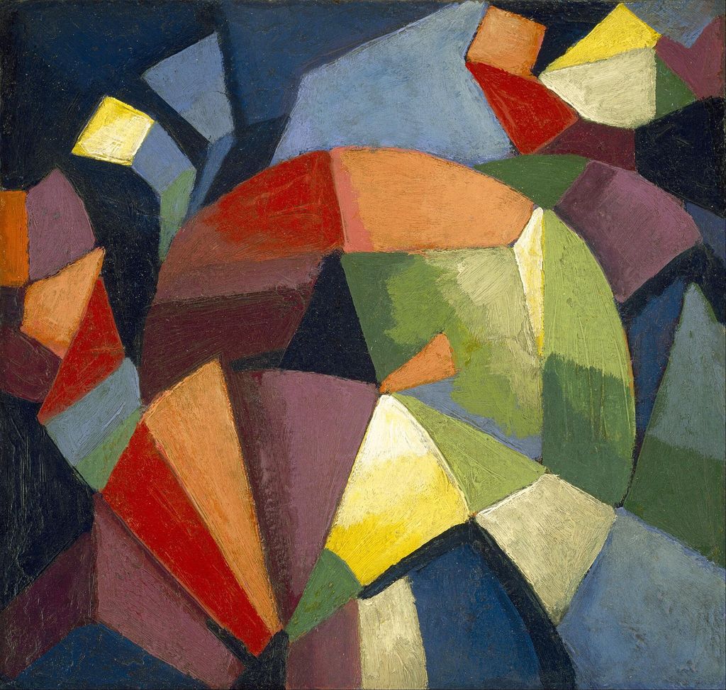
Georgia O’Keeffe’s Blue and Green Music does not illustrate a melody or identify a particular piece of music. It makes looking behave musically. Long diagonals drive towards the lower right, pale forms swell and recede through the centre, and small repetitions at the lower left establish a different pulse. Blue, green, black and white act through interval, contrast and return rather than through description.[1][2]
The painting belongs to O’Keeffe’s early effort to discover what colour and shape could express without a recognisable subject. Its musical title offers a way into that ambition, but the surface also retains the pressure of nature: folds can resemble petals, feathers, roots, bark, waves or leaves without becoming any one of them. Recent technical study adds a further correction. This apparent rush of sensation was methodically drawn, adjusted and painted.[1][9]
At a Glance
- ArtistGeorgia O’Keeffe
- ArtworkBlue and Green Music
- Artistic contextAmerican modernism
Contents
- Object identity
- Dating and title history
- Diagonals, folds and edges
- Colour as interval and pressure
- Rhythm without a score
- “Music…as something for the eye”
- Dow, Bement and the discipline of design
- Kandinsky and the limits of influence
- Synaesthesia: condition, metaphor or curatorial frame?
- The other music paintings
- Abstraction with nature still inside it
- Canvas, ground and underdrawing
- Paint sequence and the velvety surface
- Original frame, glazing and condition
- The 1923 exhibition and provenance
- A changing exhibition history
- Music returning from the painting
- How to look and listen with the eye
Object identity
- Artist: Georgia O’Keeffe (1887–1986)
- Title: Blue and Green Music
- Date: 1919–1921
- Medium: oil on canvas
- Dimensions: 23 × 19 inches / 58.4 × 48.3 cm
- Catalogue raisonné: CR 344
- Collection: Art Institute of Chicago, Alfred Stieglitz Collection, gift of Georgia O’Keeffe
- Accession: 1969.835[1][2]
The picture is modest in physical size, slightly taller than it is wide. Its visual scale feels larger because forms enter from, and continue beyond, every edge. The current catalogue record does not identify a depicted place, plant, musical composition or performer. “Music” names a mode of organisation and experience, while “blue and green” identifies the dominant colour family without exhausting the black, white, turquoise and grey that structure it.[1][2]
The current title appears independently in O’Keeffe’s Abiquiú Notebooks and in the Downtown Gallery and Whitney archives. That convergence gives Blue and Green Music firmer authority than any resemblance-based description. It also keeps the painting distinct from the larger pink-and-blue music canvases of 1918, whose related titles can otherwise encourage the early abstractions to be treated as one interchangeable group.[1][5]
Dating and title history
The catalogue raisonné archives date the work to 1919, and labels from the 1943 Art Institute exhibition and 1970–71 retrospective repeat that year. Alfred Stieglitz, however, wrote “27 / 1921” on the original stretcher. The number corresponds to the painting’s entry in the 1923 Anderson Galleries exhibition, making the inscription more than an isolated numeral.[1] Present catalogues therefore use 1919–1921 or 1919/21. The range is an honest record of incompatible evidence. It may indicate a work begun in 1919 and completed, dated or catalogued in 1921, but no public document proves that sequence.
Choosing either year as certain would conceal the archive problem. The Art Institute’s current display and the Spanish, French and Swiss retrospective records preserve both endpoints, while some later exhibition labels still select one.[1][19][20] Dating also affects historical placement. In 1919 the work follows closely upon the two Music—Pink and Blue canvases; in 1921 it sits at the end of a longer early abstract experiment and beside Stieglitz’s first public presentation of his photographs of O’Keeffe.
The date range allows both contexts to remain visible without turning uncertainty into biography.[5][8] Before the present wording stabilised, the painting circulated as Music in Vogue in October 1923. A 1927 publication called it Music—Blue and Black and Green; a 1937 portfolio used Music — Blue, Black and Green; and a 1939 primer printed Music Black Blue and Green. Stieglitz wrote Music, Blue Green & Black on a photograph.[1]
Black was once as conspicuous in language as it remains in the image. These variants are not evidence that the object itself changed. They show editors, publishers, dealer records and reproductions adjusting word order and punctuation around a painting resistant to conventional subject labels. The current title places blue and green first and removes black, even though black diagonals carry much of the structure. Title history therefore offers a compact reception history: different custodians heard, or at least named, different emphases.[1][2]
Multilingual titles extend that process rather than simply substituting words. Madrid presented Música azul y verde, Riehen used Musique bleue et verte in French and Blaue und grüne Musik in German. Each keeps music as the governing noun while treating the colours as its qualities. The translations confirm the title’s portability, but none identifies what kind of music the painting might be.[10][11][19]
Diagonals, folds and edges
A black wedge descends from the upper left and broadens towards the lower centre. A second dark-blue and black structure rises from the lower right, meeting it near the bottom like two immense shutters. Between them, pale blue-green folds twist upward and outward. These central forms seem compressed by the hard diagonals yet also appear to push through them.[1][9] The upper right opens into a blue field, while the lower left contains a green plane crossed by pale undulating bands. Those corner zones do not mirror one another.
One is relatively open and atmospheric; the other carries a compact, repeated wave. Their unequal rhythms prevent the composition from becoming a symmetrical emblem, even though the great diagonals meet near a strong lower axis.[1] Several narrow black hollows puncture the central pale body. They make neighbouring folds legible as separate layers and create pauses inside the continuous movement. The eye alternates between reading black as a flat stripe, a gap, or deep space. That instability is crucial: the picture can feel like overlapping surfaces one moment and an opening organic structure the next.[9]
The work’s two principal kinds of edge produce different tempos. Long diagonals are comparatively hard, straight and abrupt. Their direction can be taken in quickly, almost as a single visual stroke. The pale central forms curve, taper, overlap and change colour gradually, asking the eye to travel more slowly. Structure and sensation are divided across contrasting manners of painting.[1][2] The contrast never becomes absolute. Blue-green transitions soften the margins of some wedges, while a narrow bright-green line gives one diagonal a sharp melodic clarity.
Within the central mass, white-blue folds sometimes narrow into pointed shapes as incisive as the surrounding geometry. O’Keeffe lets hard and soft exchange properties, preventing a simple opposition between mechanical frame and organic centre.[9] Fondation Beyeler described wedge-shaped elements, plummeting beams and rhythmically undulating bands opening on to swells and hollows. Its French and German versions compare the organic structure with bark, roots or plumage. These are productive visual analogies rather than identifications. Their very plurality shows how the picture sustains recognition while withholding a fixed object.[9][10][11]
Colour as interval and pressure
Blue and green do not occupy separate territories. Cobalt edges meet blue-black fields; turquoise slips into pale green; white carries faint blue and yellow-green inflections. Because neighbouring colours are related rather than sharply opposed, changes of value often matter as much as changes of hue. The movement from dark blue to nearly white can feel like expansion, illumination or a rise in register.[1][9] Black supplies both weight and separation. The largest black planes divide the canvas into forceful directions, while smaller black slits sharpen the pale folds. Earlier titles that named black recognised this structural role.
Yet the present title directs attention towards the chromatic continuities that bridge those dark intervals. Black interrupts the music; blue and green carry it across the interruptions.[1] The palette’s restraint does not make the work monochrome. Variation within two named colours becomes its subject. A contemporary composer, Victoria Bond, later responded to precisely this quality, describing the picture’s motion and its variations on only two colours. Her observation is reception evidence, not proof of O’Keeffe’s intention, but it identifies how limitation can generate complexity rather than reduce it.[21]
Rhythm without a score
The lower-left waves offer the clearest repetition: several pale bands rise and fall in close succession. Their spacing and thickness change, so the sequence resembles neither a ruler’s pattern nor musical notation. It establishes expectation and then varies it. Nearby, long diagonals provide a slower directional beat, while central folds produce syncopated openings and closures.[1][13] Rhythm in a static image is made by the viewer’s movement. The eye may begin with the bottom convergence, sweep up the pale centre, jump across a black gap and return through the green waves.
Another viewing can reverse that route. Unlike performed music, the painting does not impose duration, but it designs probable paths, repetitions and delays through which visual time is experienced.[12][13] No public record connects CR 344 to a named composition, key or instrument. Terms such as harmony, dissonance, tempo and crescendo can illuminate relations in the picture, but they remain analogies. The strongest claim is also the most precise: O’Keeffe arranged colour, interval, repetition and directed movement so that seeing could acquire qualities commonly associated with listening.[2][4]
“Music…as something for the eye”
O’Keeffe later recalled hearing music from the studio of Alon Bement, her teacher at Teachers College, and recognising that it might be translated into something for the eye. The O’Keeffe Museum treats that episode as one formative moment within an interest cultivated in childhood and sustained through paintings, letters and reflection.[4] The recollection supplies a conceptual origin without dating this particular canvas. A 1922 interview placed music even closer to her practice. O’Keeffe called singing the most perfect and spontaneous means of expression, placed the violin next, and concluded that because she could not sing she painted.
In her statement for the 1923 exhibition, she said colour and shapes allowed her to say things for which she had no words.[3] Both statements make painting a positive expressive language rather than an illustration of sound. The distinction matters. Translation here need not mean assigning one colour to one pitch or copying the structure of a score. It can mean seeking a visual equivalent for music’s capacity to communicate without a represented story. The painting works through correspondences between the arts while preserving the material difference between coloured oil on canvas and sound unfolding in time.[3][5]
Music was also an activity and social experience. National Gallery scholarship records that O’Keeffe played the violin, attended concerts, opera and recitals with Stieglitz, and wrote of wanting to make her instrument “talk”. Their circle included musicians, critics and artists who used musical language for abstraction.[22] This evidence makes the title part of lived listening, although it still does not identify a score behind CR 344.
Dow, Bement and the discipline of design
Bement introduced O’Keeffe to ideas associated with Arthur Wesley Dow in 1912, and she later studied with Dow at Teachers College. His teaching replaced academic imitation with deliberate relations among line, dark-and-light mass and colour. The O’Keeffe Museum describes this as an intellectual and imaginative process grounded in personal expression and harmonious design.[7][8] Dow’s concept of notan, the organisation of dark and light, is especially useful here. The black wedges and pale central folds can be understood as an underlying value structure before their colour is considered.
Blue and green then modify that architecture with temperature, depth and atmosphere. This does not reduce the painting to an exercise; it shows how a teachable design grammar could support intensely personal results.[7] O’Keeffe paraphrased the larger method through selection, elimination and emphasis. CR 344 offers no descriptive setting, texture-rich object or narrative incident. Its economy is active rather than empty: eliminating literal subject increases the force of each interval and edge. Technical imaging now shows that this apparent simplicity required repeated decisions about precisely where those few major forms should meet.[1][8]
Kandinsky and the limits of influence
The Art Institute relates the painting to Vasily Kandinsky’s Concerning the Spiritual in Art, published in German in 1911 and in English in 1914. Kandinsky argued that visual art might learn from music’s non-literary expressive power. Such ideas circulated through the modernist teaching O’Keeffe encountered, and the comparison places her within an international debate about abstraction.[2][13] Influence does not make CR 344 a Kandinsky imitation. Its compact format, broad continuous masses and restricted palette differ from his scattered signs and more explicit theoretical systems.
National Gallery scholarship stresses that O’Keeffe sought a voice she regarded as her own even while her experiments paralleled European abstraction.[8] Dow and Bement offered methods; O’Keeffe reorganised them through her own sensations and forms. The distinction also guards against a heroic story in which European theory simply creates American abstraction. O’Keeffe’s music paintings emerged from education, correspondence, natural perception, her own musical experience and the Stieglitz circle’s debates. Kandinsky is a verified point of contact, not a complete cause. The painting belongs to a network of ideas whose local use matters as much as their international origin.[2][7]
Museum interpretation has changed on the degree of that contact. The Art Institute’s current text says O’Keeffe was drawn to Kandinsky’s theories, whereas Daniel Catton Rich’s 1970 retrospective catalogue found a close parallel but no evidence of direct influence.[2][16] The disagreement cautions against turning affinity into dependence. Kandinsky clarifies a shared modernist problem; Dow, Bement and O’Keeffe’s own statements provide the more securely documented route into her practice.
Synaesthesia: condition, metaphor or curatorial frame?
Museums often discuss early abstract art through synaesthesia, the experience in which stimulation of one sense involuntarily evokes another. The Hirshhorn’s Visual Music used the term more broadly to trace artists who joined colour, sound, movement and expanded consciousness. Its history included O’Keeffe beside Kandinsky, Stanton Macdonald-Wright, Mikhail Matiushin and later film, light and digital media.[12][13] Nothing in the public object record establishes that O’Keeffe had clinical chromesthesia or consistently saw a specific colour when hearing a specific note.
Calling her a synaesthete would turn a historical metaphor into an unsupported diagnosis. Her own language speaks of translation and expressive equivalence: an active artistic experiment rather than an involuntary sensory event.[3][4] CR 344 nevertheless belongs securely to the history of visual music. It appeared in the Centre Pompidou’s 2004–05 Sons & Lumières, a four-hundred-work account of sound and the visual arts, and in the Hirshhorn and MOCA’s 2005 survey. Those exhibitions shifted the work from an individual biography into a century-long, international account of cross-sensory art.[12][14]
The other music paintings
Music—Pink and Blue No. 1 and No. 2, both dated 1918, establish that CR 344 was part of a sustained enquiry rather than a single title invented after the fact. The Whitney’s No. 2 is much larger, at roughly thirty-five by thirty inches, and its pink, orange and blue folds expand around a deep-blue centre. Its movement is more circular and enveloping than CR 344’s diagonal compression.[5] Whitney interpretation connects the undulating forms with nonverbal emotion and the rhythms O’Keeffe perceived in nature. An audio discussion by Wanda Corn describes forms that seem to breathe and remain in a state of becoming.
That language helps with Blue and Green Music too, but the later work introduces harder wedges, sharper interruptions and a more restricted palette. It develops the problem rather than repeating an established solution.[5][6] MoMA selected both pink-and-blue canvases for Inventing Abstraction, 1910–1925, while the Whitney’s 2009 exhibition situated O’Keeffe’s abstractions across her career. CR 344 has consequently been read both within a small musical cluster and within the larger invention of nonobjective art. Each frame is useful, provided the individual painting’s date, scale and construction remain distinct.[17][18]
Abstraction with nature still inside it
Access O’Keeffe compares the pale forms to petals or leaves blowing in a breeze. Fondation Beyeler suggests bark, roots or feathers. A viewer might also find waves, flames, a folded flower or the interior of a shell. None of these readings needs to be rejected, because the work’s achievement lies partly in sustaining organic recognition without closing on one referent.[1][9] That openness challenges a rigid divide between abstraction and representation. O’Keeffe could extract contours, pressure and growth from the visible world while withholding the name of a source.
Thyssen scholarship describes her abstraction as a process of separating and distilling rather than a fixed destination. The picture can therefore be wholly abstract in catalogue terms and still feel saturated with natural behaviour.[8] The title reinforces this double condition. Music directs viewers away from a botanical identification, while blue and green recall sky, water and vegetation. Nature enters as colour memory and formal tendency rather than depicted specimen. O’Keeffe’s central mass seems to grow, fold or unfurl because its relations resemble organic processes, not because it secretly illustrates a flower.[1][6]
A National Gallery catalogue proposes a more specific but still tentative source: wind moving through pine trees at Lake George. O’Keeffe had written that Stieglitz’s pines and prairie wind in locust trees possessed sounds of their own, and described running with pine branches so that the trees seemed to sing beside her ears.[22] The correspondence supports her sensitivity to natural sound; it does not convert the painted folds into a documented stand of trees.
Canvas, ground and underdrawing
The painting remains on a 2 × 2 basket-weave canvas attached to its original four-member keyable stretcher. Technical analysis counted approximately 20.6 vertical and 22.6 horizontal threads per centimetre, identifying vertical threads as warp and horizontal as weft. Such data anchors an apparently immaterial musical analogy in a specific woven support.[1] An extremely thin ground, or possibly a bulked sizing layer, covers the picture and tacking margins while leaving thread tops exposed. Edge scalloping seen in X-radiography might usually suggest priming after stretching, yet ground appears on the edges and not on the tacks.
Conservators therefore propose that an unusually thin initial preparation remained flexible enough to distort when the canvas was stretched later.[1] A second thin white layer is confined to the compositional area. Ultraviolet fluorescence indicates that zinc white is probably its principal component, but the report cannot determine whether O’Keeffe applied either or both preparatory layers. That limit is significant. Technical instruments can reveal composition and behaviour while leaving authorship and studio sequence unresolved.[1] Infrared examination found a basic pencil sketch beneath the paint.
O’Keeffe first appears to have drawn the long diagonals faintly by hand, then returned with a softer pencil and a straightedge. During reinforcement she shifted several lines. The finished geometry is therefore neither an unmediated gesture nor a mechanically predetermined diagram; it emerged through testing and correction.[1] One diagonal originally continued into the lower-left area where repeated waves now interrupt it. A faint remnant passes through the uppermost wave. The discovery makes that corner especially revealing: undulation did not merely decorate an empty field but replaced part of the stronger rectilinear scheme.
The final rhythm arose by suppressing one direction and installing another.[1] The blue-green curve at lower right also changed during painting, becoming rounder above and smaller below. These revisions are modest enough to preserve the initial architecture but consequential enough to tune its pressure. Like adjustments in performance, they refine relation and emphasis. They do not prove that O’Keeffe worked from a musical score; they show compositional listening within the act of painting.[1]
Paint sequence and the velvety surface
The dark wavy forms at the right were painted first. O’Keeffe brought lighter paint around them and added many light greens afterwards, gradually covering portions of their edges. Infrared images show the black forms extending beyond what is now visible. The central body was constructed through encroachment, with later light narrowing earlier darkness.[1] Conservators describe the application as wet into wet, while warning that the familiar term is imperfect here. The paints are comparatively lean rather than thick and fluid.
Colours were mixed and blended on the canvas, yet the result is a matte, velvety surface that retains individual brush marks. This material restraint keeps transitions soft without turning the surface glossy or luxuriantly impasted.[1] The painting has no varnish. Small differences in gloss come from varying proportions of binding medium within the paint itself. The black diagonal at left is relatively medium-rich, appears slightly glossier in natural light and has bled through the thin preparation enough to register in a photograph of the reverse. Colour, sheen and support are physically interdependent rather than separate visual effects.[1]
Original frame, glazing and condition
The original silver-leaf frame survives, making framing part of the historical object rather than a neutral later surround. Stretcher inscriptions include a crossed-out “No 5”, “Marin frame”, Stieglitz’s name, the date and number “27 / 1921”, and a drawn frame profile with dimensions and “silver leaf”. The current record contains inconsistent attributions for the profile inscription, so certainty about its hand is unwarranted.[1] In 1986 the painting was treated for minor perimeter flaking attributed to abrasion from the snug frame. Its tight fit with glazing also created a microclimate that clouded the glass.
A rigid panel insert was added later to reduce canvas vibration. These measures reveal a conservation tension: preserving the original frame relationship while protecting an unlined, unvarnished and delicately prepared surface.[1] The most recent public report calls the canvas planar and stable. It notes efflorescence in the blacks, especially the long diagonal left of centre, small losses and abrasion at the perimeter, and dark spots with unidentified accretions in the lower-right quadrant. Grime is minimal. Condition language should remain exact: these local issues coexist with overall stability and do not justify claims of severe deterioration.[1]
The 1923 exhibition and provenance
Stieglitz presented the painting as number 27 in his one-hundred-picture O’Keeffe survey at the Anderson Galleries in 1923. An installation photograph records it on the wall. O’Keeffe’s accompanying statement defended the drawings and paintings as things made to please herself and as a language for what she could not otherwise say.[1][3] Vogue reproduced it that October as Music. Further reproductions followed in The Pageant of America in 1927, a portfolio of twelve paintings in 1937 and Sheldon Cheney’s A Primer of Modern Art in 1939.
The shifting titles accompanied widening circulation, moving the canvas from Stieglitz’s carefully staged exhibition into fashion, national art history and introductory modernist literature.[1][2] The Art Institute exhibited it in O’Keeffe’s 1943 show while the artist still owned it. A surviving label gives her An American Place address and the date 1919. Such verso evidence does more than confirm loans. It shows how the object accumulated competing chronological and institutional identities before the current catalogue reconciled them as a range.[1]
Its influence also crossed the Canadian border. Glenn Williams’s study of Bertram Brooker relates the pulsing curves of Brooker’s Green Movement to CR 344 and argues that Brooker encountered O’Keeffe’s work through New York visits, publication and exhibition.[24] The comparison does not make Brooker derivative; it shows how O’Keeffe’s visual-musical experiment entered a wider North American discussion of rhythm, colour and abstraction during the interwar years.
O’Keeffe retained the painting for roughly three decades after its first exhibition. In 1949 it went on permanent loan to the Art Institute as part of the Alfred Stieglitz Collection. A Whitney Archive note and O’Keeffe’s 9 December 1969 letter to curator Charles C. Cunningham document that arrangement and the later gift.[1] The museum accessioned it in 1969 as 1969.835, with the credit “Alfred Stieglitz Collection, gift of Georgia O’Keeffe”. The phrasing recognises both the memorial collection and the artist’s ownership and agency.
It was not simply transferred from Stieglitz’s estate: O’Keeffe placed a work she had retained into a collection bearing his name.[1][2] The original stretcher, frame, inscriptions and layers of labels preserve this path materially. An American Place stamps connect it to the later Stieglitz gallery; Art Institute, Hayward, National Gallery, Whitney and Tate labels record custody and travel. The reverse operates as an archive in its own right, carrying evidence not visible when the picture hangs.[1]
A changing exhibition history
The 1970–71 retrospective took the painting from the Whitney to Chicago and San Francisco. Tate’s Abstraction: Towards a New Art, Painting 1910–20 placed it in a transatlantic history in 1980. Georgia O’Keeffe: American & Modern travelled from London to Mexico City and Yokohama in 1993–94, while O’Keeffe and Texas reconnected the mature oil with the region of her earlier breakthroughs.[1][16] In 2001 the National Gallery’s Modern Art and America set it among works promoted through Stieglitz’s New York galleries.
Paris then included it in Sons & Lumières, and Los Angeles and Washington in Visual Music. Within four years, the same canvas served two distinct histories: the institutional making of American modernism and the international exchange between seeing and hearing.[12][14][15] The Whitney’s Georgia O’Keeffe: Abstraction in 2009–10 opposed the tendency to treat abstraction as merely an early phase abandoned for flowers and landscape. Tate, Vienna and Toronto followed with a major retrospective in 2016–17.
Cologne placed it in three centuries of American art in 2018–19, expanding its scale of comparison from one artist to a national tradition.[1][17] Madrid, Paris and Riehen displayed it again in 2021–22. The Spanish title and trilingual Swiss guides exposed subtle differences in description while agreeing on dynamic diagonals, organic association and painterly equivalents for sound. International circulation has thus made the work a testing ground for how museums translate both O’Keeffe and the unstable language of abstraction.[9][10][11][19][20]
Music returning from the painting
The work continues to generate movement in the opposite direction from O’Keeffe’s original proposition. Composer and conductor Victoria Bond created a string quartet titled Blue & Green Music, inspired by several O’Keeffe paintings. Bond cited the canvas’s motion and its variation within two colours, turning visual relations back into instrumental sound.[21] That response does not unlock an original hidden score. It demonstrates the openness of cross-art translation: O’Keeffe could derive pictorial possibility from music, while a later composer could hear possibilities in her painted structure.
Bond’s own account makes that translation unusually precise. Commissioned in 2020 for the Cassatt String Quartet, the work assigns a descending dotted rhythm to blue and an ascending rapid figure to green, then develops, fragments and combines them across four movements. The final rondo, “Dancing Colors”, joins both motifs in a syncopated figure.[23] Bond explicitly rejected literal translation, treating the painting instead as the basis for a new musical language with its own formal independence.
The relation is reciprocal and historically extended rather than a one-to-one code. Each medium keeps what cannot be fully carried into the other.[4][21] The O’Keeffe Museum’s 2024 discussion also traces the painting’s role in music education. Scholar Janet Revell Barrett recalled encountering it at sixteen and developing a lifelong inquiry into connections across the arts. Such reception matters because it shows a museum object functioning as method: the canvas encourages viewers to compare how shape, sound, movement and emotion are organised.[4]
How to look and listen with the eye
Begin with the longest black diagonal. Follow its descent, then notice where a bright blue edge separates it from the pale centre. The line seems decisive from a distance, but close looking reveals colour bleed, brush texture and changing sheen. Technical evidence adds another layer: beneath it lie a freehand trial, straightedge reinforcement and small positional shifts.[1] Next trace the repeated waves at lower left and compare them with the larger folds above. Both undulate, but one sequence is compact and lateral while the other rises, overlaps and opens dark cavities.
Their difference is the picture’s rhythmic richness. Repetition supplies coherence; changes of scale, interval and direction prevent monotony.[1][9] Finally, resist choosing between music and nature. The painting can evoke sound because its forms establish visual time, and it can evoke organic life because they swell, taper and grow beyond the frame. Its technical construction makes neither experience less immediate. Blue and Green Music joins disciplined design to sensory openness, allowing an exact material object to remain permanently unfinished in meaning.[1][2][13]
Discussion
Which piece of evidence most changes the way you read Blue and Green Music?
Reader Insights
Which visible detail most changes your reading of Blue and Green Music?
How do medium, setting and documented history shape the encounter?
What remains uncertain when documented fact is separated from interpretation?
Join the Conversation
Share your reading of Blue and Green Music below.
References
- Access O’Keeffe, “Blue and Green Music, 1919–1921,” CR 344, Georgia O’Keeffe Museum, View Source.
- Art Institute of Chicago, “Blue and Green Music,” accession 1969.835, collection API record, View Source.
- Access O’Keeffe, “In Her Words,” Georgia O’Keeffe Museum, View Source.
- Georgia O’Keeffe Museum, “‘Music…as Something for the Eye’,” 18 December 2024, View Source.
- Whitney Museum of American Art, “Music, Pink and Blue No. 2,” 1918, View Source.
- Whitney Museum of American Art, “Georgia O’Keeffe,” collection biography, View Source.
- Georgia O’Keeffe Museum, “Georgia O’Keeffe: Line, Color, Composition,” View Source.
- Museo Nacional Thyssen-Bornemisza, Georgia O’Keeffe: Selected Catalogue Texts, 2021, View Source.
- Fondation Beyeler, Georgia O’Keeffe, English room guide, 2022, View Source.
- Fondation Beyeler, Georgia O’Keeffe, French room guide, 2022, View Source.
- Fondation Beyeler, Georgia O’Keeffe, German room guide, 2022, View Source.
- Hirshhorn Museum and Sculpture Garden, “Visual Music,” 2005, View Source.
- Hirshhorn Museum and Sculpture Garden, “The Hirshhorn Presents East Coast Premiere of ‘Visual Music’,” 2 April 2005, View Source.
- Centre Pompidou, “Sons & Lumières: A History of Sound in 20th Century Art,” 2004–05, View Source.
- National Gallery of Art, Modern Art and America: Alfred Stieglitz and His New York Galleries, exhibition checklist, 2001, View Source.
- Art Institute of Chicago, Georgia O’Keeffe, retrospective catalogue, 1970, View Source.
- Whitney Museum of American Art, “Georgia O’Keeffe: Abstraction,” 2009–10, View Source.
- Museum of Modern Art, Inventing Abstraction, 1910–1925, exhibition checklist, 2012–13, View Source.
- Museo Nacional Thyssen-Bornemisza, Georgia O’Keeffe: Listado de obras / List of Works, 2021, View Source.
- Fondation Beyeler, Georgia O’Keeffe press kit, 2022, View Source.
- Georgia O’Keeffe Museum, “How Composer Victoria Bond Found Inspiration in O’Keeffe’s Paintings,” 19 February 2026, View Source.
- National Gallery of Art, Twentieth-Century American Art: The Ebsworth Collection, entry on Music—Pink and Blue No. 1, pp. 190–93, View Source.
- Victoria Bond, “Blue and Green Music: A New String Quartet,” IAWM Journal 27, no. 2 (2021), pp. 20–22, View Source.
- Glenn Williams, “Translating Music into Visual Form: The Influence of Music in the Work of Bertram Brooker,” RACAR 27, nos. 1–2 (2000), pp. 111–21, View Source.