


 by Tom Gurney
Tom Gurney BSc (Hons) is an art history expert with over 20 years experience
Page Created on September 22, 2026 / Page Updated on September 22, 2026
Email: tomgurney1@gmail.com / Phone: +44 7429 011000
At a Glance
- ArtistGeorgia O’Keeffe
- ArtworkRed Cannas
- Artistic contextAmerican modernism
Contents
- A flower that leaves no distance
- The Carter canvas
- What the plural title establishes
- Overlap, pressure and a displaced centre
- Red is a structure, not a single colour
- A flower made larger than sight
- What a canna flower actually shows
- Canna before 1927
- Five red cannas are not one sequence
- The difficult year of 1927
- Photography and the painted close-up
- Who owns the flower’s meaning?
- Gender, promotion and the Stieglitz circle
- Other ways to read organic form
- The surface before treatment
- Removing care that had become obstruction
- From the Intimate Gallery to Fort Worth
- Looking after conservation
A flower that leaves no distance
Georgia O’Keeffe’s Red Cannas places the viewer so close that the flower no longer sits inside a conventional still life. Red folds cross every edge of the vertical canvas, while only broken passages of pale ground survive between them. Recognition comes quickly, but orientation does not: petal, throat, overlap and shadow keep changing their relations as the eye moves, a tension sustained by the work’s control of every boundary.[1][2]
The painting is large enough to confront the body, measuring slightly more than three feet high. Its forms seem still larger because there is no vase, stem, tabletop or surrounding room against which to measure them. O’Keeffe turns a garden subject into an environment of colour, asking sight to travel through the flower rather than observe it from a comfortable distance, so scale is experienced spatially as well as understood numerically.[2]
That encounter has attracted incompatible explanations. The image can be described as botanical observation, modernist abstraction, photographic enlargement, sensual metaphor or an exercise in how red changes across curved surfaces. Each account catches something, yet none is sufficient alone; the painting’s continuing force comes from the way exact looking repeatedly unsettles the label applied to it, and the object continues to exceed every interpretive shorthand.[9][10]
The Carter canvas
The Amon Carter Museum of American Art in Fort Worth owns Red Cannas as accession 1986.11. O’Keeffe painted it in 1927 in oil on canvas, and the catalogue raisonné assigns it CR 589. Its measurements are 36 1/8 by 30 1/8 inches, approximately 91.8 by 76.5 centimetres, a near life-sized field whose proportions remain distinctly vertical, details that distinguish it securely from similarly titled cannas.[1][2]
The reverse confirms more than the front reveals. O’Keeffe wrote her name and the year in white paint on the canvas, while a black-ink stretcher inscription records her name, 1927 and the title Red Cannas.[1][2] Recent conservation also documented a Claessens manufacturer’s stamp, connecting the support to a canvas type preferred elsewhere in her practice, making the support itself an unusually informative archival document.[4]
The Carter acquired the painting in 1986, the year of O’Keeffe’s death, as its accession number indicates and institutional research confirms.[2][27] It is the museum’s only large-format O’Keeffe flower painting and has become a familiar gallery presence.[3] That familiarity matters because the picture seen today has recently undergone a major treatment that altered how its reds, texture and depth can be perceived.
What the plural title establishes
The accepted title is plural because the stretcher inscription says Red Cannas. The Whitney Archive, Downtown Gallery Archive and Abiquiú Notebooks preserve the singular variant Red Canna, but the catalogue raisonné gives priority to the physical inscription attached to the object.[1] Plural and singular therefore belong to its documentary history; they are not interchangeable inventions by later writers, a distinction anchored by evidence on the object rather than preference.
The visible image does not make counting easy. A great rounded lobe fills the upper right, several broad masses overlap at lower left, and tighter folds rise through the upper-left quarter. These may describe clustered blooms, adjoining parts of one close view, or a composition formed by combining observations; the title supplies plurality without turning the painting into a botanical diagram, which is why the plural title does not settle the visual count.
That uncertainty is productive. “Cannas” directs attention to a plant group, while the crop breaks the visual evidence that would securely separate one flower from another. O’Keeffe lets naming restore what enlargement has made unstable; the work is representational because its subject is recorded, yet abstract because the relations within that subject can be experienced before they are anatomically sorted, and that oscillation becomes one of the work’s central modernist effects.
Overlap, pressure and a displaced centre
No single contour organises the whole painting. The largest upper-right form bends down towards a narrow centre below the midpoint; the lower-left mass pushes upward; dark crimsons at upper left fold behind both. Their overlaps produce shallow depth, but the forms press so close to the surface that recession never opens into a space the viewer could enter physically, keeping the field compressed even where one form passes behind another.
The composition’s energetic centre is lower and farther right than its geometric centre. Several folds converge there, and two tiny yellow-green marks punctuate the surrounding red. Because these marks are so small, they acquire unusual weight without describing a complete pistil or stamen clearly; instead, they act as precise interruptions that make the surrounding expanse feel even more saturated, so small differences assume the force of major compositional events.
Pale ground appears as irregular channels rather than a stable background. A broad band runs along the top, thinner gaps divide forms near the centre, and small wedges survive at the sides and base. These intervals prevent the red mass from becoming a continuous pattern; they expose where one edge ends, another begins and the act of cropping has removed whatever lay beyond the support.
Red is a structure, not a single colour
The title may say red, but the surface ranges through vermilion, orange-red, crimson, carmine, salmon, pink and maroon. Warmer passages advance, especially across the broad left-hand forms; cooler, darker transitions turn folds inward. O’Keeffe constructs volume with changes inside one colour family, so modelling depends less on white highlights or black shadow than on temperature and saturation, and each hue contributes differently to the illusion of folded volume.
Some transitions are almost imperceptible. A petal may move from a warm centre into a cooler edge without a drawn boundary, while another fold is cut by a dark, narrow seam. The eye reads those changes as pressure, curl and thickness; colour does descriptive work, but it also creates an independent rhythm of swelling, narrowing and release, giving the surface alternating passages of softness and structural emphasis.
The pale ground is not neutral white but carries pink, grey and warm traces that keep it within the flower’s chromatic atmosphere. After recent cleaning, conservators found that aged coatings had suppressed the contrast between cool pinks and deep orange-reds.[4] Any account based on an older reproduction may therefore mistake a historically darkened, flattened surface for O’Keeffe’s intended relation among hues in the painting’s present, newly conserved state.
A flower made larger than sight
Magnification changes the terms of attention. In ordinary vision a canna bloom can be glanced at, named and passed; here, its forms extend farther than the eye can take in at once. The viewer must scan from one fold to another, spending time on small tonal differences that would disappear at garden scale; enlargement becomes a method for delaying recognition rather than merely increasing size.[2][9]
Cropping intensifies that delay. Petals continue beyond all four boundaries, and no outer silhouette encloses the flower as a complete specimen. The frame behaves like a selection made inside a much larger visual field; O’Keeffe makes absence active, so the unseen continuation beyond the canvas gives each cut edge direction and pressure while forcing viewers to imagine continuations no painted margin supplies.
This treatment substantially replaces the legacy page’s claim that close framing was the artist’s defining innovation. The stronger evidence supports a more precise account: enlarged flowers had photographic and painterly precedents, but O’Keeffe made scale, colour and cropping operate together with exceptional insistence.[9][11] Her achievement lies in the particular painted encounter, not in a simplistic claim to have invented visual closeness.
What a canna flower actually shows
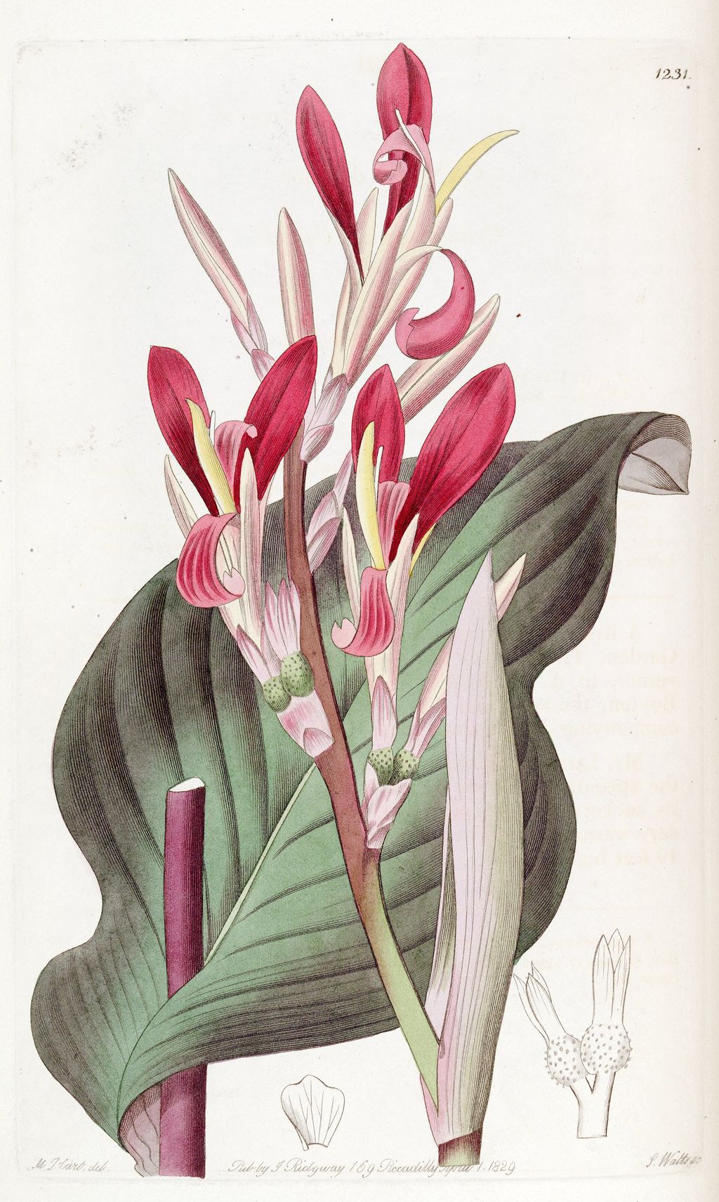
Cannas are rhizomatous plants native as a genus to tropical and subtropical America. Their flowers are structurally unusual: much of the conspicuous display consists of petal-like staminodes, while only one fertile stamen remains and is itself petaloid.[12] This asymmetry helps explain why an enlarged canna can resist the familiar mental picture of evenly arranged petals around a simple centre, rather than conforming to the radial symmetry expected of a generic blossom.
Kew records Canna indica across a wide American native range and as an introduced plant in many other regions.[13] Nothing in CR 589’s title, inscriptions or catalogue entry identifies a species or cultivated variety. Calling it Canna indica would therefore overstate the evidence, even though genus-level botany clarifies the folded reproductive structures from which O’Keeffe worked, an evidential limit that keeps visual analysis separate from taxonomic guesswork.
The painting is not a scientific plate. It omits leaves, stem, scale reference and the separated organs needed for identification, while colour and overlap are organised for a vertical canvas. Yet botany guards against another reduction: these are not generic decorative petals; canna flowers already complicate the distinction between petal and reproductive form before O’Keeffe enlarges and recomposes them, making the painting’s departures from scientific illustration deliberate and consequential.
Canna before 1927
O’Keeffe began making close views of flowers at Lake George in 1919.[7] Inside Red Canna, CR 306, turns a bloom into layered red, pink and purple geometry within a green setting. It appeared in Stieglitz’s 1923 Anderson Galleries retrospective, so the motif entered public understanding of her work years before CR 589, establishing a formal and exhibition history for enlargement well before the 1927 painting.[14]
Other 1919 cannas retain clusters, leaves or surrounding space, making the later movement inward easier to see. By the middle 1920s O’Keeffe was enlarging flowers onto substantially bigger canvases and stripping away more context. The change was neither an abrupt discovery nor a single series completed in order; it was a recurring problem that she reopened through different formats, grounds and degrees of recognisability.[7][11]
The canna also offered something beyond colour. Its curling, asymmetrical structures allowed O’Keeffe to move between exterior silhouette and interior fold without changing subjects. A bloom could remain plainly botanical at one scale and become a nearly unbounded arrangement at another; repetition was therefore investigative: the familiar plant generated new problems each time its viewpoint changed, with each new canvas preserving some clues while withholding others.
Five red cannas are not one sequence
CR 476, dated 1924–25, stretches a reddish-orange canna across a narrow pale field. Its archive entries, labels and later notes disagree about year and earlier ownership, showing how even a well-known motif can carry unstable documentation.[15] CR 589’s signed and dated reverse is unusually firm by comparison, although its exact execution place remains unpublished, and those uncertainties warn against compressing distinct objects into one familiar image.
CR 513, Red Canna of 1925–28, is close to CR 589 in size but builds a more explicit inward flare from red, pink, orange and white.[16] CR 555 of 1926 is much smaller, painted on board and set against turquoise and dark blue; a first-owner letter locates it at Lake George.[17] CR 563, also dated 1926, concentrates red and orange around a stronger spiral on a 20-by-16-inch canvas.[18]
Serial comparison reveals choices rather than progress towards a predetermined end. O’Keeffe alternated pale and coloured grounds, small and monumental supports, open spirals and overlapping lobes, single and plural titles. Red Cannas does not supersede the others by becoming “more abstract”; it makes one particular experiment: almost eliminating the outside world while preserving enough asymmetry, seam and colour change to keep the plant present, a method visible only when differences among the canvases remain intact.
The difficult year of 1927
Stieglitz opened Georgia O’Keeffe: Paintings, 1926 at the Intimate Gallery in January 1927, and O’Keeffe was at Lake George in April.[7] In June the Brooklyn Museum mounted her first museum retrospective. The same month she entered Mount Sinai Hospital for surgery to remove a benign breast cyst, followed by a second operation in December, a convergence that gives the date historical weight without explaining the image.[7]
She and Stieglitz returned to Lake George in November, but the public chronology does not assign CR 589 to a precise month or studio.[7] The earlier canna history makes Lake George plausible, not proven. Nor should the painting’s swelling red forms be converted into a coded medical autobiography simply because the year included breast surgery; documentary proximity does not establish symbolic intention, a caution especially necessary when repeated subjects invite retrospective certainty.
What can be said securely is that the picture emerged during a year of public consolidation and physical strain. A museum retrospective confirmed O’Keeffe’s stature, while operations interrupted work and daily life. Keeping those conditions beside the painting gives 1927 human density without making biography dictate its forms; the canvas must still be read through the decisions visible on its surface, and the distinction protects both biography and close visual analysis.
Photography and the painted close-up
The resemblance to a close photograph is real but incomplete. National Gallery scholarship identifies precedents in flower photographs by Imogen Cunningham, Paul Strand and Edward Steichen, as well as parallels in paintings by Charles Demuth and Marsden Hartley.[9] Spanish and German exhibition research likewise connects O’Keeffe’s sharp crop with the contemporary visual language of straight photography, while the painted object transforms those precedents through colour and duration.[21]
Photography could demonstrate how cutting off an object changes its scale and how close focus makes detail unfamiliar. O’Keeffe translated those possibilities into a slow, layered surface whose colours have no mechanical optical equivalent. The painting does not mimic a snapshot: its overlapping forms, suppressed context and carefully differentiated reds were revised through material decisions, including rotation of the support during development.[4]
The 2015–16 Grenoble exhibition Georgia O’Keeffe: Et Ses Amis Photographes later made this relationship an explicit curatorial subject.[1][24] That framing is historically valuable because O’Keeffe worked amid photographers and was repeatedly photographed herself. It should still be treated as an exchange among media, not a chain in which Stieglitz or Strand simply supplied her with a device she passively adopted.
Who owns the flower’s meaning?
Erotic interpretations accompanied O’Keeffe’s flower paintings from the 1920s. Critics mapped folds, openings and reproductive structures onto female anatomy, often treating her sex as an explanation of the work. Stieglitz’s highly charged photographic portrait of O’Keeffe helped prepare that reception by presenting artist, body and creative identity as a unified public image, a framework that often displaced attention from paint, scale and compositional labour.[9][10]
O’Keeffe repeatedly objected that viewers placed their own associations onto her flowers and then wrote as though those associations were hers.[10][21] Her resistance does not forbid a viewer from noticing sensual forms; it prevents that response from being mislabelled as documented intention. The distinction is essential because interpretation can be historically influential without becoming a biographical fact.
Sarah Garland reads O’Keeffe’s move towards recognisable objects as a deliberate attempt to check biographical and psychoanalytic interpretation. In a 1924 letter, O’Keeffe explained that she was striving for greater objectivity because she disliked readings of her abstractions; the season’s inventory included two new red cannas.[29] Those works predate CR 589 and cannot be identified with it. The letter nevertheless places the canna motif within a sustained effort to anchor attention in a named thing without surrendering formal complexity.
The legacy page treated sexual criticism mainly as something O’Keeffe denied. A fuller history must keep several truths together: the readings shaped her reception, the plant itself has reproductive anatomy, the painting is sensuous, and the artist rejected reductive claims about what she meant. Turning the canvas into either a disguised body or an entirely sexless formal exercise closes a debate the evidence leaves open.
Gender, promotion and the Stieglitz circle
The 2007–08 exhibition Georgia O’Keeffe and the Women of the Stieglitz Circle placed CR 589 within a broader history of women associated with Stieglitz’s galleries. It included Gertrude Käsebier, Pamela Colman Smith, Anne Brigman, Georgia Engelhard and Katharine Nash Rhoades, artists whose different modernisms were often eclipsed as O’Keeffe became the emblematic woman of his programme.[23]
Curator Kathleen Pyne argued that Stieglitz fashioned ideas of a pure, childlike or essential female vision from these artists’ work and used O’Keeffe most powerfully to embody that ideology.[23] This account complicates the familiar story of a male dealer merely discovering an independent genius. Promotion created opportunity and visibility while also imposing a gendered framework that O’Keeffe spent decades negotiating.
CR 589’s independence therefore concerns practice as well as statement. Its control of crop, size and colour cannot be reduced to Stieglitz’s claims, even though his Intimate Gallery first brought it to viewers. The Carter’s emphasis on O’Keeffe questioning whether a composition was intrinsically her own captures the issue: authorship meant testing influence rather than pretending that artistic work occurred outside relationships.[2]
Other ways to read organic form
French Centre Pompidou interpretation shifts attention from human symbolism to the scale of another living being. It imagines O’Keeffe’s flower viewpoint at the height of an insect or hummingbird, almost as a cinematic movement into the bloom.[20] This is not a literal reconstruction of how CR 589 was made; it is a productive account of the perceptual estrangement caused by enlargement.
The 2023–25 O’Keeffe and Moore exhibition offered another counterweight. By setting her flowers and shells beside Henry Moore’s study of stones, bones and internal-external forms, it treated natural structure as a route into modern abstraction.[22][25] Red folds could then be read through enclosure, hollow, weight and transformation rather than through gender alone.
Botanical, ecological, formal and sensual readings need not cancel one another. The strongest interpretation begins with what the object makes visible and then identifies where historical context enters. A claim becomes weaker when it pretends to exhaust the picture; Red Cannas remains open because the same curve can describe plant anatomy, organise colour and solicit bodily association without becoming only one of those things.
Garland also locates O’Keeffe’s formalism within design ideas mediated by Arthur Wesley Dow and Ernest Fenollosa, where spacing, attention and aesthetic effect could be valued apart from symbolic decoding.[29] That genealogy makes enlargement a disciplined way of directing sight, rather than simply a route to hidden content. It also carries a caution: American modernists often universalised Asian traditions while detaching them from their contexts. The argument illuminates an anti-symbolic stance; it does not prove that CR 589 encodes a specifically Zen programme.
The surface before treatment
Before its recent conservation, the painting looked unexpectedly flat and glossy. During an in-gallery survey, conservator Gwen Manthey saw ultraviolet evidence of restoration paint and suspected that the canvas had been lined, although the files contained no such record.[3] The hypothesis was reasonable because lining can compress texture, but it could not be tested until the backing was removed in the studio.
The reverse showed that the canvas was unlined and preserved its Claessens stamp.[4] Additional inscriptions suggested that O’Keeffe rotated the support while developing the composition, an important material clue to its apparently effortless crop. Rotation means the final vertical orientation emerged through work; it was not necessarily fixed before the first painted structure appeared.
Technical documentation combined normal reflected light, ultraviolet-induced visible luminescence, reflected ultraviolet, infrared methods and high-resolution photography.[4] Carter photographers also used photogrammetry to map cracks and other surface anomalies for later comparison. These methods separated the physical object from assumptions created by its appearance and established evidence against which future change can be measured, each revealing a different class of information about support, paint and intervention.
The source of the flattening lay on top of O’Keeffe’s paint. Thick synthetic coating adhered through high surface tension, areas of natural resin varnish had yellowed, and earlier restoration paint covered damage or abrasion.[4] Together these materials darkened the reds, increased gloss and suppressed the relief of brushwork, making broad areas appear more uniform than they were.
Cleaning exposed paint skips between strokes, changes to the composition and a varied impasto that had been visually compressed.[4][5] The most dramatic discovery was chromatic: cool pinks separated from deep orange-reds, and subtly different whites altered the temperature of adjoining passages. Red was revealed as a set of calculated contrasts rather than a single saturated field.
This evidence revises formal interpretation. The slow transition across the upper-right lobe and the velvet-like lower folds are not merely effects of blended colour; their physical texture participates in how light changes across them. Conservators also identified past abrasion, so not every irregularity can be confidently assigned to O’Keeffe; material history requires viewers to distinguish surviving intention, damage and later intervention where records allow.[4][5]
Removing care that had become obstruction
Treatment proceeded slowly because the coatings occupied the valleys and ridges of a delicate surface. Manthey used tiny hand-rolled cotton swabs and solvents for soluble varnish and restoration paint, poultice-like material where appropriate, and micro-scalpels or porcupine quills for stubborn synthetic deposits.[4] The unusual tools mattered because pressure sufficient to remove coating could also threaten original impasto.
The project involved O’Keeffe specialists as well as the owner. Dale Kronkright of the Georgia O’Keeffe Museum advised on varnish reduction and the artist’s preference for unvarnished surfaces; catalogue raisonné author Barbara Buhler Lynes reviewed the visual result; Carter curatorial and conservation staff assessed the painting before return.[4] Expertise operated as a conversation around the object rather than a single irreversible judgement.
After cleaning, the conservator applied a customised, gentle surface protection and toned small areas of existing abrasion.[5] Heavy red overpaint was reduced, allowing brushwork and paint skips to reappear. Post-treatment ultraviolet imaging recorded the reduced visual dominance of restoration, while photogrammetry preserved a topographic baseline; the goal was legibility and stability, not a fictive return to an untouched 1927 state.
General technical studies help place these findings without replacing them. Thyssen researchers found that O’Keeffe often planned with fine drawing, mixed several colours for a hue, applied paint thinly enough for weave to remain visible and allowed layers to dry before adding others.[19] CR 589’s actual impasto, rotation and coating history must come from its own examination; comparative procedure only sharpens the questions asked of it.
From the Intimate Gallery to Fort Worth
The painting first appeared in the Intimate Gallery’s O’Keeffe Exhibition, held from 9 January to 27 February 1928.[8] Its published provenance then passes through Mrs Carleton H. Palmer in 1929, an unidentified New York private collection and Robert Miller Gallery; because dates and names are missing, that interval should remain visible.[1] The Phillips Collection finding aid confirms a dedicated CR 589 research folder, but its contents are not online.[26]
The Carter acquired the work in 1986 as part of its broadening account of American art.[27] Its institutional life includes American Still Life in 2015 and From Remington to O’Keeffe: The Carter’s Greatest Hits in 2018–19.[2] A 2001 Carter exhibition also compared its intense treatment of natural material with O’Keeffe’s open and closed clam shells, anticipating later organic-form readings.[28]
Between 2007 and 2008, Women of the Stieglitz Circle took it from Santa Fe to Atlanta and San Diego.[1][23] Grenoble’s 2015–16 photography exhibition placed it in a different network.[24] These changing contexts demonstrate that reception is constructed through neighbours: the same canvas can exemplify a woman modernist, photographic seeing, American still life, organic abstraction or the history of a regional collection.
For O’Keeffe and Moore, the painting travelled to San Diego, Albuquerque, Montréal and Boston between 2023 and January 2025.[25] The Carter documented the practical labour behind that circulation: condition reports, trained handlers, a custom crate, Dartek wrapping, controlled transport, courier supervision and at least twenty-four hours of acclimatisation before unpacking.[6] Exhibition history is also a history of managed physical risk.
The Montréal interpretation emphasised flowers and shells as structures that connect inside and outside, explicitly challenging the dominance of sexualised readings.[22] The long loan thus altered scholarly context while exposing the object to the ordinary stresses of movement. Its return led into the conservation campaign, allowing technical study to answer questions that gallery viewing alone had raised.[3][4]
In 2026 the conserved painting became central to Georgia O’Keeffe and the Carter, an exhibition connecting current research with the museum’s landmark 1966 retrospective.[5] The sequence from international loan to treatment and redisplay makes conservation part of reception rather than backstage maintenance. Viewers now encounter a surface whose cooler pinks, warmer reds and textured transitions became newly legible through that work.
Looking after conservation
Begin at the pale edge rather than the apparent centre. Follow each interval until red closes it, noting whether the boundary is crisp, blurred or cropped by the frame. This route shows how little conventional background remains and how actively the surviving ground separates one mass from another; the flower expands because the spaces around it have been made narrow and irregular.
Then compare reds instead of naming them collectively. Look for orange warmth in the left lobes, cooler crimson in recesses, pink along turned edges and maroon where forms overlap. The recent treatment makes these distinctions historically charged: they belong to O’Keeffe’s colour construction, but their present visibility also depends on the removal of coatings that had altered them.[4][5]
Finally, hold interpretation open long enough for evidence to work. The canvas can feel bodily without proving a coded body, photographic without ceasing to be materially painted, and botanical without identifying a species. O’Keeffe’s achievement lies partly in producing those crossings; she made a flower impossible to overlook, then made sustained looking less certain than the first recognition promised.
Discussion
Which piece of evidence most changes the way you read Red Cannas?
Reader Insights
Which visible detail most changes your reading of Red Cannas?
How do medium, setting and documented history shape the encounter?
What remains uncertain when documented fact is separated from interpretation?
Join the Conversation
Share your reading of Red Cannas below.
References
- Georgia O’Keeffe Museum, Access O’Keeffe, “Red Cannas, 1927”, CR 589: View Source
- Amon Carter Museum of American Art, “Red Cannas”: View Source
- Amon Carter Museum of American Art, “Caregiving for Georgia O’Keeffe’s Red Cannas (part 1)”: View Source
- Amon Carter Museum of American Art, “Caregiving for Georgia O’Keeffe’s Red Cannas (part 2)”: View Source
- Amon Carter Museum of American Art, “Caregiving for Georgia O’Keeffe’s Red Cannas (part 3)”: View Source
- Amon Carter Museum of American Art, “Travels with Georgia”: View Source
- Georgia O’Keeffe Museum, Access O’Keeffe, “Chronology”: View Source
- Georgia O’Keeffe Museum, Access O’Keeffe, “O’Keeffe Exhibition”, 1928: View Source
- National Gallery of Art, “Jack-in-the-Pulpit No. IV, 1930”, American Paintings, 1900–1945: View Source
- National Gallery of Art, “Jack-in-Pulpit Abstraction—No. 5, 1930”, American Paintings, 1900–1945: View Source
- Metropolitan Museum of Art, Georgia O’Keeffe, Metropolitan Museum of Art Bulletin 42, no. 2 (1984): View Source
- Royal Botanic Gardens, Kew, Plants of the World Online, “Canna L.”: View Source
- Royal Botanic Gardens, Kew, Plants of the World Online, “Canna indica L.”: View Source
- Georgia O’Keeffe Museum, Access O’Keeffe, “Inside Red Canna, 1919”, CR 306: View Source
- Georgia O’Keeffe Museum, Access O’Keeffe, “Red Canna, 1924–1925”, CR 476: View Source
- Georgia O’Keeffe Museum, Access O’Keeffe, “Red Canna, 1925–1928”, CR 513: View Source
- Georgia O’Keeffe Museum, Access O’Keeffe, “Red Canna, 1926”, CR 555: View Source
- Georgia O’Keeffe Museum, Access O’Keeffe, “Canna Red and Orange, 1926”, CR 563: View Source
- Museo Nacional Thyssen-Bornemisza, “Georgia O’Keeffe in the Thyssen-Bornemisza Collections”: View Source
- Centre Pompidou, “Chez Georgia O’Keeffe, le vivant à hauteur de colibri”: View Source
- Museo Nacional Thyssen-Bornemisza, “Un paseo entre las flores”: View Source
- Montreal Museum of Fine Arts, “Georgia O’Keeffe and Henry Moore: Giants of Modern Art”: View Source
- Georgia O’Keeffe Museum, Access O’Keeffe, “Georgia O’Keeffe and the Women of the Stieglitz Circle”: View Source
- Georgia O’Keeffe Museum, Access O’Keeffe, “Georgia O’Keeffe: Et Ses Amis Photographes”: View Source
- Georgia O’Keeffe Museum, Access O’Keeffe, “O’Keeffe and Moore”: View Source
- Phillips Collection, Georgia O’Keeffe: The Poetry of Things records finding aid: View Source
- Georgia O’Keeffe Museum, “Exhibiting O’Keeffe: The Making of an American Modernist”: View Source
- Amon Carter Museum of American Art, “Celebrating America: Masterworks from Texas Collections”: View Source
- Sarah Garland, “Against Interpretation: Georgia O’Keeffe and ‘the Zen of Aestheticism’”, Women: A Cultural Review 32, no. 1 (2021), 86–103. View Source