


 by Tom Gurney
Tom Gurney BSc (Hons) is an art history expert with over 20 years experience
Published on June 19, 2020 / Updated on September 24, 2026
Email: tomgurney1@gmail.com / Phone: +44 7429 011000
Hokusai’s Red Fuji: a clear morning, many impressions
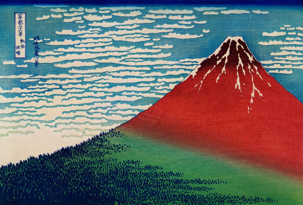
Mount Fuji fills almost the whole sheet. Its rising sides frame a summit marked by pale snow, while small dark trees mass along the lower slope. Bands of cloud cross a blue sky. There are no travellers, boats or buildings to establish a human scale. Katsushika Hokusai made this strikingly spare design for his series Thirty-six Views of Mount Fuji, probably around 1830–32. Its Japanese title, 凱風快晴 (Gaifū kaisei), is usually translated South Wind, Clear Sky or Fine Wind, Clear Morning. Most viewers know it as Red Fuji. The Sumida Hokusai Museum's Japanese record [1] confirms that familiar nickname.
The nickname gives us a way into the picture, but it can also make a colour woodblock print sound like a single, unchanging painting. Hokusai designed an image that printers could produce in many copies. Surviving sheets differ in colour, inking, paper condition and later history. The Met holds at least two catalogued impressions, JP9 [2] and JP2960 [2], each with its own accession, dimensions and appearance. Cleveland's 1930.189 [3] offers another comparison. The subject of this page is Hokusai's design and the physical impressions that let us study it; no particular museum sheet stands for all of them.
Contents
- Hokusai’s Red Fuji: a clear morning, many impressions
- Annotated image: five details in Red Fuji
- What does Gaifū kaisei mean?
- Reading the composition
- The print as an object, and why impressions differ
- Red Fuji within the Thirty-six Views series
- A more exact way to read the morning light
- What scientific study adds
- The series as a publishing proposition
- Comparing four named impressions
- A later camera view of Fuji
- Where this page fits in Hokusai's life and afterlife
- How to look closely
At a glance
- Japanese series and print title
冨嶽三十六景 凱風快晴(Fugaku sanjūrokkei: Gaifū kaisei) - Common English titlesSouth Wind, Clear Sky; Fine Wind, Clear Morning; Red Fuji
- ArtistKatsushika Hokusai, 1760–1849
- DateAbout 1830–32 for the design; exact printing date varies by impression
- FormColour woodblock print on paper
- PublisherNishimuraya Yohachi (Eijudō), as catalogued by the British Museum
- SeriesThirty-six Views of Mount Fuji: 36 initial designs and ten additions
- Pictured subjectMount Fuji, cloud-filled sky and a dark band of woodland; no identifiable person or built landmark
Annotated image: five details in Red Fuji
Select a numbered point to read its explanation below, then select the detail image to enlarge it. The detail crops come from the high-resolution image shown above.
Details from RED FUJI
Each detail is explained below the full image.
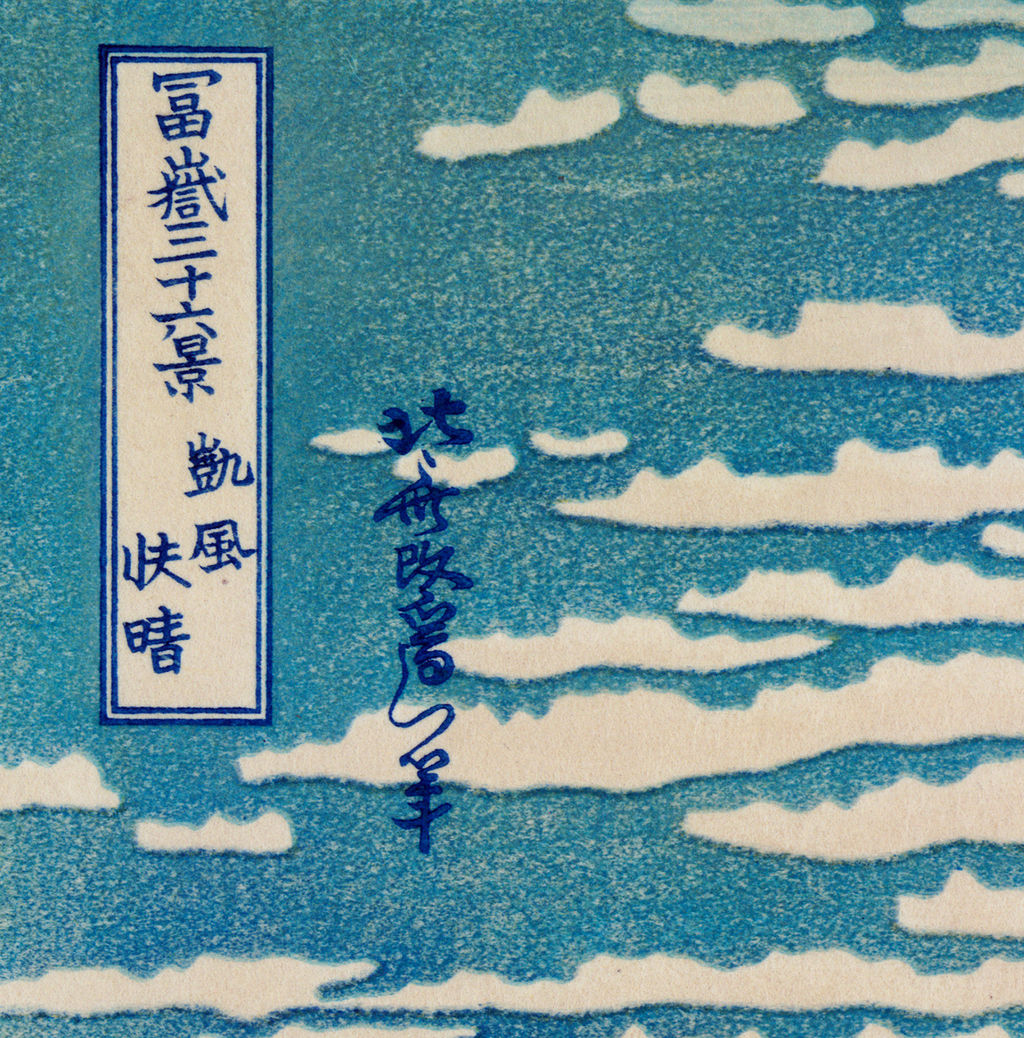
Title and signature
The printed cartouche names the Fuji series and this design; Hokusai’s signature sits beside it.
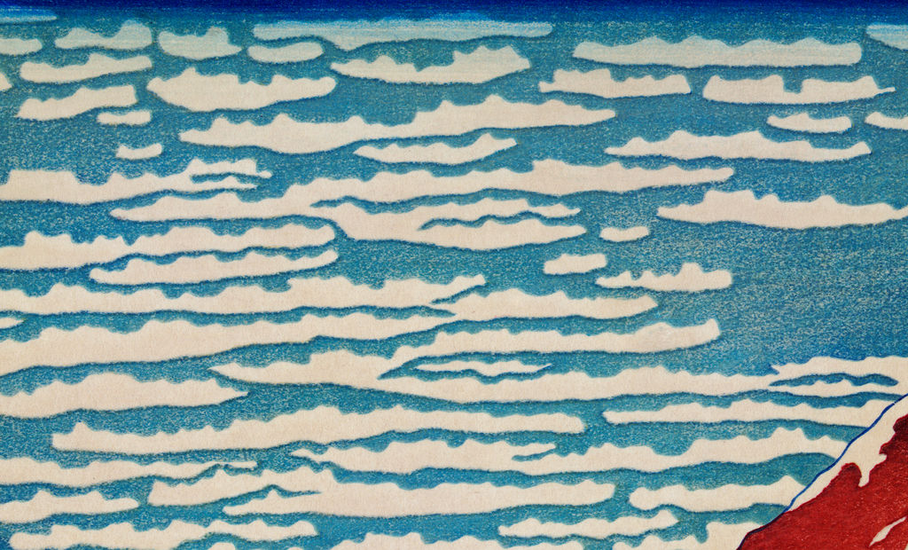
Cloud bands
Broken horizontal forms create a rhythm across the sky. The British Museum notes purposeful uneven blue inking in its own impression.
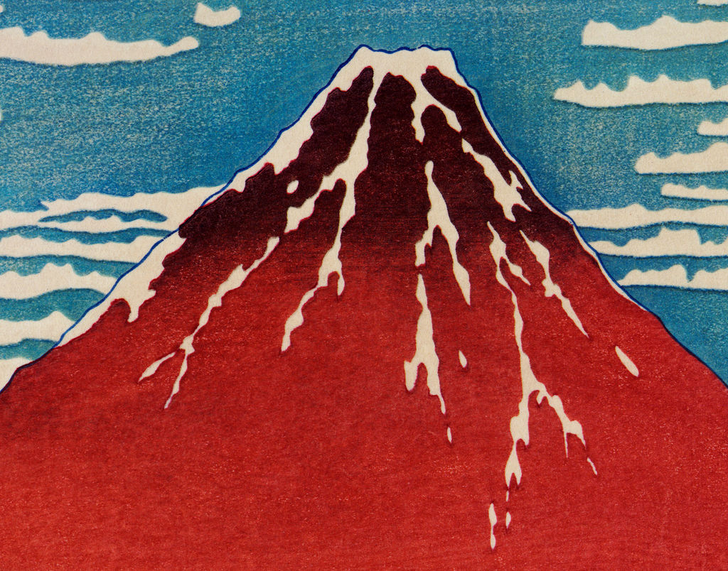
Summit and snow
Pale channels run through the dark cap, giving the broad cone a sharply textured peak.
Tiny trees
Many individual tree marks join into a dark belt that makes the mountain feel enormous.
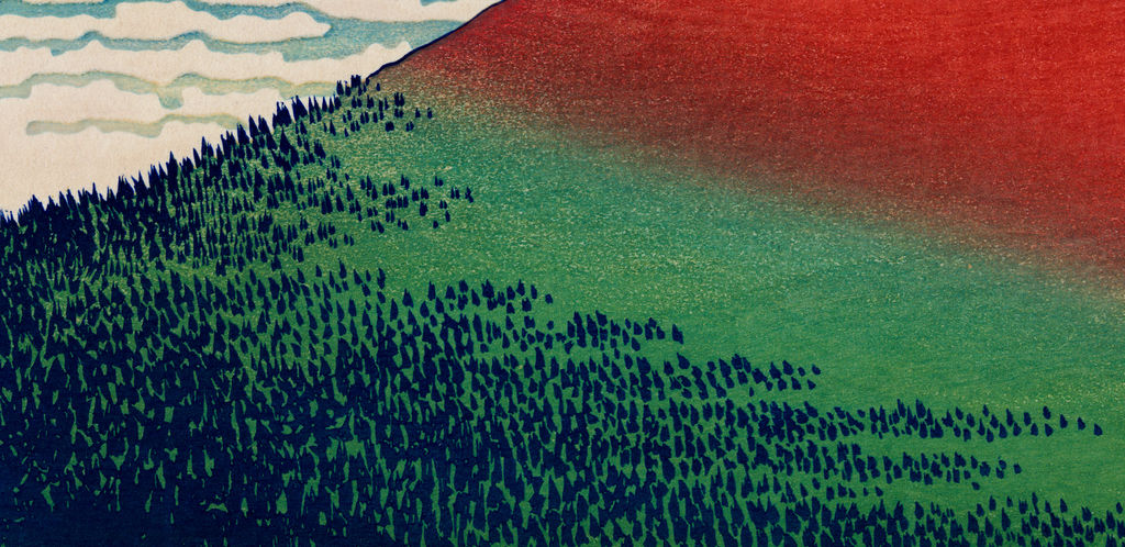
Red to green
Look at the edge of the red field: museums describe changes in this transition across different impressions.
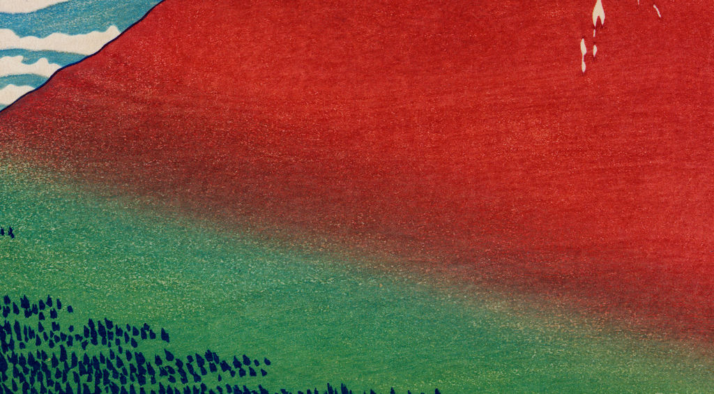
The physical museum impression represented by the image has not been identified.
What does Gaifū kaisei mean?
The formal title evokes a south wind and clearing weather. English museum titles vary: the Met uses South Wind, Clear Sky; the British Museum uses Clear Day with a Southern Breeze. The long-standing Red Fuji nickname describes the dominant impression of the mountain rather than translating the Japanese title. These are alternative names for the same design, not three separate prints. The British Museum catalogue [4] records the Japanese title and its translation, while Sumida [1] calls the design 赤富士 in its Japanese explanation.
Does the title tell us the precise hour or season? It suggests a state of the air, and museums commonly connect the reddish mountain to dawn in late summer or early autumn. The Met's JP2960 commentary [2] presents that as a traditional observation about Fuji, and Cleveland [3] likewise associates the scene with the seasonal transition. The picture itself does not give a calendar date, measured weather condition or identified observation point. Describing it as an early-autumn dawn is a useful interpretation when attributed to the source, not a documented entry in Hokusai's diary. The old page's claim that the print was made in an autumn of 1830 confuses the apparent subject with the date of designing or printing it.
The Japanese title also keeps the air in the picture. Looking at the mountain alone can obscure the enormous part played by the sky. Horizontal strings of cloud interrupt the blue on the left and behind the summit. They create a sense that weather is moving across a landscape otherwise almost still. A clear sky here is not an empty sky. It is active enough to make the red mass of Fuji seem momentary, even when the mountain's outline is exceptionally stable.
Reading the composition
The slope enters low on the left, climbs to a peak right of centre and descends beyond the right edge. Hokusai lets the mountain act as both subject and structure. Its long diagonal guides the eye upward before the snow draws it to the summit. There is very little middle distance: a thin, dark-green region of trees marks the base, then the coloured face of the mountain rises almost without interruption. In the Met's JP2960 account [2], those trees are described as tiny triangles of green. Their reduced scale enlarges Fuji without adding a person as a measuring stick.
The mountain is not an even block of red. Its upper slope deepens toward a darker tone, and its foot changes toward green. Fine variation within the broad red field matters because so much of the design depends on a small number of large colour areas. Cleveland's curators note [3] that the grain of the cherry-wood printing block was transferred to the paper along with red dye in their impression. That detail is easy to miss in a thumbnail; it turns a seemingly smooth plane into visible evidence of the printmaking process. It should not, however, be assumed to appear equally in every photographed impression.
The snowy summit is sparing. White channels run down through the dark cap, breaking the symmetry of the cone. Darker lines make the top seem sharp and textured against the calm profile below. On the other side of the contrast, the clouds are spread in narrow, repeated forms across the sky. The print moves between large simplicity and small interruptions: snow channels, tree marks, cloud strands, the cartouche and signature. That alternation helps explain why it remains legible as a small reproduction but repays examination of a full sheet.
No human figure appears. This makes Red Fuji different from many images in the series where Hokusai sets labour or travel in front of the mountain. In Under the Wave off Kanagawa, the boats and crews make a distant Fuji seem vulnerable; in Kajikazawa in Kai Province, a working figure and fishing lines echo the mountain's shape. Here the mountain has nearly the whole visual field. The comparison is internal to Hokusai's series, rather than proof that he considered this sheet superior to the others. See the series overview for the full range of approaches.
The print as an object, and why impressions differ
A woodblock print is a collaborative product. A designer's image was prepared for cutting into woodblocks, with different blocks and printing passes supplying line and colour. The publisher coordinated production and sale. A new sheet could be printed from the blocks, but the resulting colours depended on the pigments, their application and the condition of the blocks; decades of light exposure and handling could then alter the sheet further. This does not mean every apparent difference in a digital image is an original printing variation. Photography, colour correction and cropping can change what a web visitor sees. Comparison starts with accession numbers and records, followed by close examination of the objects or reliable imaging.
The British Museum's impression [4] is especially useful for separating design from impression. Its curatorial notes discuss gradation and deliberately uneven blue inking, and compare an early sheet with later colour effects. They caution against imagining a single definitive red. The Met's JP9 [2] and JP2960 [2] are separate sheets even though both have the same series and design title. The first is credited to the Rogers Fund, 1914, and measures 24.4 by 35.6 centimetres; the second is from the Henry L. Phillips bequest and measures 25.4 by 37.8 centimetres. That difference in catalogue measurements is a reminder to identify exactly which sheet a caption describes; it does not, by itself, prove how the original paper was trimmed.
Hokusai's subject could also be printed in a blue-dominant version. Sumida's exhibition [1] listed 凱風快晴 beside a 藍摺版 (blue-printed version), and a museum workshop [1] introduced visitors to both “red” and “blue” Fuji. These sources establish the coexistence of versions. They do not, alone, fix whether one preceded the other or exactly how every surviving example fits a publishing sequence. The lesson for a gallery of online pictures is simple: a blue Fuji is not necessarily a wrong modern recolouring, and a red image should not be assigned an accession or production date by appearance alone.
Red Fuji within the Thirty-six Views series
Despite its title, the series grew beyond thirty-six designs. The initial group was followed by ten additional designs, giving forty-six in all. The Sumida Hokusai Museum's exhibition material [7] identifies Red Fuji, Under the Wave off Kanagawa and Storm below Fuji as three of its best-known designs, and notes differences in the key-line colour between the original thirty-six and the later ten. The Hokusai biography at Sumida [1] places the Fuji series within a period that helped establish landscape as a major genre in ukiyo-e.
This grouping makes Red Fuji more revealing. Storm below Fuji gives the same mountain a division between brightness above and dark weather underneath. Red Fuji lets colour and atmosphere transform nearly the entire cone. The Great Wave holds Fuji at a distance beneath a near mass of water. The three prints are often treated as icons together, but each asks the viewer to solve a different visual problem: a changing mountain, an unstable sky, or a shift in scale. A close reading of one becomes richer when the others are available as separately captioned comparisons.
A more exact way to read the morning light
The broad colour divisions are sometimes described as a view of sunlight advancing down a mountain. Timothy Clark's comments attached to the British Museum impression [4] make this interpretation unusually precise. In that account, the bare upper slopes take the first light while the lower, wooded region remains in shadow. The boundary of light curves over the mountain's cone, and its height differs on the two sides because the imagined sun approaches obliquely. The statement is a close visual and geographical reading of a designed print. It is not a surviving note in which Hokusai names a camera-like viewpoint. A reader can test the reading against the picture: the change between pink or red and green is not simply a horizontal stripe, and the summit is accented by a separate dark tone.
Clark also calls the high, broken cloud formations a “mackerel sky,” comparing them with a school of fish. The resemblance is interesting because the clouds have many short, repeated marks instead of one continuous mass. Yet a viewer need not accept a single meteorological label to see Hokusai's formal move: their horizontal rhythm checks the ascent of the mountain. This is why an annotation should include both the cloud bands and the colour boundary, rather than merely circling the peak. In the British Museum's scholarly notes [4], the sky can even appear subtly mobile because its pale blue was printed unevenly on purpose.
The Museum's description of an early sheet held by the MOA Museum of Art in Atami is a valuable corrective to the title by which most people recognize this print. That example had pinkish slopes and a pale blue sky, with a substantial green zone at the foot. Later impressions often used a darker reddish-brown for the mountain and a stronger blue for the sky. A nickname taken from the colour of common later sheets can therefore influence what we expect the design always to have looked like. The BM account further notes that some complex transitions between mountain colours were simplified in later printing. It describes an early curved gradation turning into a straighter diagonal in some later impressions, a difference that saved the printer time. These are concrete production differences, not just poetic changes of mood. Comparing named sheets brings those otherwise subtle differences into view.
What scientific study adds
Looking at a print tells us much, but it cannot always identify a pigment or the order in which sheets were printed. The British Museum's preventive-conservation account [5] describes false-colour infrared imaging of its Red Fuji. In that particular impression, indigo appears in the title cartouche, signature, outline of Fuji and tiny tree forms. The sky's iron-rich blue was identified as Prussian blue, while the green of the lower mountain combined Prussian blue with a yellow pigment identified as orpiment. These results belong to the analysed British Museum sheet; one should not extend the exact pigment map to an unidentified copy merely because it shares the design.
That analysis helps explain why a flat digital reproduction is an incomplete encounter with the work. The shape and colour of a cloud may result from a block, an inking choice, the paper, ageing or a combination. The British Museum's scientists also use light-sensitivity findings to set strict display conditions for their impression. A museum may show an image online while the original rests in storage; the existence of a website file does not mean the paper can remain in bright light indefinitely. The material life of the object is part of the story of why different people meet Hokusai's design in different forms.
A Metropolitan Museum scientific-research abstract [6] describes work on 180 prints from the Thirty-six Views series. Researchers studied small compositional variations in Prussian blue and indigo mixtures, then grouped impressions and compared repeated designs to investigate their possible production chronology. That is a series-wide method, and the abstract itself presents an attempt to reconstruct chronology rather than a simple date stamp for each sheet. It shows why image labels such as “1831” can be more secure for a design or broad publishing phase than for the day a particular surviving impression was pulled.
The series as a publishing proposition
The print was made for an audience buying individual sheets, not a later museum installation of forty-six images at once. Hokusai's publisher was Nishimuraya Yohachi, who used the name Eijudō. The British Museum record [4] names him as the publisher of Red Fuji. The Met's essay on the Great Wave and the Fuji series [6] describes an Eijudō advertisement around the new year of 1831 promoting the series and its imported blue pigment. That advertisement is evidence of how a contemporary print buyer might first have heard of the project: as a set of varied views of a famous mountain and a product with a striking new colour. It does not tell us that all forty-six designs appeared together on one date.
The series asks how many different visual situations can contain a recognizable Fuji. Sometimes a viewer must search for the mountain in the distance, framed by a cooper's barrel or the ribs of a wave. Sometimes a foreground person makes the mountain's scale relative. Red Fuji makes the mountain impossible to overlook, then gives variation to apparently simple air and colour. That change of emphasis would have had particular force within a series marketed on differing views. The parent Thirty-six Views overview places this image alongside the other designs and their much wider range of settings.
Comparing four named impressions
Four named museum objects offer a more useful comparison than anonymous reproductions. The British Museum's 1906,1220,0.525 [4] is the source of the unusually detailed curatorial discussion of how colour and wiping changed. Its curatorial description allows comparison with other museums’ sheets even when its image is not reproduced here. The Met's JP9 [2] and JP2960 [2] are separate impressions with different dimensions, acquisition lines and visible colour. Cleveland's 1930.189 [3] is independently catalogued and offered for open reuse; its curatorial note about wood grain gives us an especially close reason to inspect that sheet.
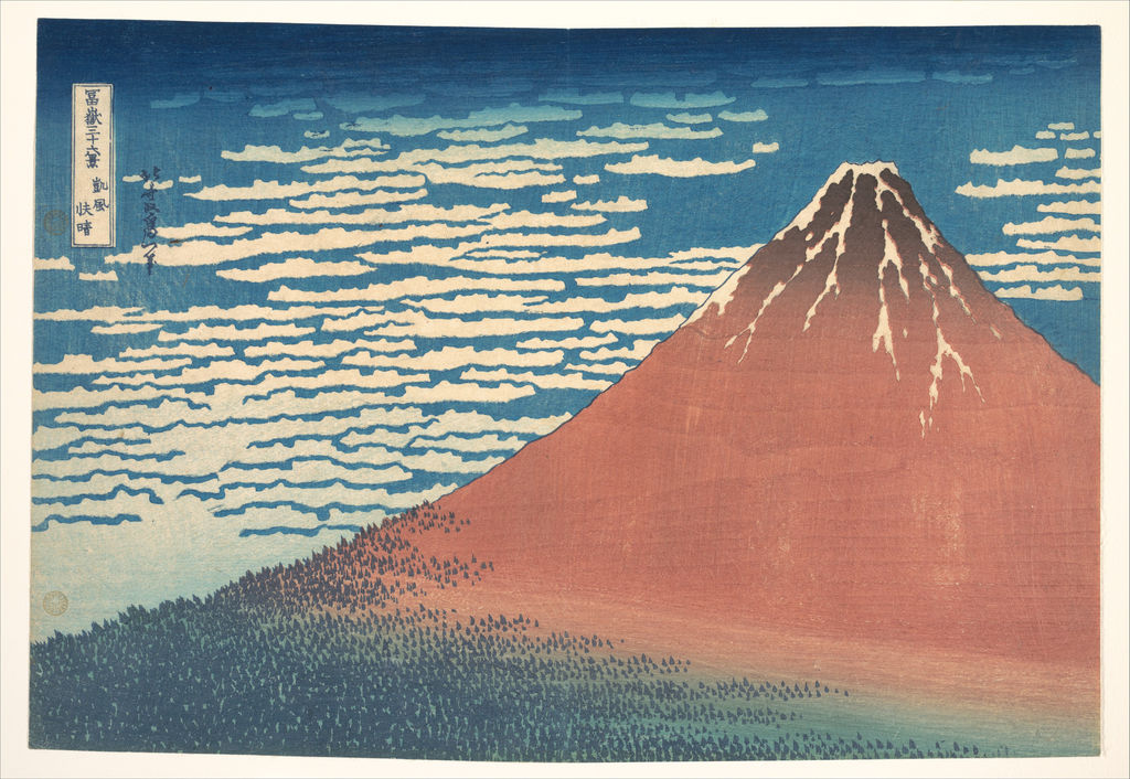
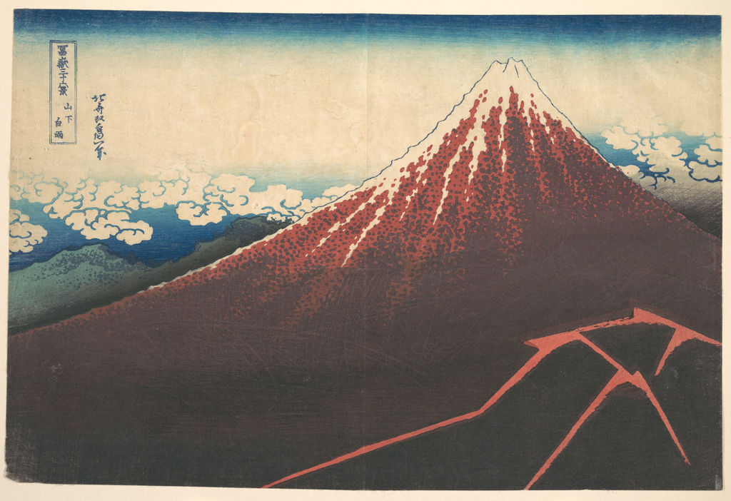
The first question is not “which one has the right shade of red?” It is where the blocks and hand-applied gradation seem to have made a difference. Is the green-to-red boundary curved or comparatively straight? How light is the sky, and does its blue look even? Is the snow at the summit crisp, and where do the clouds interrupt the sky? What does a photograph show of paper margins and surface? These are observations that can be recorded without assuming a particular copy is closest to Hokusai's original idea. A museum's judgement that one impression is early or late should be attributed to that museum and explained with the feature on which the judgement rests.
The large reproduction at the top of this article has no identified museum accession. It lets us study the title, sky, snowy cap, broad colour changes and woodlands, but its exact printing history remains unknown. The captions beside the separately identified Met sheets supply their accessions and credits.
A later camera view of Fuji
An image in the Rijksmuseum's collection [8], Mount Fuji seen from Tagonoura, is associated on the object with the photographer Kazumasa Ogawa. Its catalogue dates it from about 1883 to no later than 1893, more than fifty years after Hokusai's Fuji series. The object is a collotype, a photomechanical print from a photographic view, and survives as a page in a book. It gives us a later way of picturing the physical mountain across water and landscape. The river and small craft provide human scale that Hokusai's Red Fuji deliberately removes. Their presence makes the comparison useful precisely because the two images do different work.
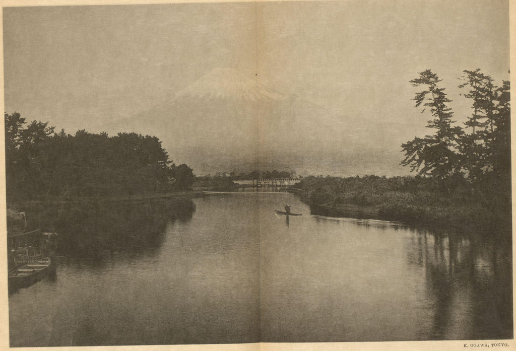
The Rijksmuseum names Tagonoura, while Gaifū kaisei gives no street, viewpoint marker or human landmark. The photograph cannot verify that Hokusai saw exactly this cloud formation from this place. It also shows a historical reproduction of a camera image, not a neutral window onto nineteenth-century weather. Its date range, format and identified collection object make the comparison more reliable than an undated “old Fuji” photograph found without provenance. Hokusai's print remains a constructed and multiply printed design, and the camera image remains a separate late-nineteenth-century object. The shared mountain connects them without collapsing their histories.
Where this page fits in Hokusai's life and afterlife
The Sumida Hokusai Museum biography [1] places the Fuji prints within Hokusai's late career and emphasizes how their popularity helped establish landscape as an important ukiyo-e genre. His age matters less as a formula about “late genius” than as a reminder that the Fuji designs followed decades of work in different formats. The reader who wants that wider chronology can follow the separate Hokusai biography. Here the emphasis belongs on what a mature print designer and his publisher made possible within a repeatable commercial medium.
The print has also been reproduced so often that a flat modern image can seem to be the work itself. Its plain silhouette and broad colour make it effective on a screen or book cover, but a digital reproduction is a photograph or scan of some sheet, with its own tonal decisions. The Museum of Fine Arts, Boston's Hokusai's Landscapes [9], by curator Sarah E. Thompson, is a substantial published way to explore the landscape prints in a museum collection. Andreas Marks's TASCHEN volume on the Thirty-six Views [10] offers the full series as a visual sequence. The three editions listed after the references offer different routes into the subject: a series-wide illustrated book, a museum study of landscapes and a close account of the companion Great Wave.
How to look closely
Start with the full image. Trace the left slope to the summit and ask where the red becomes green and where it becomes dark at the top. Then read the cloud pattern horizontally rather than treating it as a background wash. Zoom into the tree line and ask how little detail is needed to make it feel deep. At the summit, compare the white snow channels with the black or dark red edges surrounding them. Finally, look at the series-title cartouche and Hokusai's signature: they are part of the printed design, not labels placed beside it by a modern museum.
The cartouche gives the overarching series at the top and the individual design title below. Its framing takes a little space from the sky, making the printed words part of the image's balance. The signature beside it identifies Hokusai's Iitsu name; the British Museum's description [4] renders it as the artist changing his name to Iitsu. A cropped reproduction that removes those marks may look more like a timeless landscape, but it also hides the evidence that this was a named design in a published series. The enlarged cartouche and adjoining signature make their place in the composition easier to see.
The clouds reward a second look because white paper and blue printing play together. In the complete view they can seem like pale lines painted over a uniform sky. In an enlarged crop, their jagged edges and changes of blue make the intervals between them as important as the marks themselves. The British Museum's account [4] identifies intentionally uneven inking in one early impression. This enlarged image invites us to notice variation, but it cannot establish the exact ink formula of the unidentified copy. That distinction between seeing and scientifically identifying a material is central to responsible close looking.
The lower tree belt can be read as a collection of individual little marks, then as a dark band at ordinary screen size. Cleveland's wood-grain observation [3] encourages a similar switch of scale on the mountain itself: from a red silhouette to the small textures produced through wood and pigment. The enlarged details let us move between those scales; the trees’ marks do not identify a specific printing block. The green transition is a fifth detail worth isolating because its position and form change in museum descriptions of early and later impressions. It is more informative to compare that edge than to judge which entire JPEG looks most pleasing.
The accession and holding institution beside each version let us compare the same area in two identified sheets. The colour of a web JPEG alone is weak evidence, while a museum's object record can tell us what sheet was photographed and sometimes why its colour or surface is distinctive. Cleveland's wood-grain note is a good example of a visible feature tied to a named object. The large reproduction’s unidentified impression can explain the design and its details, though its printing history remains unstated.
Frequently asked questions
It is a colour woodblock print design, made in multiple physical impressions. The Met's JP2960 record [2] gives the medium as woodblock print, ink and colour on paper. A painted preparatory design is not the same thing as the printed sheets museums display.
The title suggests clear conditions after a south wind, and museums associate the reddish light with dawn around the end of summer. The red is also a deliberate printed colour within Hokusai's composition. Cleveland's record [3] links the colour to season and points out wood grain visible in the dye on its sheet. We cannot recover one exact observed morning from the image.
The print does not identify an exact viewpoint. Unlike designs named for a road, province or bridge, this title describes wind and clear weather. The lack of buildings or other identifiable foreground landmarks makes a precise modern camera-match especially speculative.
Yes. They are English renderings or conventional names for 凱風快晴; Red Fuji is its popular nickname. Museum images may show different physical impressions of that design. Compare the Met [2], British Museum [4] and Cleveland [3] catalogue entries before assuming their files picture the same sheet.
Yes. The Sumida Hokusai Museum's exhibition list [1] includes a blue-printed version of 凱風快晴. A blue version belongs to the history of the print, although each example still needs its own accession and provenance.
References
- Sumida Hokusai Museum,
冨嶽三十六景 凱風快晴; Hokusai biography; red and blue Fuji exhibition; museum workshop on variants. - The Metropolitan Museum of Art, JP2960; JP9; Open Access policy.
- Cleveland Museum of Art, 1930.189; Open Access initiative.
- British Museum, 1906,1220,0.525.
- British Museum, Not fade away: preventive conservation on Hokusai prints.
- Metropolitan Museum, scientific-research abstracts, 2019; The Great Wave: Anatomy of an Icon.
- Sumida Hokusai Museum, 2017 exhibition release on the series.
- Rijksmuseum, Mount Fuji seen from Tagonoura, RP-F-2001-7-589-2, public domain.
- Museum of Fine Arts, Boston's Hokusai's Landscapes
- TASCHEN volume on the Thirty-six Views