


 by Tom Gurney
Tom Gurney BSc (Hons) is an art history expert with over 20 years experience
Published on June 19, 2020 / Updated on September 23, 2026
Email: tomgurney1@gmail.com / Phone: +44 7429 011000
Hokusai: prints, books and paintings across a long career
Katsushika Hokusai (1760–1849) made prints, paintings, illustrated books and drawings across a career of more than seven decades. The sea and mountain in Under the Wave off Kanagawa are instantly recognisable, but that single sheet is a late chapter in a much larger story. He had already worked in theatre imagery, privately commissioned verse prints, commercial books and drawing manuals before the Fuji series appeared. The British Museum's career timeline [2] counts illustrations for nearly 270 books as well as thousands of prints and paintings. It also places him in a collaborative world of publishers, block-cutters and printers, rather than treating every object as the work of one isolated hand.
This homepage offers several ways into that range. A colour Fuji print rewards attention to ink and weather; a bound opening makes sequence and page turning matter; a late painting shows the brush at work on silk. The Sumida Hokusai Museum [1], in the Tokyo area where Hokusai spent much of his life, emphasises his changes of name and approach, and the range of subjects that he drew. The guide below follows those differences without forcing all of them into the familiar story that everything led inevitably to The Great Wave.
Contents
- Hokusai: prints, books and paintings across a long career
- Three ways into Hokusai
- The names mark change, but do not form a neat ladder
- Prints before and beyond Fuji
- Reading an individual print as an object
- A place name is a starting point, not a camera coordinate
- Birds, flowers and the close view
- Books, drawings and the many hands behind an image
- A late painting and an active last decade
- How to think about Hokusai's later influence
- Where to go next
At a glance
- ArtistKatsushika Hokusai, 1760–1849
- Working placePrimarily Edo, now Tokyo; closely associated with Sumida
- FormsSingle-sheet colour woodblock prints; privately commissioned prints; illustrated books and drawing manuals; preparatory drawings; paintings
- Selected namesShunrō, Sōri, Hokusai, Iitsu, Manji and Gakyō Rōjin; names can overlap or appear in longer forms
- Entry points on this siteThirty-six Views of Mount Fuji; Under the Wave off Kanagawa; One Hundred Views of Mount Fuji; the biography
- Illustrated objects hereSix public-domain design reproductions whose physical impressions are unidentified, and four accessioned Met Open Access images
Three ways into Hokusai
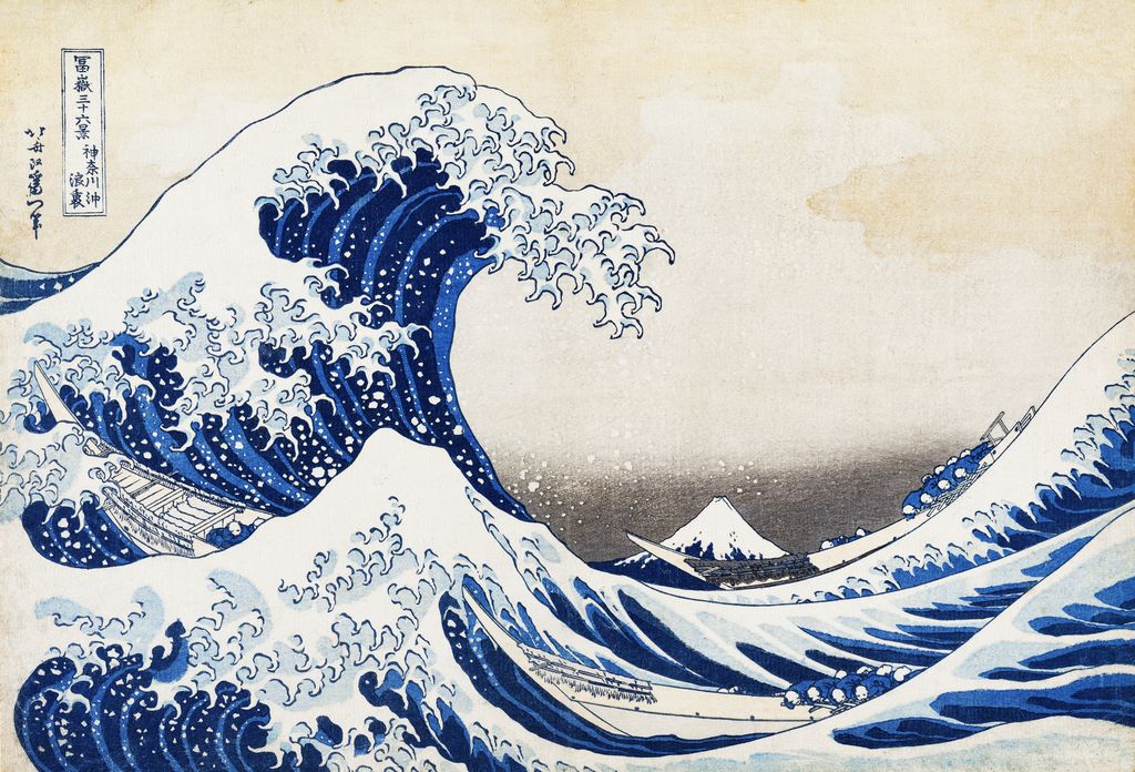
The three objects in this gateway are not competing claims about which work is “most Hokusai.” They show three different jobs an image can do. Under the Wave off Kanagawa is a single colour sheet designed as part of Thirty-six Views of Mount Fuji. In the Met's accessioned impression [4], the curve of water almost encloses the small triangular mountain. Boats run beneath the crest; foam and oars carry the eye across the surface. The composition is intensely structured, yet the boats make the danger feel immediate. The reproduction shown here identifies the design, while the physical impression behind the file remains unknown. The dedicated Great Wave page compares identified impressions and printing details.
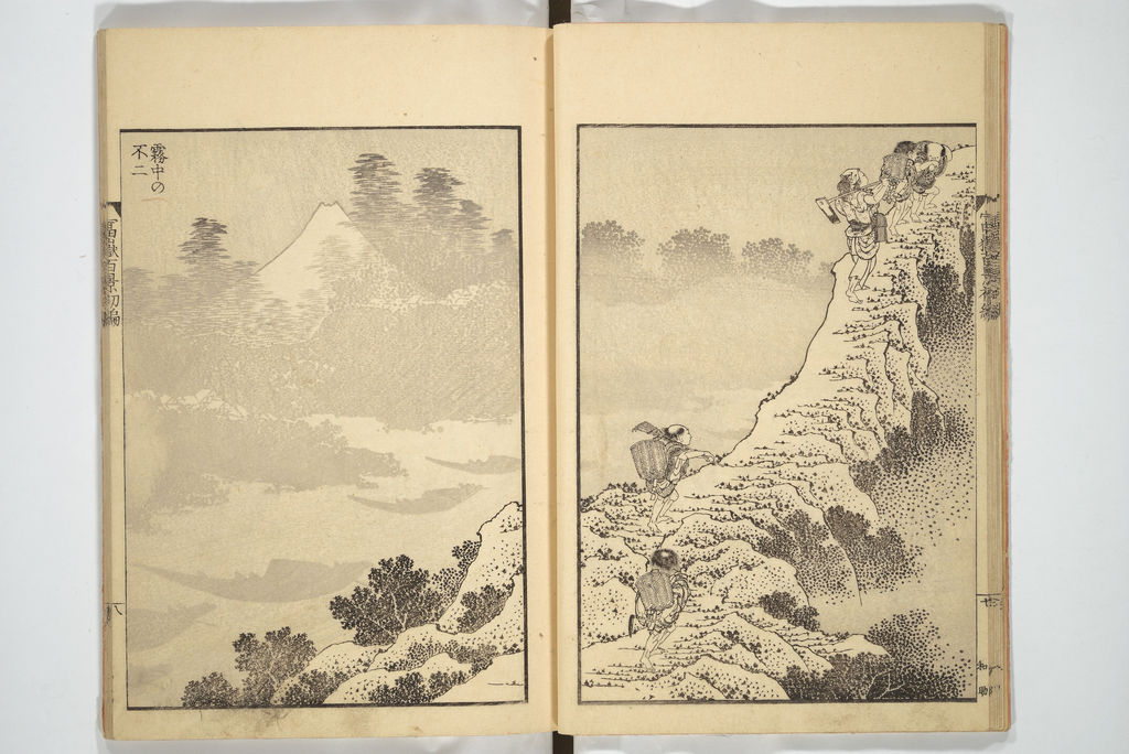
The second object is an opening from One Hundred Views of Mount Fuji, a three-volume black-and-grey book series. In the Met's exact set, 2013.732a–c [5], the opening often called “Fuji in Mist” places a pale mountain on one leaf and travellers on rising ground on the other. The central fold is a physical fact; a modern crop that lifts Fuji out of the opening would change how the scene unfolds. The National Diet Library [6] dates the first two volumes to 1834 and 1835. The third volume's publication year is debated, as the book-series page explains. A three-volume work should not be flattened into a single 1834 print series.
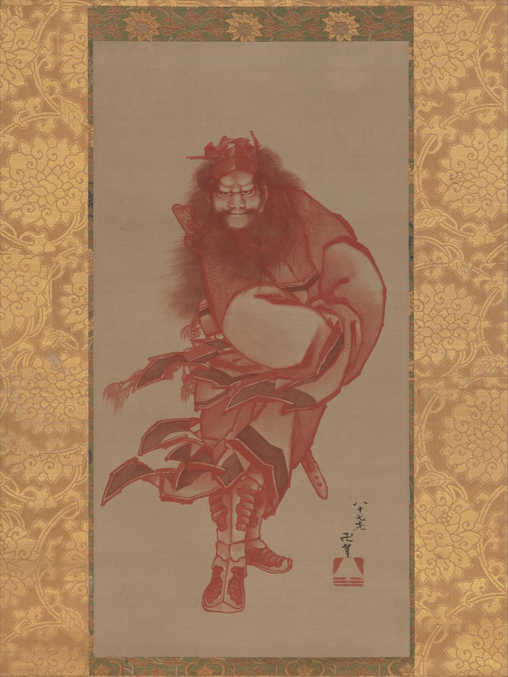
The third object is a painting. The Met's Red Zhong Kui, the Demon Queller, accession 14.76.37 [7], is a hanging scroll in ink and colour on silk dated 1846. Its red figure has a different scale, purpose and visual rhythm from a blue-and-white wave. The museum explains that Zhong Kui, called Shōki in Japan, was a protective figure and that red was associated with warding off smallpox. This makes a useful late-career starting point: Hokusai had not ceased being inventive when the commercial Fuji series ended. A painter could address a festive or protective subject with a brush on silk while continuing to think about forceful contour and expressive colour.
The three together show why medium matters. A print is made through blocks and repeated impressions; a book asks a reader to turn leaves and see adjacent pages; a hanging scroll is a mounted painting brought out and seen in a different setting. Their shared artist does not erase those distinctions. Conversely, Hokusai's ability to move between them helps explain why a style label alone is too small a summary of his career. The British Museum's account of his published books [3] describes how books reached urban shops and provincial readers, while individual prints and paintings circulated through other channels. A famous design is one part of this larger ecology.
The names mark change, but do not form a neat ladder
Hokusai used many art names. They help date and understand works, but a name printed on a sheet is not a complete biography or an automatic guarantee of first edition. The British Museum timeline [2] begins with Shunrō, given after his entry into Katsukawa Shunshō's studio in the late 1770s. He designed actor prints in this period and learned within a commercial print culture. The museum states that the reason for his early adoption into a mirror-polisher's household and the precise reason for his later expulsion from the Katsukawa studio are unknown. A responsible account can describe the moves without inventing their motives.
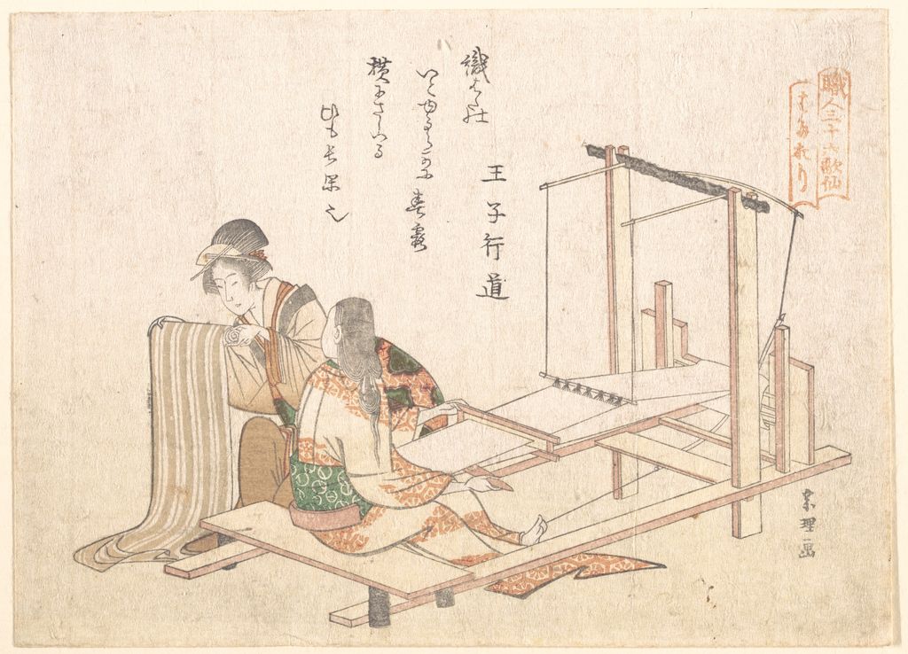
In the mid-1790s, poetry circles and privately commissioned prints became important. Hokusai used Sōri, a name associated with a decorative artistic lineage, and made illustrated books and prints for verse gatherings. Around 1798 he transferred the Sōri name to a student and began using forms of Hokusai. The British Museum relates the latter to devotion to Myōken and the North Star. In an early Met surimono, The Weaving Factory, ca. 1802, JP2575 [8], the small sheet brings together a work scene and printed verse. It is a useful corrective to an account built only around storms, mountains and monumental nature. Hokusai's art could also be intimate, social and made for a particular circle of readers.
Iitsu appeared in connection with the new sixty-year cycle around 1819–20. A reader of the Fuji prints will encounter that signature frequently, but it does not mean Hokusai first found an audience in his seventies. The British Museum records significant activity and recognition much earlier, and the Art Institute of Chicago's discussion of the 1830s [9] describes him as already highly regarded as an artist, print designer and book illustrator when the decade began. The Fuji series was a major late renewal, not his first discovery by the Japanese public.
Manji and Gakyō Rōjin, often rendered “old man mad about painting,” belong to his later self-presentation. His first-volume postscript to One Hundred Views of Mount Fuji imagines artistic understanding continuing to grow into impossible old ages. The Sumida Hokusai Museum's account [1] treats this as evidence of an artist's ambition to keep learning. It should not be used to rank every later image as automatically superior to every earlier one. The names are markers of changing self-definition, and the books and objects still need to be read on their own terms.
Prints before and beyond Fuji
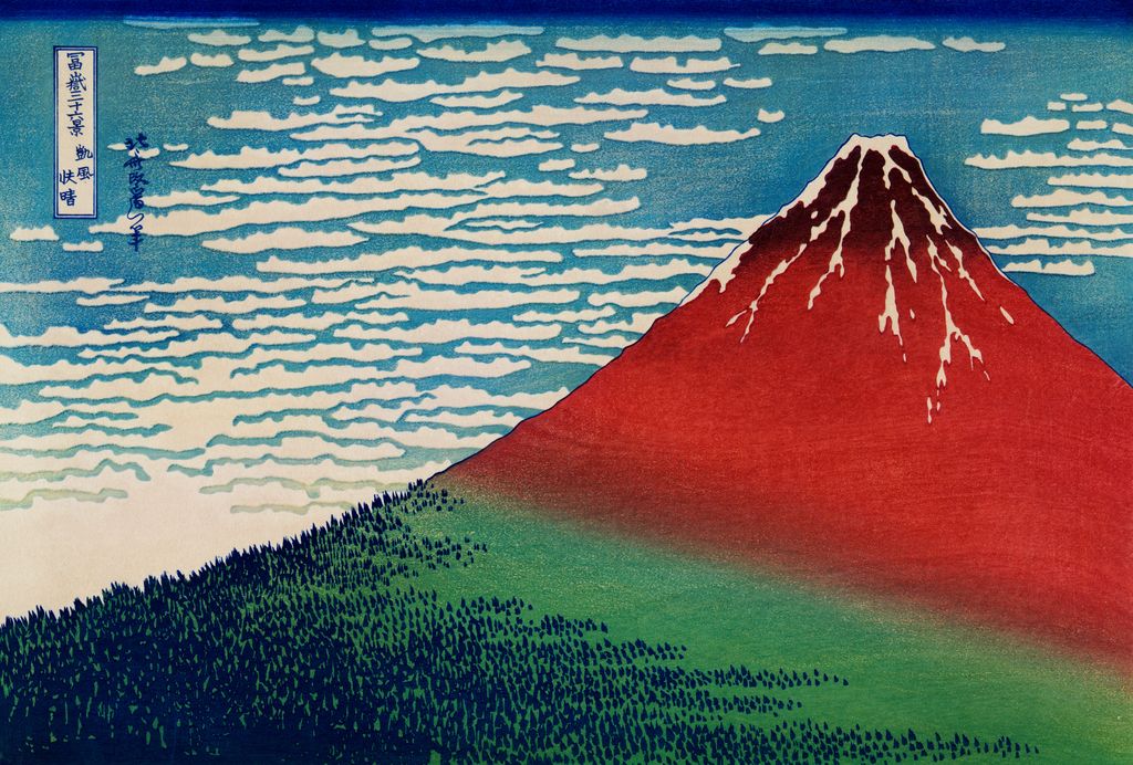
The Great Wave and Fine Wind, Clear Morning belong to Thirty-six Views of Mount Fuji, issued around 1830–33 and ultimately expanded to forty-six designs. Both put the same mountain into different conditions. In the wave design, Fuji is small, held between the moving water and the horizon. In Fine Wind, commonly called “Red Fuji,” the mountain occupies most of the sheet. The Met's South Wind, Clear Sky record [11] explains the red hue as a particular dawn effect and notes the trees reduced to tiny shapes at its base. The two compositions demonstrate a series method: recognisability survives major changes in scale, weather and colour. Neither sheet is an accurate visual proxy for every mountain view Hokusai drew.
The site's full Thirty-six Views guide gives the designs and their individual contexts. On the homepage, it is enough to notice that the series is a study of looking as well as place. A traveller, a boat, a rooftop or a band of cloud can intervene between the viewer and Fuji. The Met's object discussion [11] describes the dawn colour of Red Fuji and the tiny trees at its base. Colour is not merely applied after Hokusai finished a line drawing; printing choices and states affect how a surviving impression appears. When two modern files of “the same” design differ in saturation or detail, the answer may involve the impression, its condition, photography, editing, or a later reproduction.
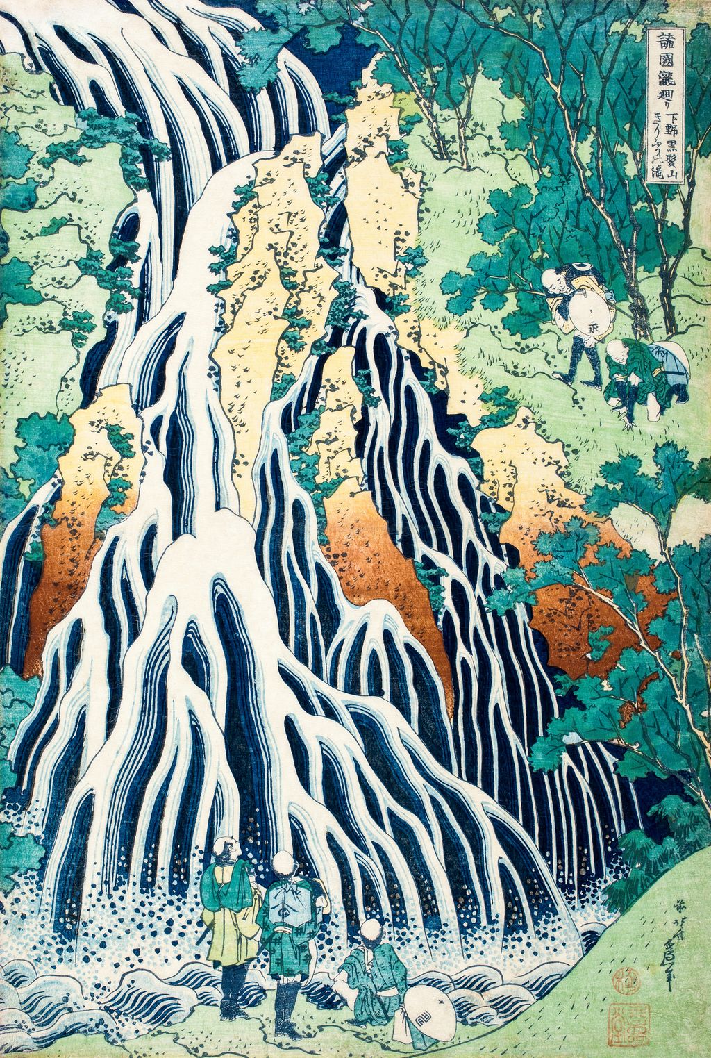
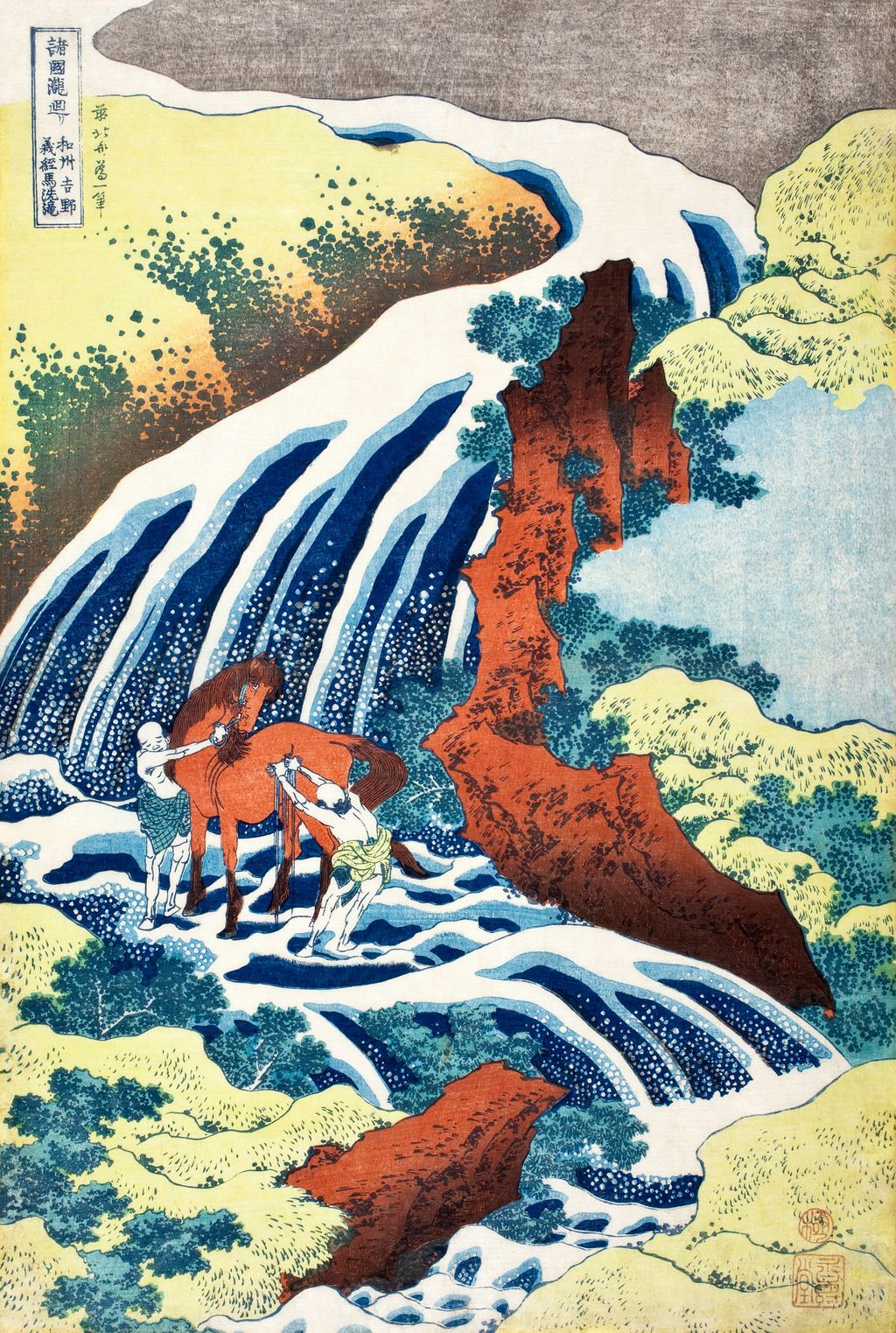
Hokusai's landscapes also moved beyond Fuji. The two images shown here represent designs from A Tour of Waterfalls in Various Provinces. The Met identifies Kirifuri Waterfall at Kurokami Mountain in Shimotsuke [12] and The Waterfall Where Yoshitsune Washed His Horse at Yoshino in Yamato Province [13] as works by Hokusai within that series. These records confirm the designs and titles; they do not identify the physical impressions reproduced here. The series lets water take remarkably different forms. Kirifuri spreads into many branching white courses against darker ground. At Yoshino, one fall descends toward a horse and its handler, joining a powerful natural feature to a named historical story.
The waterfalls are also a reason to slow down around geographical labels. The words “Kirifuri” and “Yoshino” name places, but a print still composes its site. The eye might be led along impossible-seeming white strands, or held at a dramatic cascade while human figures supply scale. We should not put a modern photograph of an unspecified waterfall beside the print and label it the camera equivalent. A historical photograph is useful only where the identified site, date and reuse rights support that comparison. A place comparison needs the design's title and source record, alongside a photograph whose own location and date are known.
Reading an individual print as an object
A Hokusai design can be famous without any one modern reproduction being definitive. Many colour woodblock impressions could be printed from a set of blocks. As those blocks were used, altered or reassembled, and as sheets passed through ownership, light and conservation, surviving examples came to differ. The difference between the design and a particular impression is especially important here: a digital image may accurately reproduce a design while its paper, edition, state and original collection remain unknown. A museum accession identifies one actual object. It cannot be attached to a separate digital image merely because the composition looks similar. The Met's Great Wave object [4] and the AIC's Hydrangea object [14] are exact comparators used for naming and interpretation here, not provenance claims for these reproductions.
Sarah E. Thompson's accessible MFA Boston preview, “Looking at Hokusai's Prints,” printed p. 20 [23], gives a practical method. A cartouche can carry both a series name and the title of a particular design. The artist's signature can incorporate a current name and a reference back to an earlier one, such as “former Hokusai.” Inspection and publisher seals can offer further information, but they are not present in every print. This means a title read from the sheet is stronger than a label copied from an online filename, and a seal or inscription should be read before an edition is asserted. On the two flower works, the large and small format is another basic clue; a horizontal flower print and a vertical one should not be made into the same object because they share Hokusai's name.
Thompson also notes that these prints themselves do not carry publication dates. Dates in museum catalogues are therefore scholarly assessments built from publishers, signatures, related records, impressions and comparisons. Her visible account describes the Fuji and waterfall series as likely early and overlapping in Hokusai's burst of landscape publishing, while the sequence of several other groups remains less certain. The homepage gives approximate dates where museums agree and sends readers to the series pages for the fuller evidence. It would be misleading to turn a range such as “about 1832” into the day a particular unidentified impression left the press.
The publishing detail can also be playful. Thompson points to characters and marks referring to Eijudō, the firm of Nishimuraya Yohachi, embedded within some designs. Her Kirifuri discussion in the same accessible preview [23] identifies small references on travellers' hats and a pack. Once a viewer knows to look, the human figures are more than convenient scale markers: their possessions can carry the publisher into the landscape. Such observations are a reason for high-resolution details and honest source images. They depend on marks that a compressed thumbnail may erase. Where details support a close reading, the marks should be checked against a high-resolution source before they are described.
A place name is a starting point, not a camera coordinate
The names on Hokusai's prints often make a scene seem locatable. Thompson's MFA Boston preview [23] describes Kirifuri as a destination for pilgrims on their way to Nikkō, and interprets the small visitors in the print as probable pilgrims. That places the design in a travel culture while preserving uncertainty about who each tiny person represents. Her discussion of the Onmaya embankment near Ryōgoku Bridge similarly identifies a historical ferry whose route offered Fuji views in clear weather. A place and an activity can be researched; the resulting image is still a deliberate composition of curves, colour and human attention rather than a photographic record.
This distinction shapes our use of vintage photography in the Japanese clusters. A nineteenth-century photograph may show a later bridge, riverbank or mountain view and help readers imagine changes at a named location. It must be dated as a later object and matched to the right place. The Sumida Hokusai Museum [1] names Ryōgoku Bridge and other local subjects in Hokusai's work, but an image of another Tokyo bridge would not be an honest substitute. The dedicated One Hundred Views page uses a documented later Tagonoura photograph as a comparison, without pretending that it records Hokusai's precise viewpoint. It offers a useful example of how to label a later photograph honestly.
Birds, flowers and the close view
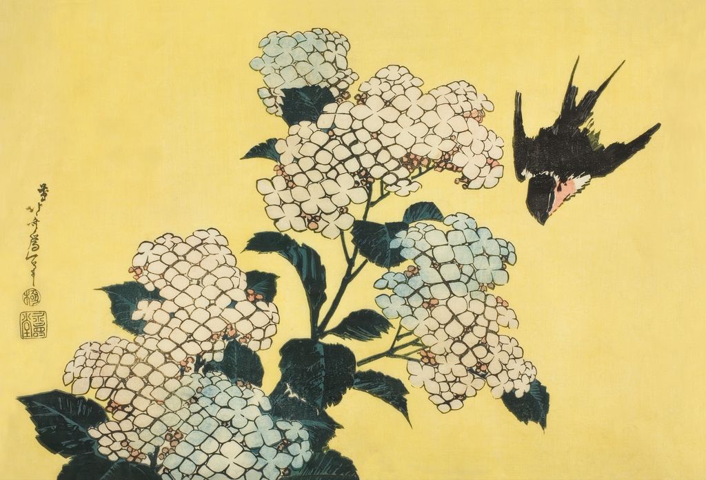
The two bird-and-flower designs here change the scale of attention again. In Hydrangea and Swallow, a swallow crosses a flowering branch; the leaf masses and birds' silhouette are as important as the pastel blossom. The Art Institute of Chicago's identified impression, 25117 [14], calls it part of an untitled series of large flowers and dates it about 1833–34. The image shown here reproduces the design, but no physical impression is identified for it. The museum record supports the title and context; its accession number belongs to the museum's own sheet.
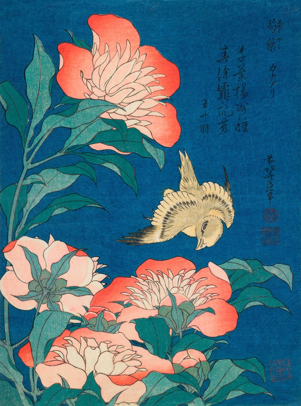
Peonies and Canary belongs to a different, smaller format. The Art Institute's object, 25091 [15], dates the design around 1834; the MFA Boston's impression 21.10228 [16] records it within the untitled Small Flowers group and gives the publisher Nishimuraya Yohachi. A pink flower, dark blue ground and small bird make a tight arrangement whose visual effect is not simply “botanical accuracy.” The coloured ground gives the pale petals and the bird's movement force. Again, this is a design comparison: the two museum impressions and this reproduction must not be collapsed into one unverified object.
Hokusai's attention to natural forms had precedents in his books. The Met's Pictures after Nature album, JIB17 [17], dated around 1814, contains colour printed images of figures, landscapes, animals and flowers. Its digitised pages are part of a physical folding album, not independent prints made for a modern online grid. A selected opening on this page demonstrates that a reader might have met Hokusai's visual variety through a book long before the famous 1830s flower sheets. His subjects crossed formats; the layout and scale of a book altered how closely they were handled.
Books, drawings and the many hands behind an image
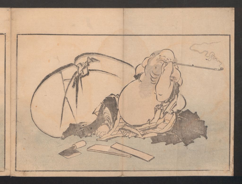
Books were central to Hokusai's reach. The British Museum [3] describes illustrated warrior tales, poetry books and manuals circulating through shops and travelling libraries. Its account of the Hokusai manga says the fifteen-volume sequence began in 1814 and continued in publication through 1878, decades after Hokusai's death. The historic word manga in this title should not be treated as proof that these volumes were modern narrative comics. The volumes gather drawings of people, animals, plants, mythic beings and other subjects as models and amusements for different readers. The British Museum's explanation of the title [18] makes the distinction between these sketchbooks and later comics explicit.
The Met's One Hundred Views set shows another book purpose. It sustains a single motif, Fuji, over three volumes, but with 102 documented designs according to the Sumida Hokusai Museum [10]. Black lines and graded greys carry the work. A window, bridge or fishing net may dominate the foreground while the mountain becomes a small discovery. The dedicated page has nine complete digitised openings and separates the first publication dates from the history of the individual Met books. Its image sequence makes clear why a count of uploaded scans is not a count of Hokusai's designs.
A book's apparent directness hides collaboration. Hokusai drew designs. Publishers financed and organised production; specialist carvers translated lines into blocks; printers made impressions; binders and later owners shaped surviving volumes. The British Museum's complete One Hundred Views record [19] names a carving workshop and publishers as well as Hokusai. Differences among copies can therefore matter to colour, grey tone, line and date. On the homepage, we use the name “Hokusai” to orient readers, while the deeper pages identify particular editions and impressions when the evidence allows.
Nor did every major project reach print. The British Museum's Great Picture Book of Everything research [20] describes more than one hundred preparatory drawings for a picture encyclopedia that was never published as intended. This work complicates a catalogue built solely from commercial sheets and bound volumes. Drawings can reveal an idea before a cutter or printer gave it another form, and an unpublished project can still be a major part of an artist's labour. The homepage's range is necessarily a selection, not a claim to display every medium or every surviving object.
A late painting and an active last decade
The late painting Red Zhong Kui is a useful answer to the old story that Hokusai's art simply faded after his seventies. The Met dates it to 1846 [7], three years before his death. The figure is concentrated, emphatic and red, set against a much quieter field. The museum explains the image's protective association with Boys' Day and disease. This is not the same aesthetic or use as a sheet sold from a landscape series; it is evidence that Hokusai remained engaged with subjects and forms other than Fuji.
The British Museum timeline [2] places painting and drawing in the final years and notes his work alongside his artist daughter Ōi. It also describes personal and financial difficulties earlier in the 1820s, but those details are not a sufficient explanation for the quality of any single 1840s work. The biography addresses chronology and family evidence more fully. Here the painting gives the point directly: the last decade has objects worth looking at, not just a dramatic closing anecdote.
How to think about Hokusai's later influence
Hokusai's images travelled across languages and media. The Sumida Hokusai Museum [1] notes that material from Hokusai manga appeared in Philipp Franz von Siebold's Nippon during Hokusai's lifetime, while European recognition expanded later in the nineteenth century. This rules out the claim that no Hokusai work was seen beyond Japan before 1853. It does not justify saying that every European artist who used a flat field, a wave or a bird copied a particular Hokusai image.
Influence becomes more persuasive when it can be shown through an object, collection or documented comparison. The MFA Boston's exhibition publication [21] examines responses by Japanese artists and later international makers, while the Met's study of Japanese woodcuts and French prints [22] gives specific examples of French artists using Japanese designs. This homepage keeps that reception compact. It links to the site's Monet and Japanese prints article for one narrower path, while leaving sweeping slogans about Hokusai “creating Impressionism” out of the account. A reader can admire the reach of the work without giving one artist sole credit for several later movements.
Where to go next
Start with The Great Wave if the question is how one design works and how impressions differ. Choose Thirty-six Views of Mount Fuji to follow the colour series and its expanded design programme. Choose One Hundred Views of Mount Fuji for bound monochrome books, their uncertain third-volume date and complete photographed openings. The biography follows people, places and disputed life events in chronological order. These paths answer different questions, and moving among them is a better way to meet Hokusai than treating a famous wave as the explanation for all his art.
Frequently asked questions
No. The British Museum [2] records paintings, prints and illustrations for nearly 270 books. The Met's 1846 Red Zhong Kui [7] is an identified late hanging-scroll painting.
No. It became his most internationally recognised design, but the British Museum [2] records substantial Japanese success through earlier prints, books and manuals. The early 1830s were a further major phase.
No. The Met's colour-print records [11] place Thirty-six Views around 1830–32, while the National Diet Library [6] identifies One Hundred Views as three later monochrome books. Their numbers are titles rather than exact surviving file counts.
The names marked stages, affiliations and personal beliefs. The British Museum timeline [2] tracks Shunrō, Sōri, Hokusai, Iitsu and Manji. Names help orient a work but do not by themselves establish its exact printing date.
The title Hokusai manga uses an older meaning and names sketchbooks whose first volume appeared in 1814. The British Museum's discussion [18] explains both the historical connection and the difference from later narrative comics. A direct invention claim is too simple.
Discussion
Look across Hokusai’s prints, books and painting, then use the prompts below to compare what each format makes possible.
Reader Insights
Which visible detail would help you distinguish a named design from a particular surviving print?
How does a bound opening change your attention compared with a single colour sheet?
Which earlier or later work challenges the idea that Hokusai is only the artist of the Great Wave?
Join the Conversation
Share a work or detail that changed your view of Hokusai.
References
- Sumida Hokusai Museum, “Hokusai”. English institutional overview of Sumida, media, names, ambition and overseas reception.
- British Museum, “A timeline of Japanese artist Katsushika Hokusai”. Career stages, artist names, books, Ōi and qualified biographical evidence.
- British Museum, Hokusai resources. Book publishing, distribution and manuals.
- The Met, Under the Wave off Kanagawa, object 45434. Exact accessioned comparison for the design, not for the user-owned reproduction.
- The Met, One Hundred Views of Mount Fuji, 2013.732a–c. Exact three-volume book set and source for the displayed Fuji opening.
- National Diet Library, Hokusai's Fugaku hyakkei (Japanese). First two volume dates and book context.
- The Met, Red Zhong Kui, 14.76.37. Exact 1846 painting, meaning and public-domain status.
- The Met, The Weaving Factory, JP2575. Exact early surimono.
- Art Institute of Chicago, museum studies on Hokusai in the 1830s. Established reputation before the Fuji sheets.
- Sumida Hokusai Museum, “Hokusai × Fuji” (Japanese). Design count for One Hundred Views.
- The Met, South Wind, Clear Sky, JP2960. Exact Red Fuji object comparison.
- The Met, Kirifuri Waterfall, JP1081. Waterfall design and object record.
- The Met, Yoshitsune Horse-Washing Falls, JP1084. Waterfall design and object record.
- Art Institute of Chicago, Hydrangea and Swallow, 25117. Large Flowers comparison.
- Art Institute of Chicago, Canary and Peony, 25091. Small Flowers comparison.
- MFA Boston, Peonies and Canary, 21.10228. Publisher, signature, date and impression-specific data.
- The Met, Pictures after Nature, JIB17. Exact 1814 album object and digitised pages.
- British Museum, “Hokusai: the father of manga?”. Historic title and relationship to modern comics.
- British Museum, complete One Hundred Views of Mount Fuji set. Publishers, carving and copy distinctions.
- British Museum, The Great Picture Book of Everything exhibition. Unpublished drawing project.
- MFA Boston, Hokusai: Inspiration and Influence publication page. Scope of its response study; no claim to have read the full book.
- The Met, The Great Wave: The Influence of Japanese Woodcuts on French Prints. Specific examples of later print reception.
- MFA Boston, Sarah E. Thompson, Hokusai’s Landscapes preview. Printed pp. 20, 52 and 90–91 used for print reading, named sites and Kirifuri.
- The Met, Open Access policy. Rights for Met public-domain files.