


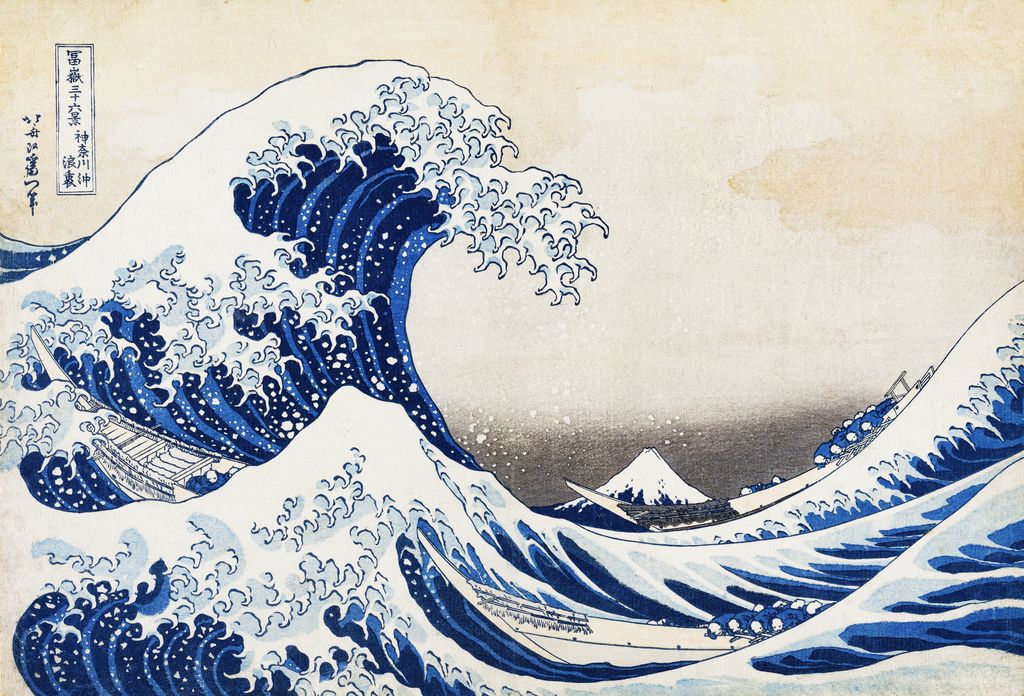
Katsushika Hokusai, Under the Wave off Kanagawa, from Thirty-six Views of Mount Fuji. Public-domain design reproduction; exact impression unidentified.
 by Tom Gurney
Tom Gurney BSc (Hons) is an art history expert with over 20 years experience
Published on June 19, 2020 / Updated on September 23, 2026
Email: tomgurney1@gmail.com / Phone: +44 7429 011000
Hokusai’s Thirty-six Views of Mount Fuji
Katsushika Hokusai's Thirty-six Views of Mount Fuji (冨嶽三十六景, Fugaku sanjūrokkei) is a series of colour woodblock prints made in the early 1830s. Despite its title, it comprises forty-six designs. The first thirty-six were followed by ten additional views after the series proved popular. Fuji is present in every print, but Hokusai rarely allows the mountain to do the same job twice. It is a small triangle beneath a wave, a red mass filling the sheet, a distant landmark above a working riverbank, and a destination climbed by pilgrims. Sumida Hokusai Museum [1] and the Smithsonian National Museum of Asian Art [3] confirm the forty-six-design scope.
The best-known image, Under the Wave off Kanagawa—often called The Great Wave—belongs to this much wider experiment. Looking beyond it changes the series from a set of famous views into a study of how one mountain can connect different places, activities and kinds of weather. It also shows why a print's story cannot be told only through Hokusai's drawing. A publisher commissioned and marketed the designs; carvers translated them into blocks; printers made copies whose colour and detail can vary. Today, museums preserve individual impressions of those designs, not one definitive original image of each. The Victoria and Albert Museum's account of colour woodblock production [6] explains those separate roles.
Contents
- Hokusai’s Thirty-six Views of Mount Fuji
- Why Fuji could hold a whole series
- How thirty-six became forty-six
- How to read the forty-six designs
- Ten views that show the range
- All forty-six views
- The blue that helped sell the views
- Designs, impressions and later copies
- The other Fuji project: One Hundred Views
- Seeing the series today
- Search the 46 Fuji designs
At a glance
- 1神奈川沖浪裏
- 2山下白雨
- 3凱風快晴
- 4尾州不二見原
- 5江都駿河町三井見世略図
- 6甲州石班澤
- 7深川万年橋下
- 8江戸日本橋
- 9御厩川岸より両国橋夕陽見
- 10青山円座松
- 11五百らかん寺さざゐどう
- 12甲州三島越
- 13遠江山中
- 14東都浅草本願寺
- 15信州諏訪湖
- 16甲州三坂水面
- 17登戸浦
- 18甲州犬目峠
- 19駿州江尻
- 20相州七里浜
- 21甲州伊沢暁
- 22相州梅沢左
- 23武州玉川
- 24相州箱根湖水
- 25礫川雪ノ旦
- 26東海道金谷ノ不二
- 27東海道品川御殿山ノ不二
- 28東海道吉田
- 29隅田川関屋の里
- 30従千住花街眺望ノ不二
- 31身延川裏不二
- 32相州江の島
- 33駿州片倉茶園ノ不二
- 34東海道江尻田子の浦略図
- 35武陽佃島
- 36諸人登山
- 37東海道程ヶ谷
- 38相州仲原
- 39武州千住
- 40下目黒
- 41隠田の水車
- 42東都駿台
- 43本所立川
- 44駿州大野新田
- 45上総ノ海路
- 46常州牛堀
- Japanese title
冨嶽三十六景(Fugaku sanjūrokkei) - Artist and mediumKatsushika Hokusai; colour woodblock prints on paper
- PublisherNishimuraya Yohachi, working under the Eijudō name
- DateThe series began around 1830–31 and was issued through the early 1830s; individual museums date surviving impressions differently
- Number of viewsThirty-six planned/original designs, then ten supplementary designs: forty-six in all
- SubjectFuji seen or imagined from numerous places, in changing seasons, weather and human settings
- Distinguish fromHokusai's later three-volume illustrated book One Hundred Views of Mount Fuji (
富嶽百景)
The series title does not mean that Hokusai painted thirty-six original canvases. The works were designed for woodblock printing and sold as individual sheets. The same design could be printed repeatedly, and museums may own several impressions from the same blocks. The forty-six count refers to distinct compositions, not the number of surviving sheets. The Sumida Hokusai Museum's exhibition checklist [1] lists those forty-six designs before turning to the separate book project.
Why Fuji could hold a whole series
Fuji was at once a recognisable landform, a sacred mountain and a presence in ordinary views of Edo and the surrounding region. That combination gave Hokusai more than a fixed scenic subject. He could draw the mountain as something travellers sought, townspeople glimpsed and workers barely noticed while they went about their business. In some prints its recognisable outline is enough; in others the mountain is physically overwhelming. The Smithsonian's series history [13] emphasises both Fuji's devotional meaning and its familiarity as a backdrop to Edo life.
The market for these images also mattered. In the late Edo period, travel, pilgrimage and outings made named places attractive subjects for publishers. Guidebooks and prints let buyers recognise a route, remember a journey or imagine a place they might never visit. The National Diet Library's Japanese-language history of meisho-e (famous-place pictures) [2] connects the growth of travel and printed place culture with landscape prints. The V&A [6] similarly describes inexpensive prints as souvenirs of places that people admired. None of this means that every sheet is an eyewitness record of Hokusai's own travels. The series works as a designed journey through places and ways of seeing.
Fuji was also part of religious life. The Sumida Hokusai Museum's 2026 comparison of Hokusai and Hiroshige [8] describes the Fuji-kō groups organised in Edo neighbourhoods to support pilgrimage and worship, the custom of greeting the first Fuji view of the new year, and celebrations around the mountain's seasonal opening. These practices help explain why a recognisable outline could carry associations beyond geography. They do not establish that every buyer belonged to a Fuji society, or that every print was made primarily as a devotional object. A worker beneath the mountain can belong simultaneously to a commercial landscape print, a picture of daily activity and a culture in which Fuji had religious force.
The series balances familiarity with variety. Some buyers could recognise a named road or river; others might have enjoyed seeing how far Hokusai could take a repeated subject. The mountain may be snowy, red, almost hidden, reflected, framed or climbed. A title tells us where the design claims to be, but the picture also asks how a viewer might find Fuji within it. That search is an active part of looking: the peak can disappear behind a barrel, a bridge, a wave or a working city before its small triangle finally comes into view. The Sumida Museum [1] organised its complete presentation around composition, nature and customs for that reason; a geographical list alone would miss much of the series's invention.
Fuji's position changes the relationship between the people and landscape. In The Great Wave, the mountain is small enough to fit in the hollow between two great swells. In South Wind, Clear Sky, usually called Red Fuji, almost the entire sheet belongs to its slope and sky. At Kajikazawa, a fisherman works along a river while his tackle and body form angles that answer the distant peak. At Onden, people turn a waterwheel in a landscape where Fuji is only one part of an engineered scene. The images invite viewers to look for the mountain, then to notice what Hokusai placed between it and them. These are visual readings of the specific designs; their identities are recorded in the Sumida checklist [1] and the corresponding Met object records linked below.
How thirty-six became forty-six
The publisher Nishimuraya Yohachi, whose shop was known as Eijudō, issued the Fuji prints as a commercial series. The Met's technical essay [4] notes an advertisement for the project timed to the New Year festivities of 1831. The British Museum's Red Fuji record [14] names Nishimuraya as publisher. Hokusai was in his seventies, but this was neither a private sketchbook nor a solitary late-life exercise: it was a collaborative print venture intended for an audience.
Demand led the publisher to expand the series while retaining its original name. The ten extra images are often called 裏富士 (ura-Fuji), or the supplementary “rear Fuji” views. The Sumida Hokusai Museum [1] explains their position after the original thirty-six; the Smithsonian [13] also records the expansion and reprinting of popular designs. “Thirty-six” therefore describes the project's initial conception, while “forty-six” counts the eventual designs. The label ura-Fuji is a convenient description of the additions, not the title of an unrelated second series.
One useful visual distinction is in the printed outlines. Sumida describes blue keylines on the initial thirty-six designs and black keylines on the ten additions; the Met's 1985 Hokusai bulletin [15] makes the same broad distinction. A keyblock printed the principal lines, while further blocks applied colour. Line colour can help readers notice a phase of production, but a photograph of one surviving impression cannot by itself date every print in a series. Wear, changes in printing, light exposure and later copies all complicate that judgement.
The original publication order is less simple than a modern gallery numbered one to forty-six. Museums may arrange the designs by subject, geography, presumed issue phase or exhibition theme. Sumida's bilingual exhibition checklist, for example, starts with the three most celebrated designs, then groups the others by composition, nature and customs. Its numbering is a helpful checklist of distinct images, not evidence that customers bought them in that order. The publisher also made additional impressions as demand continued, so an image reproduced today may reflect a later moment in the life of a design.
What the publisher advertised
A contemporary advertisement is unusually useful evidence for how the project was offered. A Japanese study preserved by the National Diet Library [9] quotes a notice at the end of a book published by Nishimuraya in Tenpō 2 (1831). It names Hokusai, promises blue-printed sheets, and says views would be issued one at a time in succession. This supports a staged publication model rather than a boxed set of thirty-six finished prints appearing at once. It does not give us a secure day-by-day sequence for all forty-six designs.
The same study suggests that the Fuji views were sold as individual sheets. That matters to the way the series grew. A purchaser could acquire a favourite image without owning every view; a publisher could watch demand and order further printings or designs. The additional ten designs are evidence of commercial success, but they do not tell us the precise sales figures for any one scene. The blue advertised at the outset was also a selling point. The Met [16] connects the 1831 advertisement with the appeal of Prussian blue, while the National Diet Library's account of landscape print culture [2] puts Hokusai among the artists who made blue-dominant famous-place images desirable.
The publisher's role extended beyond buying a drawing. Nishimuraya financed the blocks, organised carving and printing, advertised the sheets and could order more impressions while the blocks remained useful. The visual identity of the series belongs to that system. A strong composition made a print memorable; the publisher's distribution and the workshop's ability to reproduce it let that composition circulate. This is why a history of the series has to ask both what Hokusai designed and how a popular sheet changed through further printing.
How to read the forty-six designs
The designs are not simply a sequence of fixed viewpoints around a mountain. They use Fuji to test scale, framing and the relationship between a distant landmark and nearby activity. In Fujimigahara in Owari Province, the great circular form in the foreground is a barrel under construction. The man working on it and the tiny peak beyond create a comparison between human labour and the mountain's form. The Met's object commentary [17] points to a second triangular shape in the cooper's body. Hokusai has made an apparently insignificant worker as structurally important as the famous peak. Reading the print as “a view of Fuji” alone misses that equality.
Other foreground frames are built from bridges, buildings and trees. Under the Mannenbashi Bridge at Fukagawa asks us to see Fuji through a man-made arch. The Mitsui Shop at Surugachō turns a commercial street and the shop's architectural lines toward the distant mountain. Hodogaya on the Tōkaidō places travellers among trees that interrupt and reveal the view. These pictures can be followed by place-name, but their formal solutions differ. The Sumida checklist [1] identifies each design, while the National Diet Library [2] explains why famous-place prints appealed to an audience interested in roads and destinations.
Hokusai repeatedly gives work its own visual rhythm. The fisherman at Kajikazawa, the cooper at Fujimigahara, the people managing the waterwheel at Onden and the workers handling timber at Tatekawa are not interchangeable decorations. Their tools, ropes, poles, wheel or planks shape the composition. Fuji is sometimes placed where those lines lead; elsewhere it persists almost despite the busy foreground. The result is a set of landscape prints in which commerce, craft and movement help define a place. This is an interpretation of the visible designs, anchored in the Met's object records for Kajikazawa [18], Onden [19] and Tatekawa [20], rather than a claim that Hokusai recorded these specific workers from life.
Weather and water provide another set of comparisons. Storm below Mount Fuji divides the mountain between a bright upper cone and darkness with lightning beneath. Red Fuji makes atmosphere and colour alter the whole mountain. Ushibori in Hitachi Province lets water and shore occupy much of the sheet while Fuji remains small. Under the Wave off Kanagawa makes the moving sea seem to threaten the still mountain. These are not four versions of the same scenic formula. They change what can dominate the sheet and what must be sought at a distance. The Met's discussion of its Red Fuji impression [21] explicitly contrasts that calm design with the storm sheet.
Finally, Groups of Mountain Climbers changes the viewer's relation to Fuji entirely. Most designs position the mountain beyond the immediate scene; this one puts human figures on its slopes. Its inclusion underlines how much “view” can mean in the series: not only looking at Fuji from elsewhere, but imagining the act of approaching and occupying it. The 2026 Sumida exhibition history [8] places this work within a city culture that both admired and worshipped the mountain. The design itself is evidence of climbers represented by Hokusai, not a documentary record of a particular expedition.
Ten views that show the range
Under the Wave off Kanagawa (神奈川沖浪裏). Three fast boats are caught in the trough as the wave rises overhead. Fuji sits quietly in the distance, almost another patch of foam. The image's drama has made it the international emblem of the series, but its scale trick belongs to a larger Hokusai habit of making the near and distant compete for attention. The Met's JP2972 object record [22] documents one surviving impression; the Sumida Hokusai Museum's Japanese explanation [23] identifies the vessels as fast fish-transport boats. The dedicated Great Wave page examines the composition and printing in more detail.
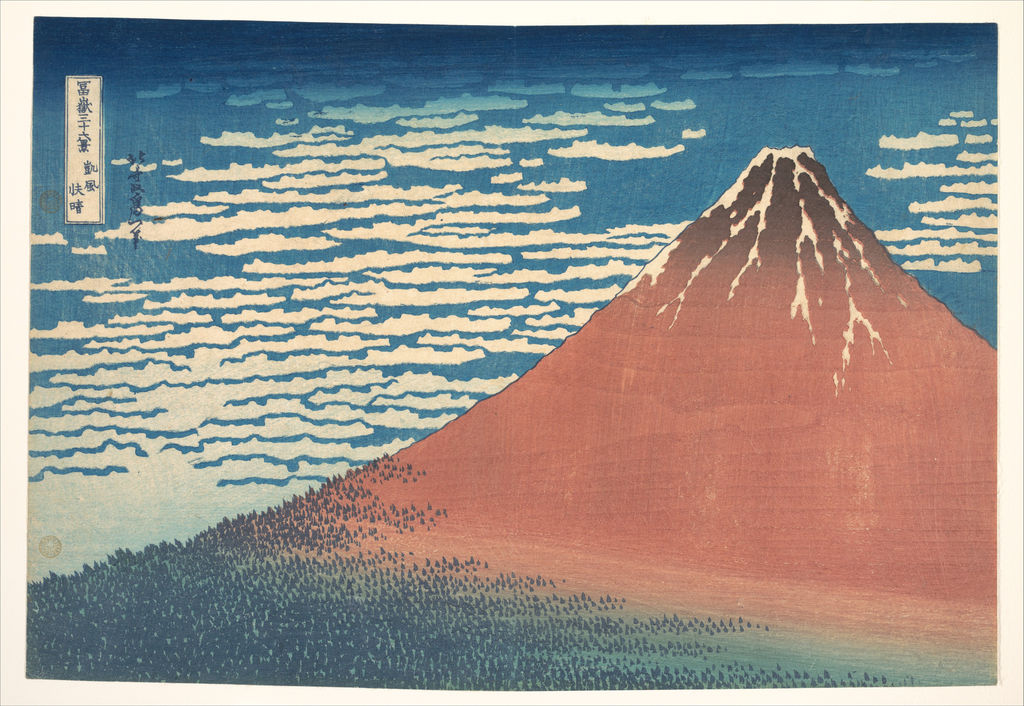
South Wind, Clear Sky (凱風快晴, “Red Fuji”). Here the mountain nearly fills the composition. Its red slope, dark lower flanks and patterned sky turn Fuji from a distant sign into the immediate subject. This is one of the three works the Sumida Hokusai Museum [1] calls the 三役, or celebrated trio. The Met's JP9 impression [21] gives an object-level comparison with the darker Storm below Mount Fuji.
 [21]
[21]The title describes a clear sky after a south wind; it does not require the viewer to identify a precise morning on which Hokusai stood before the mountain. The British Museum's discussion of its impression [14] notes the association of a red-looking Fuji with particular atmospheric and lighting conditions, while also presenting the print as a constructed image. The simplified cone is almost a test of how much Hokusai can remove before the mountain ceases to be unmistakable. Comparing the Met and British Museum sheets is also a reminder that “Red Fuji” does not guarantee one fixed shade of red in every surviving copy.
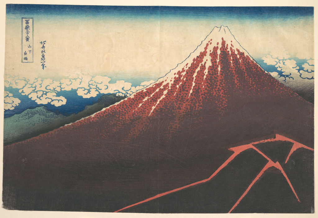
Storm below Mount Fuji (山下白雨). A darkening lower mountain and forked lightning answer the broad, calm upper cone. Read beside Red Fuji, it shows that the series is concerned with changing conditions as much as with changing viewpoint. The Met's JP2567 record [25] dates its surviving print broadly to the early 1830s. Its commentary notes how a different pull from the same blocks can change the handling of rain and trees. A design is therefore not always a single immutable colour image.
 [25]
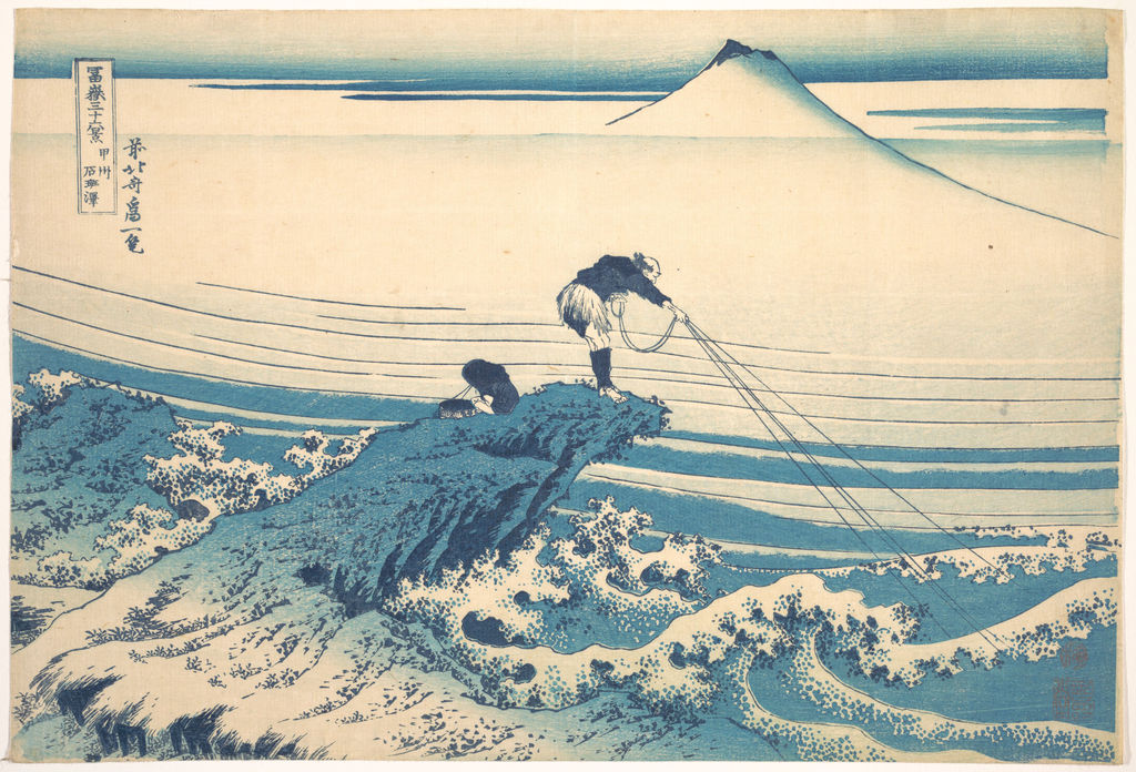
[25]Kajikazawa in Kai Province (甲州石班澤). A river worker braces against moving water, while his lines and pose form a visual conversation with the triangular mountain. Fuji is comparatively small, yet the surrounding activity makes the viewer look back toward it. The Met's JP2986 record [18] identifies the design, and Sumida's checklist [1] preserves its Japanese title. The work is a better example of the series's integration of labour and landscape than a generic claim that Hokusai merely “painted nature.”
 [18]
[18]The Waterwheel at Onden (隠田の水車). Workers carry, pour and collect water around a wheel. Fuji rises behind the purposeful motion of the foreground. The Met's JP2967 impression [19] makes it possible to study the wheel, people and mountain as parts of one composition. It belongs on a series page because it explains what else, besides a scenic view, this Fuji project could include.
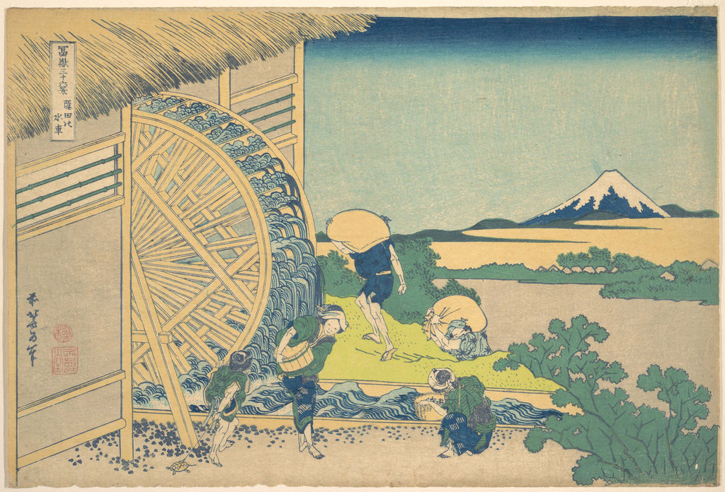 [19]
[19]Fujimigahara in Owari Province (尾州不二見原). A large circular barrel being worked on by a cooper frames the small distant Fuji. The form that occupies most of the sheet is an object made by human labour, not the mountain itself. The Met's JP2956 object [17] shows how Hokusai uses a foreground frame to alter scale. The circle makes the eye search for the peak it encloses.
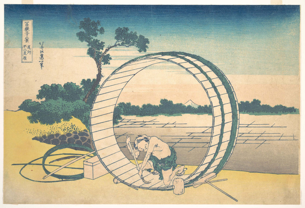 [17]
[17]The Met's curator [17] also draws attention to the echo between the worker's bent body and Fuji's triangular form. That echo does more than make the image clever: it puts a man making a vessel in direct visual relation to the natural landmark. A print named for a mountain can thus make a viewer consider the labour that sustains ordinary life beneath it. The circle makes the tiny mountain feel carefully placed, while the human figure prevents the composition from becoming a purely abstract study of circles and triangles.
Hodogaya on the Tōkaidō (東海道程ヶ谷). Travellers and trees establish a rhythm across the road; Fuji appears between them. The Met's JP2562 print [26] offers a contrast with the images in which the mountain dominates the sheet. It also connects the series with the famous-place culture of roads and journeys described by the National Diet Library [2]. A road scene does not establish that Hokusai personally made this particular journey.
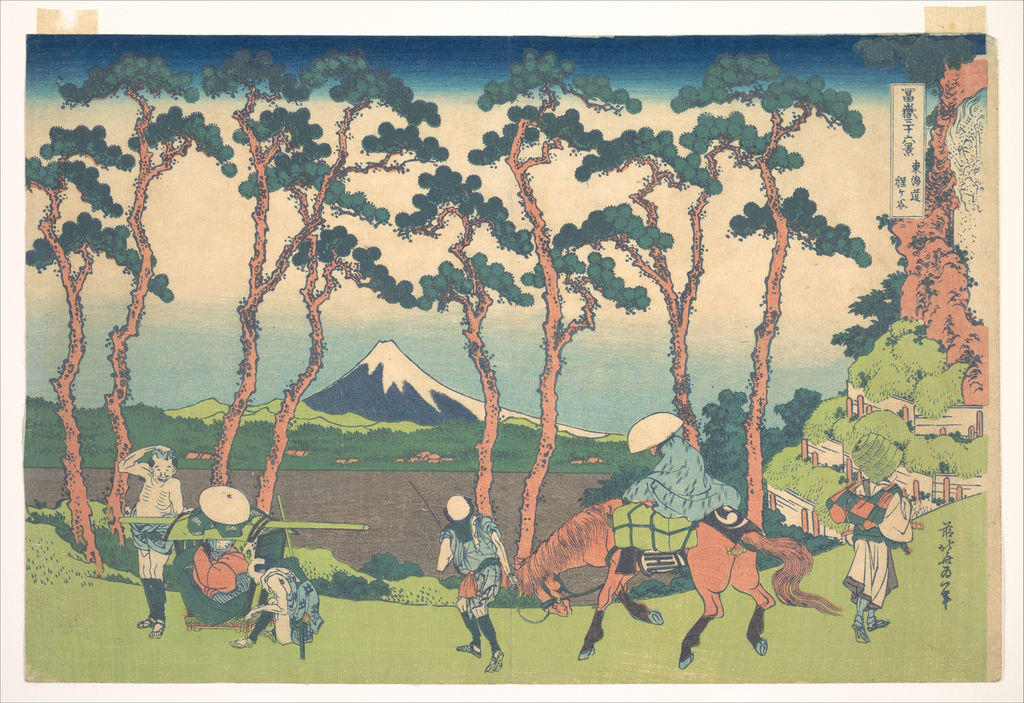 [26]
[26]Ushibori in Hitachi Province (常州牛堀). The distant mountain is viewed across water and activity at the edge of a settlement. In the Met's JP1848 object [27], Fuji's slight size is part of the design: it remains the repeated subject even while the foreground carries the everyday life of the place. The series asks viewers to attend to both scales at once.
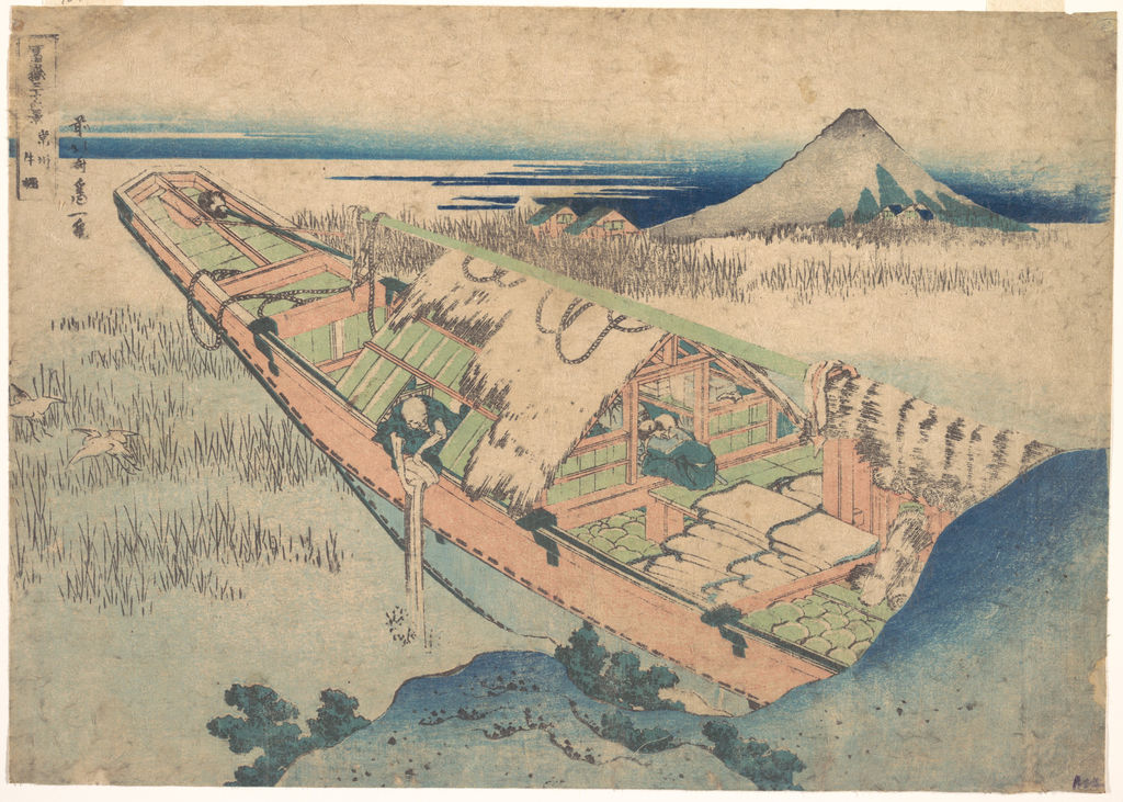 [27]
[27]Groups of Mountain Climbers (諸人登山). Some sheets show Fuji as a sight from elsewhere; this one puts human bodies on the mountain itself. The Met's JP2962 record [28] connects the image to the mountain's direct human use. The subject also prevents the series from being reduced to a collection of distant postcard views. Its forms reward a careful look at how people occupy the slopes.
Tatekawa in Honjō (本所立川). Timber, tools and workers occupy the near field while Fuji sits far beyond. The Met's JP2982 print [20] makes the city and its materials part of the Fuji view. Hokusai could turn a working urban environment into a picture of the mountain without pretending that the mountain was physically close to the people in the foreground.
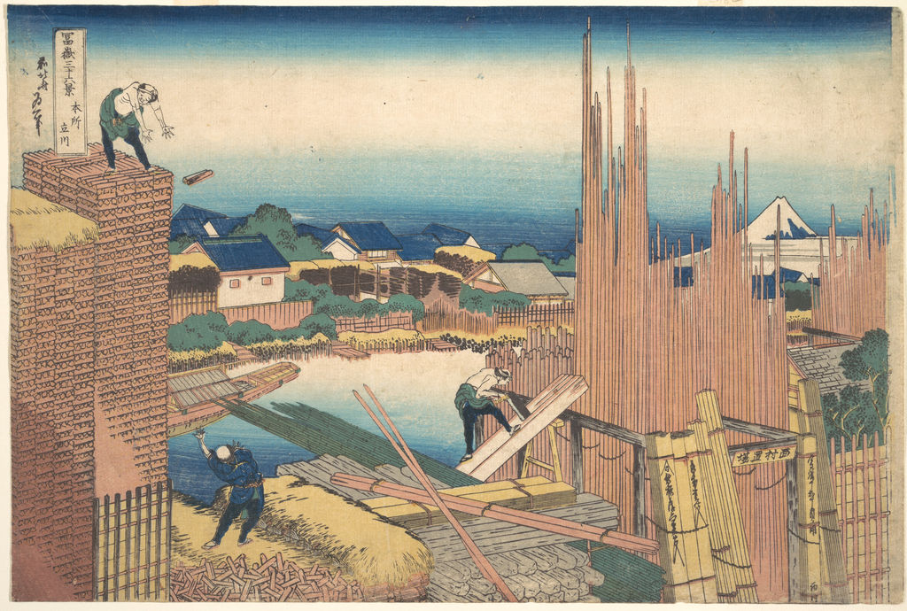 [20]
[20]These ten are an introduction, not a ranking of the “best” designs. The table below gives the full set of forty-six.
All forty-six views
These are the forty-six designs in the Sumida Hokusai Museum’s exhibition checklist [1]. The museum grouped them by theme; this table is not a proposed order of publication. English titles follow that checklist and vary elsewhere.
The blue that helped sell the views
The colour that many viewers remember is a strong blue. Edo-period printmakers had used organic blue dyes, but Prussian blue—called ベロ藍 (bero-ai) in Japan—offered a newly valued colour for skies and water. The National Diet Library's Japanese-language print history [2] notes the growth of blue-dominant prints and identifies ten Hokusai Fuji designs in that mode. The Met's account of the Great Wave [4] describes how Eijudō advertised the series with its newly available pigment. “Blue” is not, however, one material or one operation in every part of every print.
A Japanese analytical study by Susumu Shimoyama, Hideo Matsui and Yasuko Shimoyama examined blue colourants in thirty-six original-series prints. In the material they tested, the keyblock outlines were printed with indigo, while the blue colour blocks used Prussian blue. The authors used visible/near-infrared reflectance to distinguish dyes and pigment. That is a more precise account than saying that every blue mark in the series is Prussian blue. The study and its English abstract [5] state the result and scope.
The Met's scientific examination of an early Great Wave impression [4] shows still more complexity: its printers mixed indigo and Prussian blue in some lines and printed one over the other in parts of the wave. The studied Met impression is accession JP1847, a different physical sheet from the Met's JP2972 impression discussed above. The technical results describe the examined print and its sampled areas; they should not automatically be assigned to every Great Wave impression.
Colour also depended on skilled human work. The designer supplied the image, the carver made blocks, and the printer registered and applied them with varying pressure, colour and gradation. Publishers organised and sold the result. The V&A printmaking guide [6] explains the shared production process; the Met's analysis [4] shows how double printing can give parts of one Great Wave impression more depth. Hokusai's invention and the anonymous workshop's craft both matter to the finished sheet.
What scientific study can—and cannot—date
The 2006 Japanese study of thirty-six prints is an important finding about the works it measured. It does not settle the chemistry of every surviving sheet. A later multi-institutional study in Heritage Science [10] examined 145 impressions from the Met, Victoria and Albert Museum, Brooklyn Museum, New York Public Library and Brussels collections; 141 could be used in its statistical model. It concentrated on the blue outlines of the initial thirty-six designs and found varying mixtures of indigo and Prussian blue. Those variations helped group impressions that might have been printed in different batches. The study did not include the ten supplementary designs with black outlines in that model.
This is a useful correction to an over-simple story in which “early” always means one pure blue recipe and “later” always means another. The earlier Japanese researchers identified indigo in the keylines of their sample; the broader later project found mixed compositions across a larger group of surviving impressions. Different samples and methods can reveal different aspects of the printing history. Neither result should be turned into a claim that one photograph proves the date of a print. The researchers combined the material evidence with the traditional close comparison of block wear and line quality, because chemistry alone does not show precisely when a particular sheet was pulled.
The later study identified one cluster with exceptionally crisp lines and little keyblock wear, which it interpreted as early production. Another cluster contained much later prints made from re-carved blocks, with blue outlines made only from Prussian blue. Those findings have implications for captions and collecting: a sheet can depict an early 1830s Hokusai design yet have been printed at a later time. “Hokusai, 1831” on a reproduction may describe the design, not the age of the pictured paper. A trustworthy object record separates the design's date, the date of a surviving impression where known, its museum accession and any evidence about state or later reprinting. Vermeulen and colleagues, Heritage Science [10].
Effects beyond blue
Colour is only one layer of the print. The Sumida Hokusai Museum's study of its Tamagawa River impression [8] describes karazuri, or blind embossing, used to make waves visible through relief in the paper without an added coloured line. In later impressions of the same composition that subtle effect can be weak or absent; some have blue lines in its place. This is an unusually clear example of a change that a small digital image may fail to convey. It also shows why an impression in strong condition can teach us something about a printer's original ambitions that a faded or simplified later pull may hide.
The British Museum's account of woodblock technique [29] explains how the same blocks can produce different impressions as pressure, moisture, pigment and registration vary. Gradated colour, called bokashi, depended on the printer's handling of pigment on a block, not on a camera-like transfer of a fixed colour image. Looking closely at the sea in The Great Wave or the sky in Red Fuji therefore means looking at both a design and a performance of printing. The artist's name on the sheet does not erase the technical decisions that made one impression distinct from another.
Designs, impressions and later copies
If two museums show “the Great Wave,” they may be showing two original impressions printed at different times from the same set of blocks. One can be darker, more delicately graded or more worn than the other. Some differences come from printing choices, some from deterioration of the blocks, and some from the later history of the paper and colours. The British Museum's comparison by scientist Capucine Korenberg [7] uses tiny breaks in the carved lines to distinguish points in the blocks' working life. It also reminds us that there is no single surviving sheet that stands in for all copies of the design.
An impression is one physical print pulled from blocks. A design is the image planned for those blocks. A later copy may reproduce the appearance using new blocks or another printing process. These distinctions matter when comparing reproductions. One image may show the overall composition clearly, while a museum's accession identifies a particular sheet whose colours and line condition can be studied. Similar looking reproductions cannot automatically be treated as photographs of the same object.
The differences are not merely a connoisseur's puzzle. They change what a reader can see. Faded clouds, a less saturated sea or an altered outline can affect the apparent balance of a composition. Comparing exact impressions may reveal the choices and limits of nineteenth-century colour printing. It can also prevent a false conclusion that Hokusai personally changed an image whenever two photographed copies differ.
The detailed case of The Great Wave shows how far this work can go. British Museum scientist Capucine Korenberg compared 111 impressions and identified changes that distinguish eight states. Tiny breaks in the keyblock, altered cloud printing and different colours or blocks for boats all help reconstruct a production history. The published British Museum research [11] also warns against assuming that all damage accumulated smoothly: some breaks appear abruptly between printings. This evidence belongs especially on the dedicated Great Wave page, but it changes how the whole series should be introduced. The question is not simply “which of forty-six designs is this?” It is also “which surviving impression or later version am I seeing?”
Conservation affects what is visible now. British Museum scientists discussing Hokusai and other Japanese prints [30] explain that some nineteenth-century colourants are sensitive to light. Museums limit display exposure because a print can be changed by the very act of showing it. A digital reproduction may record the sheet at one moment, under one lighting and photographic treatment. Two online files can therefore differ because their physical impressions were printed differently, because their pigments aged differently, or because the photography and image processing differ. Image comparison is most reliable when exact holding institutions and accession numbers are kept attached to the files.
The other Fuji project: One Hundred Views
After the colour-print series, Hokusai produced One Hundred Views of Mount Fuji (富嶽百景), an illustrated book project issued in three volumes. The related titles can sound like a simple expansion from thirty-six to one hundred, but the objects are different. The earlier set consists of individual colour prints; the later project is a book printed mainly in black and grey. The Sumida Hokusai Museum [1] counts 102 images across its three volumes and describes a wider play of history, legend, ritual, distance and humour. The British Museum book record [7] and Met book set [31] provide object-level anchors. The two projects deserve their own pages because the change of format changes how Hokusai and his publishers let readers move through Fuji images.
Hiroshige later made major landscape series, including his own Fuji projects, but his prints should likewise be identified by artist, title and publisher rather than folded into Hokusai's forty-six. A close comparison can be illuminating only after the two exact designs are named. The wide ocean in a later Hiroshige Fuji sheet, for example, may recall Hokusai's wave while belonging to a different series and decade. The Nakasendō Hiroshige Museum's Japanese record for Sea off Satta [32] identifies it as part of Hiroshige's 1858 冨士三十六景.
The Sumida Hokusai Museum's 2026 exhibition [8] makes that longer comparison explicit. It places Hokusai's forty-six Fuji designs beside Hiroshige's two later thirty-six-design Fuji series and selected views from One Hundred Famous Views of Edo. This is a helpful way to study influence without collapsing the artists into one tradition. Hokusai's emphatic geometries and Hiroshige's later approaches to named scenery can be compared at matched locations or motifs, but their dates, formats and publishing histories differ. The museum notes that Hokusai helped lift famous-place landscapes into a major print genre, while Hiroshige sustained their popularity over the following decades. That account is a guide to the genre's development, not proof that every Hiroshige composition directly copies a Hokusai sheet.
Seeing the series today
A museum display rarely puts every surviving impression on the wall at once. Paper and colour need protection from light, and large collections may show different sheets in rotation. The National Museum of Asian Art's 2012 exhibition [12] assembled examples of all forty-six designs, including early impressions with unusual colouring; the Sumida Hokusai Museum [8] likewise presents complete series exhibitions with changes between display periods. These exhibitions demonstrate that “the complete series” means one example of each design, not all surviving copies.
Online catalogues make broader comparison possible, but they demand careful labels. The same design can have several English titles: South Wind, Clear Sky may be called Red Fuji, while Storm below Mount Fuji appears as Rainstorm beneath the Summit in Sumida's checklist. Japanese titles, accession numbers and image source links help reconcile those differences. The complete checklist below retains the museum's Japanese and English names. The nine images on this page are a selective guide to how the series works, with a public-domain lead image and accession-specific Met impressions for the supporting examples. The lead image's exact physical impression remains unidentified; it should be used to read the composition, not as evidence for a particular museum sheet's pigments or state.
Search the 46 Fuji designs
| Name | Date | Medium |
|---|---|---|
| Under the Wave off Kanagawa | early 1830s | Woodblock print |
| Rainstorm beneath the Summit | early 1830s | Woodblock print |
| A Mild Breeze of a Fine Day | early 1830s | Woodblock print |
| Fujimigahara in Owari Province | early 1830s | Woodblock print |
| The Mitsui Shop at Surugachō in Edo | early 1830s | Woodblock print |
| Kajikazawa in Kai Province | early 1830s | Woodblock print |
| Under the Mannenbashi Bridge at Fukagawa | early 1830s | Woodblock print |
| Nihonbashi Bridge in Edo | early 1830s | Woodblock print |
| Viewing Sunset over the Ryōgokubashi Bridge from the Ommayagashi Embankment | early 1830s | Woodblock print |
| The Enza-no-matsu Pine Tree at Aoyama | early 1830s | Woodblock print |
| The Sazaidō Hall of the Gohyaku Rakanji Temple | early 1830s | Woodblock print |
| Mishima Pass in Kai Province | early 1830s | Woodblock print |
| In the Mountains of Tōtōmi Province | early 1830s | Woodblock print |
| Hongwanji Temple at Asakusa in Edo | early 1830s | Woodblock print |
| Lake Suwako in Shinano Province | early 1830s | Woodblock print |
| Reflection in the Surface of Lake Misaka | early 1830s | Woodblock print |
| The Coast of Nobuto | early 1830s | Woodblock print |
| Inumetōge Pass in Kai Province | early 1830s | Woodblock print |
| Ejiri in Suruga Province | early 1830s | Woodblock print |
| Shichirigahama Beach in Sagami Province | early 1830s | Woodblock print |
| Dawn at Isawa in Kai Province | early 1830s | Woodblock print |
| Umezawa Manor in Sagami Province | early 1830s | Woodblock print |
| The Tamagawa River in Musashi Province | early 1830s | Woodblock print |
| Hakone Lake in Sagami Province | early 1830s | Woodblock print |
| Snowy Morning at Koishikawa | early 1830s | Woodblock print |
| Mount Fuji from Kanaya on the Tōkaidō Road | early 1830s | Woodblock print |
| Mount Fuji from Goten'yama at Shinagawa on the Tōkaidō Road | early 1830s | Woodblock print |
| Yoshida on the Tōkaidō Road | early 1830s | Woodblock print |
| Sekiya Village on the Sumida River | early 1830s | Woodblock print |
| Mount Fuji Seen in the Distance from Senju Pleasure Quarter | early 1830s | Woodblock print |
| Back View of Mount Fuji from the Minobugawa River | early 1830s | Woodblock print |
| Enoshima in Sagami Province | early 1830s | Woodblock print |
| Mount Fuji from the Tea Plantation at Katakura in Suruga Province | early 1830s | Woodblock print |
| Simplified View of Tagonoura Beach at Ejiri on the Tōkaidō Road | early 1830s | Woodblock print |
| Tsukudajima Island in Musashi Province | early 1830s | Woodblock print |
| Pilgrims Climbing in the Mountain | early 1830s | Woodblock print |
| Hodogaya on the Tōkaidō Road | early 1830s | Woodblock print |
| Nakahara in Sagami Province | early 1830s | Woodblock print |
| Senju in Musashi Province | early 1830s | Woodblock print |
| Shimomeguro | early 1830s | Woodblock print |
| Waterwheel at Onden | early 1830s | Woodblock print |
| Surugadai in Edo | early 1830s | Woodblock print |
| Tatekawa at Honjo | early 1830s | Woodblock print |
| Ōno-shinden in Suruga Province | early 1830s | Woodblock print |
| Sea Lane off Kazusa Province | early 1830s | Woodblock print |
| Ushibori in Hitachi Province | early 1830s | Woodblock print |
Frequently asked questions
Thirty-six was the first planned group. The publisher added ten designs after the series succeeded and kept the recognised title. Forty-six is the number of distinct compositions in the completed series, not a count of every surviving impression. Sumida Hokusai Museum [1].
The celebrated image is a colour woodblock print design. Surviving museum objects are individual printed impressions on paper, made with carved blocks and hand-applied colour. Hokusai designed the image; carvers and printers helped turn it into a sheet that could be sold. Met JP2972 [22]; V&A printmaking account [6].
The series represents real named locations as well as inventive views, but a print's place-name is not a travel record. It does not by itself establish that Hokusai visited the place. The National Diet Library [2] explains how famous-place imagery could give buyers access to sights beyond their own travel.
No. Thirty-six Views is the forty-six-design colour-print series of the early 1830s. One Hundred Views is a later three-volume illustrated book, chiefly in monochrome, with 102 images counted by the Sumida Hokusai Museum [1].
Discussion
These prints invite close comparison across places, weather and individual impressions.
Reader Insights
Which view makes you look hardest to find Mount Fuji, and what fills the foreground instead?
How do two impressions of the same design change your reading of its sky, water or outline?
What do the workers, travellers and climbers add to a series named for a mountain?
Join the Conversation
Share a detail or comparison that changed how you see Hokusai’s Fuji series.
References
- Sumida Hokusai Museum,
北斎×富士exhibition essay (Japanese) and its bilingual 46-design checklist. - National Diet Library,
名所絵の誕生(Japanese). - Smithsonian National Museum of Asian Art, Hokusai: Thirty-Six Views of Mount Fuji.
- The Metropolitan Museum of Art, Marco Leona, The Great Wave: Anatomy of an Icon, and the linked object records for the named impressions.
- Susumu Shimoyama, Hideo Matsui and Yasuko Shimoyama, pigment study, Bunseki Kagaku 55 (2006).
- Victoria and Albert Museum, Japanese woodblock prints (ukiyo-e).
- British Museum, One Hundred Views of Mount Fuji book record and Great Wave impression comparison.
- Sumida Hokusai Museum, Hokusai and Hiroshige: Their Fuji (Japanese) and Scholars’ Delight conservation discussion.
- Japanese study of Edo woodblock print publishing and advertising, preserved by the National Diet Library.
- Marc Vermeulen and colleagues, production chronology study, Heritage Science (2020).
- Capucine Korenberg, British Museum study of The Great Wave states.
- National Museum of Asian Art, 2012 complete-series exhibition.
- Smithsonian's series history
- British Museum's Red Fuji record
- Met's 1985 Hokusai bulletin
- Met
- Met's object commentary
- Met's object records for Kajikazawa
- Onden
- Tatekawa
- Met's discussion of its Red Fuji impression
- Met's JP2972 object record
- Sumida Hokusai Museum's Japanese explanation
- Open Access (CC0)
- Met's JP2567 record
- Met's JP2562 print
- Met's JP1848 object
- Met's JP2962 record
- British Museum's account of woodblock technique
- British Museum scientists discussing Hokusai and other Japanese prints
- Met book set
- Nakasendō Hiroshige Museum's Japanese record for Sea off Satta