


 by Tom Gurney
Tom Gurney BSc (Hons) is an art history expert with over 20 years experience
Published on June 19, 2020 / Updated on September 27, 2026
Email: tomgurney1@gmail.com / Phone: +44 7429 011000
Original print or reproduction?
The word print can name two very different things. Paul Klee made original etchings and lithographs: he devised images for a plate, stone or transfer process from which impressions were printed. A poster made decades later from a photograph of one of his paintings is also called a print in a shop, but it is a reproduction of another object. Its existence does not turn that painting into an original Klee print. This guide concerns the works Klee conceived for printmaking, the impressions through which they circulated, and the difference between those sheets and his oil-transfer drawings.[1][2]
The Zentrum Paul Klee's German account of its 2009–10 survey gives 109 graphic works made between 1901 and 1932. MoMA independently uses 109 in its print chronology. The figure counts works within that historical print corpus, not every impression pulled from them, not Klee's far larger body of drawings, and not present-day reproductions. One lithograph may have an edition of a hundred or more; an early etching may survive in only a few proofs. Even the same design may lead to a drawing, a transfer, a printing matrix and a particular sheet with its own state or later hand colouring.[1][2]
Contents
- What makes an original Klee print?
- Why did Klee begin with etching?
- How did the early printed surface change?
- What changed with lithography and publication?
- How do portfolio and hand-coloured sheets differ?
- Why did Klee return to etching?
- Is an oil-transfer drawing a print?
- How should we read and identify a Klee impression?
What makes an original Klee print?
For an etching, the artist works on a metal plate: lines or other exposed areas are bitten by acid and hold ink for printing under pressure. Drypoint cuts directly into a surface, raising a burr that can make a softer edge; aquatint and sugar lift introduce different kinds of tonal or drawn texture. A lithograph is printed through the separation of greasy and water-receptive areas on stone or a related transfer surface. These descriptions identify families of process, not a single appearance: Klee used them in varied ways, and current museum labels sometimes disagree with older technical descriptions for the same print.[3][4]
An impression is one physical sheet produced from the matrix. An edition describes an intended or recorded group of impressions, but an edition statement alone does not tell us that every sheet looks identical or that every proposed impression was actually issued. A proof may be printed while the artist or printer is testing the image. A state identifies a change to the matrix, so two state labels can mark materially different versions of the image. Paper, inking, plate tone, printer and later hand additions can further distinguish individual sheets. These distinctions make an owning museum's record, inscriptions and specialist catalogue essential when identifying a Klee print.[3][5][6]
Eberhard W. Kornfeld's Verzeichnis des graphischen Werkes is the specialist catalogue for these works. Museums cite its numbers and states. Klee's own annual work notation, the later published catalogue raisonné number, Kornfeld's print number, an edition fraction and a museum accession are different identifiers. The archive at the Zentrum Paul Klee holds his handwritten oeuvre catalogue, while its continuing work database is available on site by appointment. The printed Kornfeld volumes and that database have not yet been directly consulted for this page; where a Kornfeld number appears below it is explicitly taken from the named owner record.[1][5][7]
Why did Klee begin with etching?
The early graphic work predates the colourful square pictures by which many visitors know him. The Zentrum Paul Klee's Italian biography says he undertook independent etching work after returning to Bern in 1902. Howardena Pindell's essay for MoMA's 1979 exhibition traces a still earlier practical encounter with etcher Walter Ziegler in 1899, using an excerpt from a letter to Klee's mother. Those dates describe different things: an introduction to a workshop and a sustained body of independent work. The original German letter should be read before building a broader account of his intention around its translated excerpt.[3][8]
The etchings Klee called Inventionen (Inventions) developed across 1903–05. MoMA's 2004 essay calls this a series of twelve and describes grotesquely altered bodies and satirical reversals of classical models. Other accounts group or count the early plates differently; the original series boundary should be checked against Kornfeld's catalogue rather than presented as an unproblematic universal total. Pindell describes Klee's early command of academic figure drawing as something he redirected toward exaggerated forms. These were calculated distortions, not the accidental result of being unable to draw a conventional body.[3][9]
One concrete impression is MoMA's Two Men Meet, Each Believing the Other to Be of Higher Rank, 1903, an etching from the Inventions. The museum gives the plate as 11.7 × 22.6 cm, the sheet as 14.8 × 26.4 cm, and an approximate edition of thirty. It names Max Girardet as printer and Klee in Bern as publisher. The long title directs our attention to the comic social misrecognition; the image is not just an exercise in metalwork. Yet the wording and the plate are only part of the object: the sheet margin and impression history belong to the evidence too. An approximate edition is not a serial number assigned to MoMA's particular sheet.[10]
The early etching's reproducibility did not mean mass circulation. MoMA's print chronology says prewar etchings were often pulled in small groups of proofs. Its record for Reflecting Window (Spiegelndes Fenster), 1915, names an approximate edition of fifteen and separates a 15.9 × 11.5 cm plate from a much larger 33.4 × 23.9 cm sheet. Those measurements remind us that a small image can occupy a deliberately generous field of paper. Comparing the plate to a cropped online image alone loses the scale of the margin.[2][11]
How did the early printed surface change?
Pindell's 1979 MoMA essay follows Klee from controlled engraved and etched figures toward aquatint, sugar lift, plate tone and experimental supports. She associates Two Nudes of 1907 with sugar-lift etching and names Pergola of 1910 and Railroad Station of 1911 as drypoint on celluloid. Her account matters because it describes how marks are made: a sugar-lift area can leave a more freely drawn, textured bite, while a celluloid drypoint can produce a line unlike a clean etched groove. The essay's own checklist supplies object examples, though it explicitly omits states; the specialist catalogue remains necessary for a full impression history.[3]
The technique of Drinker (Trinker) is a caution against treating one old checklist as the final word. MoMA's 1979 checklist calls it a 1910 sugar-lift etching. A separate MoMA object record dates its impression circa 1909 and calls the medium etching and drypoint, identifying Kornfeld 21 and an edition of two. These may reflect different cataloguing decisions, impression states or technical revisions, but the currently available records do not explain the discrepancy. This page therefore does not use Drinker as a settled demonstration of sugar lift. It reports the conflict and leaves examination of the print and Kornfeld entry open.[3][12]
Printed line is not the same as drawn line even when a drawing lies behind it. Pindell notes that early etched allegories could follow carefully worked drawings and that later images also moved between sheets and processes. That genealogy should not be reduced to a mechanical one-to-one translation. A matrix can reverse an image, accept added texture, be reworked, or yield impressions whose tone changes with wiping. The source drawing and the printed sheet are related works whose differences deserve looking at, not treating one as a mere copy of the other.[3]
What changed with lithography and publication?
MoMA's chronology identifies 1919–25 as the period of more frequent Klee lithographs for group portfolios, periodicals and books, often in larger editions than the early etchings. Lithography widened circulation while allowing drawn lines, tonal fields and transfer effects that suited his graphic imagination. It did not simply replace etching forever: Klee returned to etching from 1928 to 1932. The printer and publication context matter because a print encountered in a bound volume has a different history from a proof kept as a separate sheet.[2]
The National Gallery of Art's Riesenblattlaus (Giant Aphid) is a 1920 lithograph in the bound publication Deutsche Graphiker der Gegenwart. The owner gives accession 1980.26.2.8 and, from Kornfeld's 1963 catalogue, no. 77, state ii/ii b. The letters and Roman numerals are catalogue state notation, not Klee's annual work number and not a claim that this particular sheet is “number two of two.” The NGA describes the volume as containing fifteen lithographs, eight woodcuts, eight photomechanical reproductions and one drypoint. That mix itself demonstrates why a printed book's images must be identified process by process rather than all called original lithographs.[5]
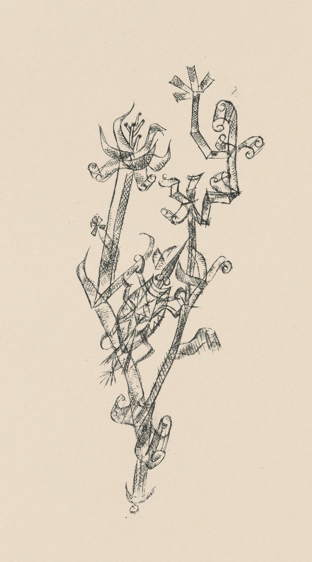
The dark line branches, circles and loops into an organism-like network. It is reasonable to see insect and plant associations in the print's original title and forms, but not to promote the NGA's automated visual description into Klee's own account of what each part depicts. Its compact form also changes when viewed as one contribution among many processes in a bound anthology. The cleared museum image lets this page show an actual original-print impression without implying that the reproduction here is itself an original lithograph.[5]
Queen of Hearts (Herzdame), 1921, offers a different route to a public. MoMA records the lithograph in Der Ararat, volume 2, number 4, issued in April 1921, with Goltzverlag as publisher. Its edition field says 100 plus one known proof. The composition measures 25.6 × 17.6 cm, while its sheet measures 29 × 21.9 cm. A proof is recorded separately from the edition; it should not be silently counted as numbered sheet 101. MoMA's interpretive essay reads Klee's earlier etchings as a satirical answer to classical figure study, then treats this later image through the Bauhaus-period language of signs. That is a curatorial argument, not a diary statement by Klee about the exact picture.[9]
How do portfolio and hand-coloured sheets differ?
The Centre Pompidou's French record for Der Verliebte (The Lover), 1923, calls it a lithograph on paper from the Portfolio des Maîtres du Bauhaus. The museum's particular sheet is numbered 89/100 and carries inventory AM 81-65-848 (6). Its printed image is 27.4 × 19 cm, while the full sheet is 34.4 × 27 cm; the portfolio as a whole includes eight plates in a folder. The fraction identifies a numbered impression in this issue, whereas the inventory identifies the museum's accession. The nearby inscription recorded as 91 should not be mistaken for a second edition fraction without examining the catalogue context. The work belongs to both Klee's practice and a collective publication.[6]
Another 1923 lithograph, Tightrope Walker (Seiltänzer), was printed at the Staatliches Bauhaus, Weimar and published by the Marées-Gesellschaft/R. Piper & Co., according to MoMA. Its edition is given as 300. Pindell's 1979 technical account explains a more unusual path: Klee used his oil-tracing transfer method to take the design to lithographic transfer paper, then to stone for printing. The result is an editioned lithograph even though its making began with a transfer process that can also make a single drawing. MoMA's 1994 Bauhaus print exhibition describes the work within the school's print culture, but the owning object's printer and publisher fields keep the production chain specific.[3][13]
Not every printed image was left as ink from a matrix alone. The Centre Pompidou calls Drei Köpfe (Three Heads), 1919, a lithograph heightened with watercolour and transcribes an inscription that includes “LITHO HANDKOLOR.” Its 13 × 14.5 cm measurement and accession AM 1972-7 refer to the museum's object record. Hand colouring means that the lithographic base and later colour must both be described. It does not make the whole work a pure watercolour or a modern mechanically colour-printed poster. Pompidou links the lithograph to a 1918 pencil drawing, another lead for comparing a precursor with a print; the exact work-number relationship still needs checking in the printed catalogue.[14]
Why did Klee return to etching?
Klee's 1928–32 return to etching, recorded by MoMA, shows that the medium remained useful after the Bauhaus lithographs. The National Gallery of Art's Height! (Höhe!), 1928, is an etching in black on Japan paper, accession 1950.17.200. The NGA cites Kornfeld 100, state b and transcribes the inscription “1928.T.9. ‘Höhe!’ 10/70” below the plate mark. Here 10/70 belongs to an individual impression's edition inscription; state b is a catalogue classification; 1950.17.200 is a museum number. None should be substituted for another. The NGA's image is unavailable for download, so this page uses the object data and sends readers to its record rather than adding an uncleared reproduction.[2][15]
Pindell's 1979 MoMA catalogue describes Height! more specifically as sugar-lift etching, while the NGA's present online medium line says only etching. A broad museum medium label may omit a technique, but the records alone do not establish whether they refer to exactly the same state or technical finding. The image and specialist Kornfeld entry need comparison before sugar lift is asserted for the NGA impression. The contrast is informative: even when catalogue number and design are stable, a technique claim may depend on which physical sheet was examined and how an institution describes it.[3][15]
The late etching Rechnender Greis of 1929 connects the new phase to a commission. Kunstmuseum Basel's German history of the Swiss Graphic Society says the society commissioned Klee in 1928. MoMA records Old Man Figuring (Rechnender Greis) as a 1929 etching published by the Schweizerische Graphische Gesellschaft, printed by Hans Klingler in Leipzig, in an edition of 125. The National Gallery's Old Man Reckoning impression gives Kornfeld 104, state b, with plate and sheet dimensions recorded separately. The English titles vary, but the German title and matching medium/date tie the institutional records to the same print. A French record at Musée Jenisch Vevey gives a 1928 publisher year and a 1929 object date for its own impression. Kornfeld's later auction catalogue calls it the society's 1928 annual gift, sent in 1929. The commission, annual-gift year and print date therefore describe different points in the work's public life.[16][17][20]
These records also show the care needed with state labels. The NGA identifies one Rechnender Greis impression as state b. MoMA's page gives edition size, printer and publisher but no state for its own sheet. It would be wrong to transfer the NGA's state automatically to MoMA's impression. Nor can the edition of 125 be read as proof that every impression now survives or was pulled under identical conditions. The printer's name and paper measurements are part of this print's concrete history; they are more informative than calling it simply a “late black-and-white work.”[16][17]
There is also a later chapter in the physical plate's history. Galerie Kornfeld records that the copper plate was printed again in 1995 for an edition artistically reworked by Ian Anüll, with a coloured stamp addition. The gallery calls these sheets reprints from Klee's original plate and lists them separately under a later state/reworking, citing Kornfeld's 2005 print catalogue. They are historically related to Rechnender Greis, but they are not sheets printed during Klee's lifetime or substitutes for the society's 1928/29 issue. A photograph of the same design cannot show that distinction reliably without the paper, marks, state and issue evidence.[21]
A different 1928 annual gift must be kept separate. Berlin's Sammlung Scharf-Gerstenberg identifies Gaukler im April (Jongleurs en avril) as an etching with drypoint on zinc. Its German object essay says Klee printed twelve impressions at the Bauhaus in April 1928 for the Klee-Gesellschaft, an artists' support society founded in 1925. That is not the Schweizerische Graphische Gesellschaft responsible for Rechnender Greis. The Berlin essay reads the tightrope performer as a possible emblem of artistic risk, explicitly as an interpretation, while the recorded plate and issue tell us why this is another original print with a different audience and scale.[22]
The Berlin record labels Jongleurs en avril as the original title and Gaukler im April as its collection title. Klee's titles are not all originally German; the language field of a reliable owner record can matter as much as a familiar English translation. This is another reason to keep the print's original inscription, catalogue entries and later display titles separate instead of treating each translated title as a different work.[22]
Is an oil-transfer drawing a print?
Klee's oil-transfer drawing creates a print-like line, but a transferred single drawing is not automatically an editioned print. Pindell explains how Klee painted one side of a transfer sheet with oil-based material, laid a model drawing above it and pressed its lines through with a needle onto a receiving sheet. The pressure could carry irregular marks and surface texture as well as the intended contour. MoMA's Twittering Machine of 1922 is classified as oil-transfer drawing, watercolour and ink on paper, with gouache and ink borders on board. Its reproducible-looking marks did not make it an edition of lithographs. The drawings guide studies that sheet in its own material terms.[3][18]
The process becomes printmaking when the design goes on to a printing matrix, as Pindell describes for Tightrope Walker. The distinction lies in the production chain and resulting impressions, not simply in whether a line looks mechanically mediated. A single transferred drawing may be unique; a lithograph pulled from a stone can have many impressions. The materials and techniques guide explains Klee's wider support and transfer choices, while the watercolours guide follows coloured sheets that may include graphic additions.[3][13][18]
How should we read and identify a Klee impression?
Begin with the original-language title, date, process, plate or printed-image size, sheet size, publication or portfolio, printer, publisher, and the actual inscription. Then ask whether a number is Klee's annual entry, a published catalogue number, a state, a numbered impression or a museum accession. For Der Verliebte, 89/100 is a fraction on a portfolio sheet. For Height!, 10/70 is an inscription and state b is a separate specialist classification. For Riesenblattlaus, Kornfeld 77 points to the print catalogue while the NGA's accession identifies its bound-volume object. These are not interchangeable shorthand for authenticity or value.[5][6][15][22]
If buying or studying a sheet, a catalogue entry and image alone cannot authenticate a physical impression. Paper, ink, dimensions, marks and provenance need examination by a qualified specialist against a documented state and other impressions. The term “limited edition” on a modern sales listing does not establish that Klee made the printing matrix, approved that issue, or even saw the reproduction. MoMA's 1947 Prints of Paul Klee publication and its later facsimile contain reproductions of forty historical prints, not a new set of original Klee-pulled impressions. They belong to the history of how audiences learned about the prints, a different material category from the original etchings and lithographs.[19]
Klee's original graphic work is a compact but varied part of his career: small early etched editions, published lithographs, hand-coloured sheets and renewed late etching. The matrices and impressions let us follow how a line could be drawn, bitten, transferred, printed, altered and distributed. The most useful label tells us which physical sheet we are seeing and how it was made. From there, an interpretation of satire, organism-like form or an aging figure can be tied to the actual marks rather than to a generic idea of “Klee prints.”[1][2][3][5][17]
Discussion
Klee’s original etchings and lithographs survive through particular impressions, states and publications.
A physical sheet and its inscriptions can tell us more than a cropped image of the design.
Reader Insights
Which impression, state or portfolio changed how you saw a Klee print?
What does a plate or sheet measurement add to your reading?
Which original print would you compare with a preparatory drawing?
Join the Conversation
Share the object and the source behind your reading.
References
- Zentrum Paul Klee, Paul Klees Grafik. Die Passion des Eberhard W. Kornfeld, German exhibition account (2009–10), on the 109-work, 1901–32 corpus and Kornfeld's specialist catalogue. The printed catalogue itself remains to be consulted, View source.
- Museum of Modern Art, Klee print chronology in German Expressionism: The Graphic Impulse, English, on 109 prints, early etchings, 1919–25 lithographs and the 1928–32 return to etching, View source.
- Howardena Pindell, Paul Klee Centennial: Prints and Transfer Drawings, Museum of Modern Art, 1979, English, printed pp. 3–10 and checklist. Read from the complete digitized catalogue; OCR names and media were cross-checked against current owner records where used. Its translated Klee quotations and broad historical characterizations are treated cautiously, View source.
- Museum of Modern Art, intaglio technique guide, English, for basic process distinctions; object-specific medium lines govern individual Klee cases, View source.
- National Gallery of Art, Riesenblattlaus (Giant Aphid), 1980.26.2.8, English owner record, publication composition, Kornfeld state as cited by NGA, and object-specific public-domain download; NGA open-access policy.
- Centre Pompidou, Der Verliebte, AM 81-65-848 (6), French owner record, portfolio, 89/100 inscription, image and sheet dimensions. Public-domain artwork status does not itself clear the RMN photograph, View source.
- Zentrum Paul Klee, archive and research description, German, on Klee's handwritten oeuvre catalogue and the on-site successor database to the printed nine-volume catalogue raisonné, View source.
- Zentrum Paul Klee, Italian biography, on early self-directed graphic work; a translation within the same institutional source family, not an independent archive witness, View source.
- Harper Montgomery and Sarah Suzuki, excerpt from Artists and Prints (MoMA, 2004), on the Queen of Hearts object page, English, on the Inventions grouping and interpretive trajectory; the twelve-etching count remains to check in Kornfeld, View source.
- Museum of Modern Art, Two Men Meet, Each Believing the Other to Be of Higher Rank, 137.1946, English owner record with plate/sheet dimensions, printer, publisher and approximate edition, View source.
- Museum of Modern Art, Reflecting Window, 336.1948, English owner record, etching, plate/sheet dimensions and approximate edition, View source.
- Museum of Modern Art, Drinker historical German Expressionism object record, English, circa-1909 etching-and-drypoint description, Kornfeld 21 and edition two; conflicts with the museum's 1979 catalogue, reference 3, View source.
- Museum of Modern Art, Tightrope Walker, 3.1931, English owner record with Bauhaus printer, publisher and edition 300; 1994 Bauhaus print exhibition supplies institutional publication context. The technical transfer chain comes from Pindell, reference 3.
- Centre Pompidou, Drei Köpfe, AM 1972-7, French owner record, 1919 lithograph heightened with watercolour and transcribed hand-colouring inscription; museum photo is separately credited to RMN, View source.
- National Gallery of Art, Height!, 1950.17.200, English owner record, 1928 etched impression, Kornfeld 100 state b and edition inscription; image unavailable for download, View source.
- Kunstmuseum Basel, Grafik grenzenlos. Die Schweizerische Graphische Gesellschaft, German, on the society's 1928 Klee commission; MoMA, Old Man Figuring, English, on 1929 printer, publisher and edition.
- National Gallery of Art, Old Man Reckoning (Rechnender Greis), 1991.157.1, English owner record, 1929 medium, dimensions, Kornfeld 104 state b and inscription evidence, View source.
- Museum of Modern Art, Twittering Machine, 564.1939, English owner record, oil-transfer drawing and additions; transfer method compared with Pindell, reference 3, View source.
- Museum of Modern Art, history of the 1947 Prints of Paul Klee and facsimile, English, specifically describing reproductions of forty original prints; a source on reception, not evidence of forty new original impressions, View source.
- Musée Jenisch Vevey, Rechnender Greis, VD 928-0002, French owner record distinguishing 1928 publisher attribution and 1929 print date; Galerie Kornfeld, 2023 auction catalogue, lot 354, German, reporting the 1928 annual gift's 1929 dispatch. The complete 2018 Swiss Graphic Society history remains to read.
- Galerie Kornfeld, Rechnender Greis, reworked by Ian Anüll in 1995, German and English catalogue entry, identifying a later pull from the original copper plate, a coloured stamp and Kornfeld 2005 no. 104/C. It is evidence for that later issue, not direct examination of the 2005 catalogue, View source.
- Staatliche Museen zu Berlin, Sammlung Scharf-Gerstenberg, Gaukler im April, German owner record and Dieter Scholz essay, on the etching/drypoint medium and twelve Bauhaus impressions issued for the distinct Klee-Gesellschaft in 1928. The symbolic reading of the performer is attributed to Scholz, View source.