


 by Tom Gurney
Tom Gurney BSc (Hons) is an art history expert with over 20 years experience
Published on June 19, 2020 / Updated on September 27, 2026
Email: tomgurney1@gmail.com / Phone: +44 7429 011000
A crystal built from colour steps
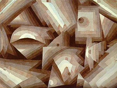
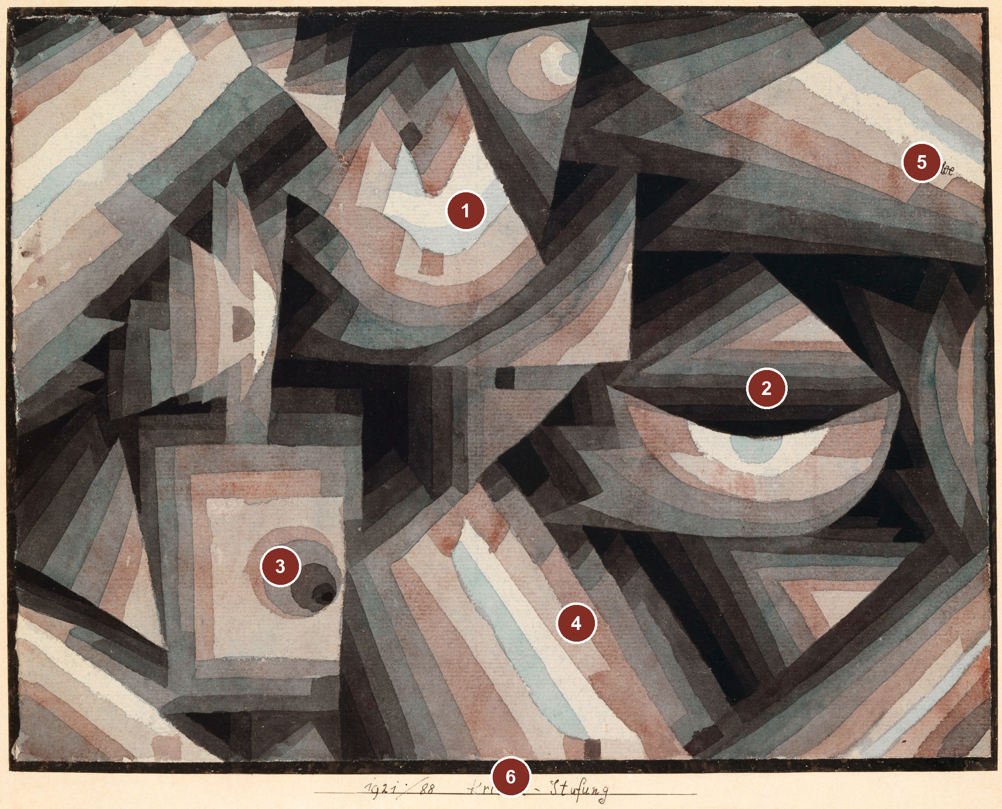
Bands of pale turquoise, pink-grey, reddish brown and near black seem to fold around one another in Paul Klee's Kristall-Stufung of 1921. Some form sharp corners, but others bend into arcs or almost circular centres. A light strip may look like the front of a solid, then become a gap between two other planes. The English title Crystal Gradation captures both halves of the problem: the forms suggest facets, while colour advances in steps rather than a smooth wash from one end of the paper to the other.[1][2][3]
The picture is a small watercolour on paper, bordered with brush and pen and mounted on cardboard. Its apparent architecture is made from thin colour on a flat support. That tension between surface and imagined depth is the point of looking closely. A reproduction can show the stepped bands, softened wash edges, signature and handwritten mount label, but it cannot establish every pigment or the exact order in which Klee applied the washes.[1][2]
Explore the details of Crystal Gradation
Select a numbered area to examine its detail at high resolution.
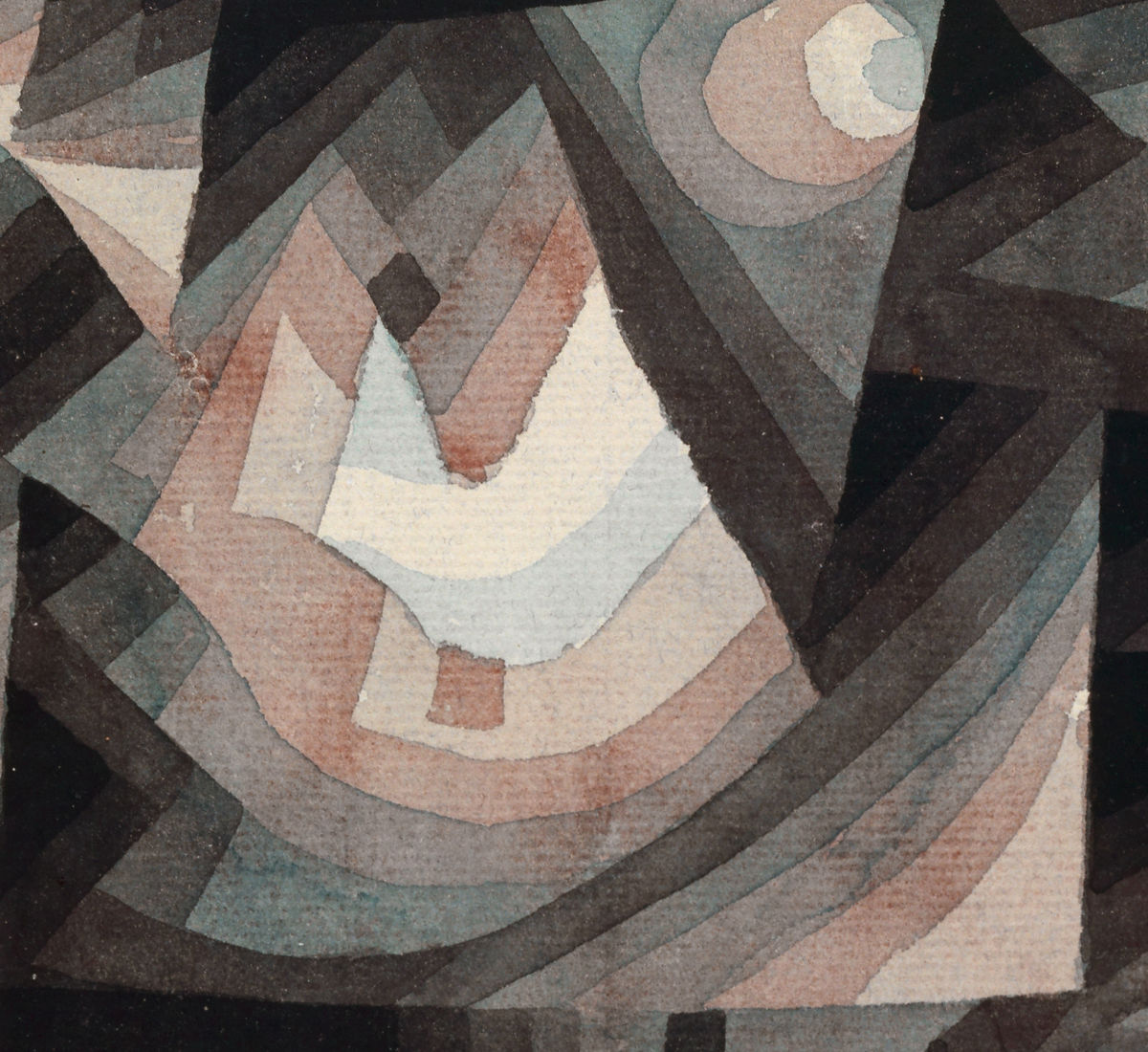
Layered upper arc
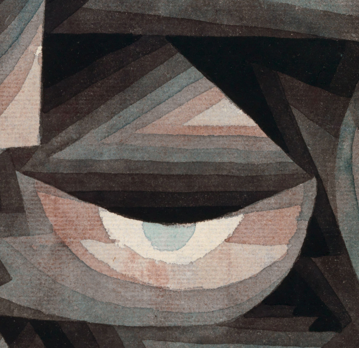
Right-hand curved bands
Lower-left concentric square
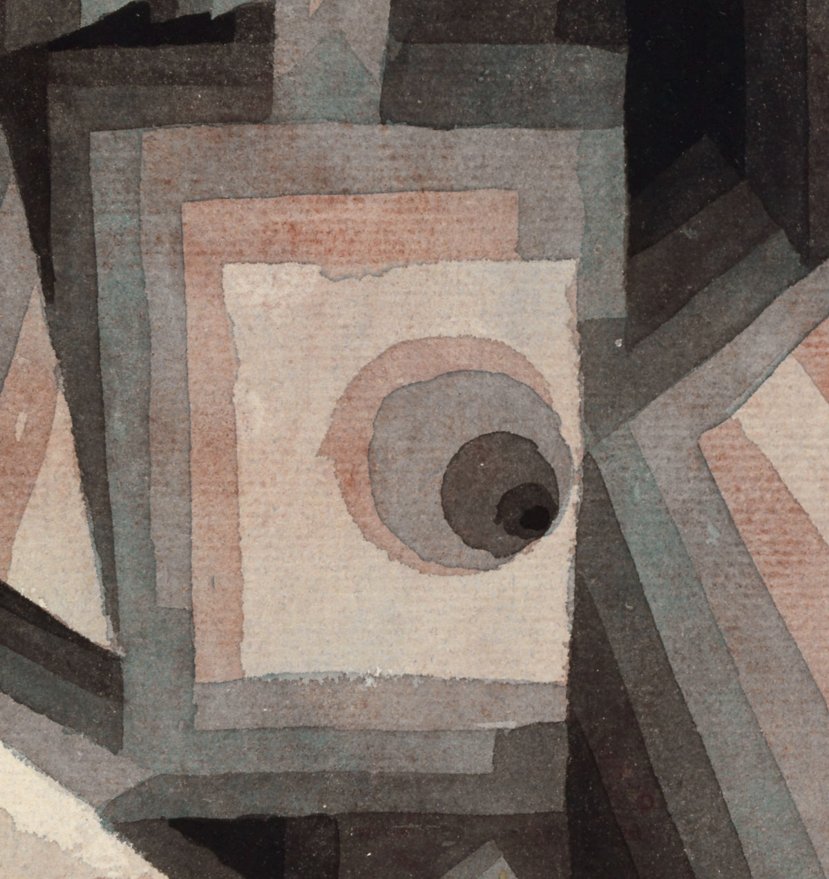
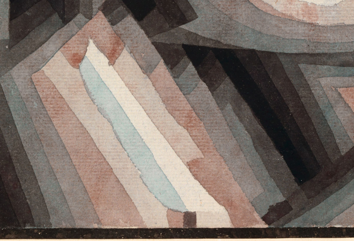
Diagonal colour steps
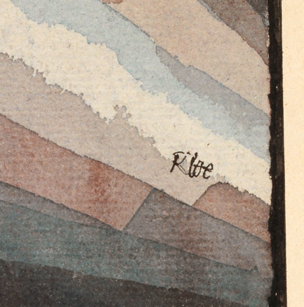
Klee signature
Title and work number on the mount

Contents
- Which Crystal Gradation is this?
- Follow the colour steps
- Are the facets flat or three-dimensional?
- The 1921 gradation group
- From Basel to a French exhibition
Which Crystal Gradation is this?
Kunstmuseum Basel records the German title Kristall-Stufung and Klee's annual work number 1921, 88. The painting belongs to the museum's Kupferstichkabinett and carries inventory number 1968.407. These numbers serve different purposes: 1921, 88 is the artist's annual designation, while 1968.407 is the museum's accession. Basel says the sheet is signed at upper right and transcribes the line on its mount as i92i / 88 Kristall-Stufung. Both features can be located in the high-resolution image, though a photograph cannot replace direct examination of ink or handwriting.[1][2]
The museum's medium description is precise: watercolour on paper, bordered with brush and pen, mounted on cardboard. It lists 24 × 31.3 cm and 30 × 36.5 cm. These appear to distinguish the painted sheet from the larger mount, but the current display of measurements does not explicitly label each pair; a technical caption should follow the museum's wording and leave that assignment open until confirmed. Stefan W. Schmidt's 2011 scholarly illustration gives 24.5 × 31.5 cm for the sheet. The small discrepancy is a record difference, not a reason to average the figures. The medium is not oil painting, digital gradation or a hatch-drawn graphic.[1][3]
Basel credits the work as a gift of Marguerite Arp-Hagenbach. Its current object record does not establish when she gave it or the full path of ownership before it came to the museum. The inventory prefix makes a late-1960s acquisition plausible but does not, by itself, date the gift. The museum's bibliography points to Catalogue raisonné Paul Klee, volume 3, page 312, no. 2679. That is a museum cross-reference: the printed entry itself has not yet been directly consulted for this project.[1]
The title also needs care. Kristall is a crystal; Stufung suggests staging, stepping or a sequence of levels. “Gradation” is a serviceable English rendering, but it can suggest a perfectly smooth fade. Here one can usually see successive intervals, separated or overlapped. A colour may shift by degree while a band keeps an edge of its own. The picture asks the eye to register both the interval and the transition.[1][2]
Follow the colour steps
Begin with the light forms. Near the top and across the lower half, pale cream and bluish green appear beside subdued pink. In the upper-left region, angled bands climb towards an off-white area, then turn through grey-green and reddish grey into darkness. Follow the lower diagonal from near the centre towards the bottom: the colour steps seem to project towards the viewer before slipping beneath a neighbouring black wedge. The middle of the composition holds no single solid object to which all the fragments belong.[2]
The upper arc offers another route. Its pale centre is surrounded by successive bands of pink, grey, green and dark brown. Similar curved stages recur at right and in a compact lower-left square. The shapes are related without being repetitions of one template. Some edges are crisply angular; elsewhere their contours soften or curve. If the title makes us expect a mineral built entirely of straight facets, the image repeatedly frustrates that expectation. A viewer may see a crystal, an abstract plan, a rotating volume, or simply a set of colour relations without settling on one object.[2][3]
Schmidt describes this as a structure of regular and irregular forms stepped both by hue and by lightness. He observes translucent watercolour layers and sees light passages approaching while darker passages withdraw. He identifies light blue-green adjacent to nearly unpainted paper, red-tinged greys, weaker reds, deeper greens and reddish browns meeting the black. That detailed account helps us see why “gradient” alone is too blunt a term. One strip can be both a tonal step and part of a spatial illusion; neighbouring colours can seem to affect one another even when they do not merge into a seamless band.[3]
The image does not tell us a fixed order in which the painter's hand moved. Schmidt proposes that Klee first set out a black-to-white scale and then loaded its tones with colour. This may explain how the visible layers work, but it is Schmidt's reconstruction, not a conclusion demonstrated by the Basel object description. No conservation cross-section or object-specific working note examined here proves the sequence. It is reasonable to say that transparent washes give the appearance of superposed colour; it is not reasonable to announce the number of washes, named pigments or an exact studio recipe.[1][3]
The painting's dark areas matter as much as the light ones. They gather between the bands, sometimes presenting a background against which a pale cluster seems to advance. Yet a dark wedge can also become part of a shape, or divide one proposed crystal from another. That instability gives the composition a sense of movement without animation in the literal sense. It asks us to look again, change which plane we treat as front, and discover another arrangement. The older page's comparison with computer filters and cartoon frames adds no evidence about this watercolour's making or perception.[2][3]
Are the facets flat or three-dimensional?
Many of the strongest borders arise where two painted areas meet. Schmidt calls attention to this way of forming an edge through adjacent planes, while noting that some limits are gently reinforced. The upper-left group and right-lower curved forms are important exceptions to a purely straight-edged crystal. The paper stays flat, but several local groups appear to overlap, hinge or slide beneath one another. Their depth is made through changing tone, transparency and occlusion, not through a single conventional vanishing point.[2][3]
Schmidt interprets the work as growth out of darkness towards light. He extends the movement from rectangles and triangles towards rounder forms and associates the circle with completion. This is a coherent interpretation of the evident curves, contrasts and apparent emergence. It is not a statement left by Klee about this particular sheet, nor does it tell a viewer which way to scan it. One can also find dark bands that interrupt a proposed route and curves that sit beside straight segments rather than replacing them. The image supports a moving eye more securely than a single one-way narrative of progress.[3]
The art historian Regine Prange offers a different emphasis in her German study of the crystalline as an artistic symbol. She describes pale red and turquoise-green complexes against darkness, with light forms repeated in progressively deeper bands. Transparent washes make adjacent strips seem to sit behind each other; at the same time, in her reading, the clusters remain fairly distinct from their ground. She compares this relatively legible figure-and-ground structure with the less stable space of another 1921 work, Herbstlicher Ort. She also relates the crystal image to a 1922 plant-growth painting: two different natural metaphors for building a picture by adding planes.[4]
Prange's “growth” does not simply repeat Schmidt's growth towards a completed circle. Her account focuses on how the making and viewing of layers become the subject and on the limits of treating crystal imagery as a key to all Klee's later work. Put beside Schmidt, it makes an instructive disagreement. Both attend to bands, overlap and colour stages; one proposes a more directional development of forms, while the other stresses the picture's still legible spatial relations and their later transformation in Klee's practice. The visible work permits both questions. Neither reading is a measurement or a documented statement of the artist's intention.[3][4]
The six existing detail images below make those claims testable. The upper arc and the curved bands at right show where straight-line expectations fail. The lower-left square and central diagonal show how adjacent stages can alternately seem flat or deep. The signature and the mount label show evidence of the work's recorded identity. A close crop changes the apparent strength of colours by removing their neighbours, so every detail should be returned to the whole image before a formal conclusion is made.[2]
The 1921 gradation group
Berlin's Museum Berggruen owns a distinct Klee work titled Rot-Stufung, annual number 1921, 89. Its curator Roland März places that sheet together with Basel's Kristall-Stufung and the privately held Fuge in Rot in an initial 1921 group that explores controlled colour relations and transparent watercolour glazing. The adjacent artist numbers 88 and 89 make a close sequence in Klee's register, but do not prove that he intended a formal pair or finished one directly after the other.[1][5]
Berlin gives Rot-Stufung as watercolour on paper mounted on cardboard, with a brush-and-ink border, 21 × 31.1 cm. Those material and format similarities make it a useful comparison. The Berlin curatorial text describes its own picture's brown-leaning red range, orange-and-blue mixtures and rounded, almost planetary forms. Such features cannot simply be moved to the Basel sheet. The comparative point is that the two watercolours explore staged colour and a sense of light through different arrangements; the Berlin sheet is not a second photograph or alternative title of Crystal Gradation.[5]
März compares these painted colour effects with experiments in coloured or reflected light by Kurt Schwerdtfeger and Ludwig Hirschfeld-Mack at the Weimar Bauhaus. The analogy helps explain why watercolour stages may appear luminous. It does not document a demonstration that Klee saw before making this sheet, much less establish that the sheet was designed as a direct response. Klee began teaching at the Bauhaus in 1921, so the historical setting is pertinent, but a general shared setting is weaker evidence than an object-specific record of influence.[5][6]
Klee's later language about colour illuminates the experiment without supplying a paint-by-numbers key. In his 1924 Jena lecture, he distinguishes line as measurable extent, light and dark as tonal weight, and colour as having hue, value and extent. He treats red and green as a complementary relation and describes varied tonal and chromatic scales. The lecture dates three years after Kristall-Stufung and does not name it. A reliable German transcription can establish the passage's meaning, while the Jenaer Kunstverein corrects a bibliographic confusion: the exhibition opened on 6 January 1924, but Klee delivered the address on 26 January, not at the opening.[7]
Marianne Keller Tschirren's study of colour ordering in Klee's Bauhaus teaching provides a useful restraint. Student exercises and diagrams can clarify the artist's available ideas, yet they should not be applied as a rigid key to every finished work. Klee's transparency and complementary relations are relevant to the group, but the precise distribution of bands on the Basel sheet remains a pictorial decision. Keller Tschirren also misassigns 1921, 88 to Berlin's Rot-Stufung in one passage; the owning museums give that number to Basel's Kristall-Stufung and 1921, 89 to Berlin's work. Following object records is safer than silently perpetuating the error.[1][5][6]
The colour historian Lorenz Dittmann likewise names Kristall-Stufung as an example when discussing Klee's expressive use of tonal range, and places it beside Wachstum der Nachtpflanzen. His German essay interprets Klee's balance of light and dark through a wider history of colour thinking. It is a contextual analogy, rather than a new object description or evidence for a pigment sequence. Dittmann, Keller Tschirren and Klee's lecture therefore enrich the question of how colour can be ordered, but Basel's object record and the picture itself remain the anchors for what this particular watercolour is.[1][6][7][8]
From Basel to a French exhibition
The sheet has a documented public life beyond its current collection record. The Centre Pompidou's database for the Paris-Berlin exhibition lists it as Graduation de cristal (Kristall-Stufung), a 1921 loan from Basel's Kupferstichkabinett. The exhibition ran 12 July to 6 November 1978. The French label shows another title rendering and confirms that this specific sheet circulated in a major historical exhibition. The online list does not establish its precise wall position, installation neighbours or a full curatorial reading; those would require the printed catalogue or installation documentation.[9]
An older catalogue trail complicates the name and medium. Prange's 1991 figure list adds im Bann des Gestirnes to the title and captions the work as an oil drawing and watercolour on lightly tinted French Ingres paper, with 24.5 × 31.5 cm dimensions. She later traces the longer wording to a Frühwerk catalogue. Basel's present record instead transcribes the shorter title on the mount and calls the work watercolour on paper. Until the earlier catalogue, Basel's technical file and the relevant printed catalogue raisonné entry are compared, the extra phrase and oil-drawing medium should remain historical catalogue variants, not silently replace current object facts.[1][4][10]
That distinction is more than a bibliographic nicety. A title suggesting a spell of stars could direct a viewer towards the pale circles as celestial bodies. Yet the documented mount inscription says only Kristall-Stufung. The older wording may have a history worth recovering, but the image does not prove it was Klee's own subtitle. Nor does a pale arc prove a moon or planet. A referenced page should let the recorded title and visible shapes guide interpretation without treating every later label as the artist's intention.[1][2][4][10]
The Croatian theorist Marcel Bačić makes the power of a title and the meeting of opposed colours part of a later philosophical reading. In a chapter of his 2016 book Prostor interpretacije, he reproduces the Basel watercolour as Kristalno stupnjevanje and brings its red-green stages beside Wittgenstein's question about a “reddish green” colour. Bačić's juxtaposition asks how apparently opposed terms might meet in an image, and his wider chapter argues that a title can open as many puzzles as it resolves. This is Croatian-language reception of the work, not evidence that Klee knew Wittgenstein's later colour remarks or painted a philosophical proposition. The reproduced sheet and its documented name remain the object of the comparison.[12]
The museum bibliography provides further object-specific leads: a 2002 Basel works-on-paper leaflet, a 2006 Zentrum Paul Klee catalogue on melody and rhythm, a 2012 publication by Fujio Meada, and a 2025 Paul Klee: Solitary and Solidary catalogue. Their listing establishes that the museum associates those publications with the sheet; it does not supply their arguments. Likewise, Annie Bourneuf's study of Klee's visible and legible pictures places a reproduction of this watercolour within a broader comparison between transparent layered watercolours and later, more opaque oil square pictures.[1][11]
The force of Crystal Gradation lies in what can be checked even before those leads are resolved. Stages of colour make hard planes seem to bend; pale bands emerge without severing their relation to the dark field; a small painted sheet offers more than one plausible route into depth. Klee's title starts the mineral analogy, but the watercolour remains a study in how looking joins, separates and reorders colour. The unresolved catalogue and technical questions are reasons to keep researching the work, not reasons to turn its visible complexity into a simple software “gradient.”[1][2][3][4]
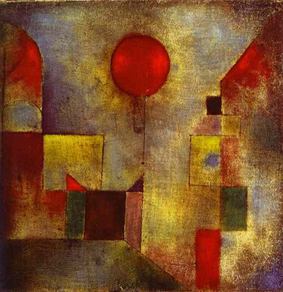
For related Klee experiments, see Red Balloon for another small Bauhaus-period work on a prepared support, Ancient Harmony for a later field of colour units, and the materials and techniques guide for why watercolour, oil and mounting methods must be kept distinct. The colour overview and Bauhaus page put those works in a wider practice.
Explore selected works from Klee’s much larger oeuvre. Titles without a link have an authenticated catalogue identity but no reviewed article yet.
Artworks directory
| Name | Date | Medium |
|---|---|---|
| A Gate | 1939 | Painting and mixed media |
| A Woman for Gods | 1938 | Watercolour and mixed media |
| Ab Ovo | 1917 | Watercolour and mixed media |
| Above Mountain Summit | 1917 | Drawing and mixed media |
| Abstract Trio | 1923 | Drawing and mixed media |
| Acrobats | 1915 | Watercolour and mixed media |
| Actor's Mask | 1924 | Painting and mixed media |
| Ad Marginem | 1930 | Drawing and mixed media |
| Ad Parnassum | 1932 | Painting and mixed media |
| Adventurer Ship | 1927 | Drawing and mixed media |
| Affected Place | 1922 | Drawing and mixed media |
| After a Sketch from Zurich | 1914 | Watercolour and mixed media |
| After Drawing | 1919 | |
| After The Floods | 1936 | Watercolour and mixed media |
| All Souls' Picture | 1921 | |
| Ancient Harmony | 1925 | Painting and mixed media |
| Angel Applicant | 1939 | Drawing and mixed media |
| Angel Serves the Desired | 1920 | |
| Angel, Still Female | 1939 | Painting and mixed media |
| Angelus Novus | 1920 | Drawing and mixed media |
| Animal Terror | 1926 | Painting and mixed media |
| Arab Song | 1932 | Painting and mixed media |
| Archangel | 1938 | Painting and mixed media |
| Architecture | 1923 | Painting and mixed media |
| Architecture of the Plain | 1923 | Drawing and mixed media |
| Around the Fish | 1926 | Painting and mixed media |
| Arrival of the Air Steamer | 1921 | Drawing and mixed media |
| Asiatic God | 1924 | Painting and mixed media |
| Astrological Fantasy Portrait | 1924 | Drawing and mixed media |
| Athlete's Head | 1932 | Watercolour and mixed media |
| Aufgehender Stern | 1931 | Painting and mixed media |
| Autumn Flower | 1922 | Painting and mixed media |
| Bad Band | 1920 | Drawing and mixed media |
| Baroque Centaur | 1939 | Painting and mixed media |
| Before the Blitz | 1923 | Drawing and mixed media |
| Before the Snow | 1929 | Drawing and mixed media |
| Besessenes Madchen | 1924 | Watercolour and mixed media |
| Bird Garden | 1924 | |
| Bird Wandering Off | 1926 | Watercolour and mixed media |
| Blossoms in the Night | 1930 | Watercolour and mixed media |
| Blue-Bird-Pumpkin | 1939 | Painting and mixed media |
| Boats in the Flood | 1937 | Painting and mixed media |
| Botanical Theatre | 1934 | Drawing and mixed media |
| Boy in Fancy Dress | 1931 | Watercolour and mixed media |
| Broken Key | 1938 | |
| Brother and Sister | 1930 | Watercolour and mixed media |
| But the Red Roof | 1935 | Painting and mixed media |
| C - C = Fisch | 1931 | Watercolour and mixed media |
| Cacti | 1912 | Painting and mixed media |
| Camel (in Rhythmic Landscape with Trees) | 1920 | Drawing and mixed media |
| Captive Pierrot | 1923 | Drawing and mixed media |
| Castle and Sun | 1928 | Drawing and mixed media |
| Cat and Bird | 1928 | Drawing and mixed media |
| Cathedrals | 1925 | Watercolour and mixed media |
| Chalice of the Heart | 1937 | Painting and mixed media |
| Characters in Yellow | 1937 | Painting and mixed media |
| Chosen Site | 1927 | Mixed media |
| Christmas Picture | 1923 | Drawing and mixed media |
| City of Towers | 1916 | Painting and mixed media |
| Clarification | 1932 | Painting and mixed media |
| Collection of Figurines | 1926 | Painting and mixed media |
| Colorful Architecture | 1917 | Painting and mixed media |
| Comedians' Handbill | 1938 | |
| Comic Opera Singer | 1927 | Painting and mixed media |
| Composition | 1939 | Painting and mixed media |
| Composition with Figures | 1915 | Drawing and mixed media |
| Composition with the Yellow Half-Moon and the Y | 1918 | Watercolour and mixed media |
| Conch–Still Life II | 1939 | Watercolour and mixed media |
| Cosmic Composition | 1919 | Painting and mixed media |
| Crystal Gradation | 1921 | Drawing and mixed media |
| Dance of the Grieving Child | 1922 | Painting and mixed media |
| Dancing Girl | 1940 | Painting and mixed media |
| Das Licht und Etliches | 1931 | Mixed media |
| Death and Fire | 1940 | Painting and mixed media |
| Death for the Idea | 1915 | |
| Demon as Pirate | 1926 | Watercolour and mixed media |
| Diana | 1931 | Painting and mixed media |
| Diavolo Player | 1923 | Drawing and mixed media |
| Die Kapelle | 1917 | Watercolour and mixed media |
| Die Vase | 1938 | Painting and mixed media |
| Doctor | 1930 | Drawing and mixed media |
| Dredger and Sailboat | 1931 | Watercolour and mixed media |
| Ein Tor | 1939 | Painting and mixed media |
| Ein Weib fur Gotter | 1938 | Mixed media |
| Embrace | 1939 | Watercolour and mixed media |
| Episode before an Arab Town | 1923 | |
| Equals Infinity | 1932 | Painting and mixed media |
| Eros | 1923 | Drawing and mixed media |
| Error on Green | 1930 | Watercolour and mixed media |
| Evening Figure | 1935 | Drawing and mixed media |
| Falling Bird | 1919 | |
| Fermata | 1932 | Watercolour and mixed media |
| Fire Clown | 1921 | Watercolour and mixed media |
| Fire Full Moon | 1933 | Watercolour and mixed media |
| Fire in the Evening | 1929 | Painting and mixed media |
| Fish in the Harbour | 1916 | Watercolour and mixed media |
| Fish Magic | 1925 | Watercolour and mixed media |
| Flock of Birds | 1917 | Drawing and mixed media |
| Flora on Sand | 1927 | Watercolour and mixed media |
| Flower Myth | 1918 | |
| Flower Stand with Watering Can and Bucket | 1910 | Watercolour and mixed media |
| Flowering Tree (Abstraction with Reference to a Flowering Tree) | 1925 | Painting and mixed media |
| Flowers in Pots | 1923 | |
| Flowers in Stone | 1939 | Painting and mixed media |
| Forest Witch | 1938 | Painting and mixed media |
| Fright of a Girl | 1922 | Drawing and mixed media |
| Fruits on Red | 1930 | Drawing and mixed media |
| Full Moon | 1919 | Mixed media |
| Föhn Wind in Franz Marc's Garden | 1915 | Watercolour and mixed media |
| Garden in St Germain, The European Quarter near Tunis | 1914 | Watercolour and mixed media |
| Ghost Chamber with the Tall Door (New Version) | 1925 | |
| Ghost of a Genius | 1922 | Drawing and mixed media |
| Girl in Mourning | 1939 | Painting and mixed media |
| Glance of a Landscape | 1926 | Watercolour and mixed media |
| Gluht Nach | 1939 | Drawing and mixed media |
| Golden Fish | 1925 | Watercolour and mixed media |
| Goldfish Wife | 1921 | Watercolour and mixed media |
| Green Plant, Blood, Louse | 1924 | Drawing and mixed media |
| Hafenbild | 1918 | Mixed media |
| Hammamet with Mosque | 1914 | Watercolour and mixed media |
| Harbour with Sailing Ships | 1937 | Painting and mixed media |
| Hauptweg und Nebenwege | 1929 | Painting and mixed media |
| Heavenly and Earthly Time | 1927 | Drawing and mixed media |
| Heroic Fiddling | 1938 | Painting and mixed media |
| Heroic Roses | 1938 | Painting and mixed media |
| Heroic Strokes of the Bow | — | Mixed media |
| Highway and Byways | 1929 | Drawing and mixed media |
| Houses near the Gravel Pit | 1913 | Watercolour and mixed media |
| Howling Dog | 1928 | Painting and mixed media |
| In the Current Six Thresholds | 1929 | Painting and mixed media |
| In the Style of Kairouan | 1914 | Drawing and mixed media |
| Individualized Altimetry of Stripes | 1930 | Painting and mixed media |
| Insula Dulcamara | 1938 | |
| Interior with the Clock | 1913 | Watercolour and mixed media |
| Irma Rossa the Animal Tamer | 1918 | Drawing and mixed media |
| Journey in Corsica | 1927 | Drawing and mixed media |
| Landscape with Bluebirds | 1919 | Watercolour and mixed media |
| Legend of the Nile | 1937 | Painting and mixed media |
| Lemon Harvest | 1937 | Watercolour and mixed media |
| Likeness in the Bower | 1930 | Watercolour and mixed media |
| Limits of Reason | 1927 | Painting and mixed media |
| Little Hope | 1938 | Watercolour and mixed media |
| Magdalena before the Conversion | 1938 | Drawing and mixed media |
| Mask of Fear | 1932 | Painting and mixed media |
| May Picture | 1925 | Painting and mixed media |
| Monument in a Cemetery | 1922 | Watercolour and mixed media |
| Monuments at G | 1929 | Watercolour and mixed media |
| Municipal Jewel | 1917 | Watercolour and mixed media |
| Mural from the Temple of Longing Thither | 1922 | |
| Nach der Uberschwemmung | 1936 | Watercolour and mixed media |
| New Harmony | 1936 | Painting and mixed media |
| New House in the Suburbs | — | Mixed media |
| Old Steamboat | 1922 | Drawing and mixed media |
| On the Edge | 1930 | Drawing and mixed media |
| Once Emerged from the Gray of Night | 1918 | Drawing and mixed media |
| One Who Understands | 1934 | Painting and mixed media |
| Oriental Pleasure Garden | 1925 | Painting and mixed media |
| Park of Idols | 1939 | Watercolour and mixed media |
| Passing by Red Pillars | 1928 | Watercolour and mixed media |
| Persian Nightingales | 1917 | Drawing and mixed media |
| Popular Wall Painting | 1922 | Painting and mixed media |
| Prestidigitator | 1927 | Watercolour and mixed media |
| Rainy Day | 1931 | Watercolour and mixed media |
| Red and White Domes | 1914 | Watercolour and mixed media |
| Red Balloon | 1922 | Drawing and mixed media |
| Redgreen and Violet-Yellow Rhythms | 1920 | Drawing and mixed media |
| Refuge | 1930 | Watercolour and mixed media |
| Rhythmic Rythmical | 1930 | Painting and mixed media |
| Saint of the Inner Light | 1921 | |
| Scaffolding of a New Building | 1930 | Painting and mixed media |
| Scholar in Dealing with Stars | 1926 | Watercolour and mixed media |
| Seated Woman | 1930 | Drawing and mixed media |
| Senecio | 1922 | Painting and mixed media |
| Separation in the Evening | 1922 | Drawing and mixed media |
| Sinbad the Sailor | 1923 | Drawing and mixed media |
| Skeptically Smiling | — | Mixed media |
| Small House in the Garden City | 1928 | Watercolour and mixed media |
| Small Portrait of a Girl in Yellow | 1925 | Painting and mixed media |
| Southern Gardens | 1919 | Watercolour and mixed media |
| Static-Dynamic Gradation | 1923 | Drawing and mixed media |
| Still Life | 1927 | Painting and mixed media |
| Still Life with Gladioli | 1932 | Watercolour and mixed media |
| Strange Garden | 1923 | Drawing and mixed media |
| Stricken City | 1936 | Painting and mixed media |
| Strong Dream | 1929 | Watercolour and mixed media |
| Struck from the List | 1933 | Drawing and mixed media |
| Structural I | 1924 | Drawing and mixed media |
| Sumpflegende | 1919 | Painting and mixed media |
| Temple Gardens | 1920 | Drawing and mixed media |
| The Arrow before the Target | 1921 | Drawing and mixed media |
| The Barbed Noose with the Mice | 1923 | Watercolour and mixed media |
| The Flora of the Heath | 1925 | Watercolour and mixed media |
| The Goldfish | 1925 | Watercolour and mixed media |
| The Hour Before One Night | 1940 | Painting and mixed media |
| The Man in Love | 1923 | |
| The Mask with the Flag | 1925 | Mixed media |
| The Pathos of Fertility | 1921 | |
| The Rhine at Duisburg | 1937 | Painting and mixed media |
| The Way to the Citadel | 1937 | Painting and mixed media |
| Three Houses and a Bridge | 1922 | Watercolour and mixed media |
| Tightrope Walker | 1923 | |
| Tomb in Three Parts | 1923 | Watercolour and mixed media |
| Tomcat's Turf | 1919 | Watercolour and mixed media |
| Tower in Orange and Green | 1922 | Drawing and mixed media |
| Tree and Architecture - Rhythms I | 1920 | Watercolour and mixed media |
| Tree and Architecture - Rhythms II | 1920 | Painting and mixed media |
| Tropical Dawn with the Owl | 1921 | Mixed media |
| Tropische Dammerung | 1921 | Painting and mixed media |
| Twittering Machine | 1922 | Drawing and mixed media |
| Variations (Progressive Motif) | 1927 | Watercolour and mixed media |
| Ventriloquist and Crier in the Moor | 1923 | |
| Viaducts Break Ranks | 1937 | Drawing and mixed media |
| Villa R | 1919 | Painting and mixed media |
| Village Carnival | 1926 | Painting and mixed media |
| Vor dem Blitz | 1923 | Drawing and mixed media |
| Wald-Hexen | 1938 | Painting and mixed media |
| Young Forest | 1925 | Drawing and mixed media |
Related artworks
Explore eight other Klee works, beginning with works close in date to this one.
Angelus Novus
1920
Red Balloon
1922
Senecio
1922
Twittering Machine
1922
Sinbad the Sailor
1923
Actor's Mask
1924
Flower Myth
1918
Discussion
The bands can look flat, translucent or like interlocking volumes.
The visible forms and later scholarly interpretations answer different questions.
Reader Insights
Where does a colour band seem to pass behind another?
Which curve most disrupts the idea of a straight crystal facet?
How does your reading change between a detail and the whole sheet?
Join the Conversation
Share the visual detail or source behind your reading.
References
- Kunstmuseum Basel, Kristall-Stufung, collection item 12079 (German object record), title, work number, inscription, material, two measurements, donor, inv. 1968.407 and bibliography; item details were directly recorded in the project dossier before the collection interface became intermittently inaccessible. Its catalogue-raisonné cross-reference is vol. 3, p. 312, no. 2679, not a claim that the printed entry was read, View source.
- Rawpixel, Crystal Gradation, exact-match item 7728476, item-level CC0/high-resolution original. Visual observations were checked against the unenhanced 6539 × 5279 px, 300 dpi local master and the museum-sourced front-view image, not against Rawpixel's enhanced variant, View source.
- Stefan W. Schmidt, “»… eine kleine Reise in das Land der besseren Erkenntnis«: Paul Klee und der Begriff des »bildnerischen Denkens«,” Zeitschrift für Ästhetik und Allgemeine Kunstwissenschaft 56/2 (2011), 275–96, especially article pp. 18–20 / journal pp. 292–94 (German), author-uploaded full article. His paint-order and growth accounts are attributed interpretations, not a technical report, View source.
- Regine Prange, Das Kristalline als Kunstsymbol: Bruno Taut und Paul Klee (Hildesheim/Zürich/New York, 1991), printed pp. 336–38 and fig. 154 (German), German National Library digital volume. Directly read from the saved page text and page images; older caption variants are recorded separately from Basel's current description, View source.
- Staatliche Museen zu Berlin, Museum Berggruen, Roland März, Rot-Stufung object record (German), updated 28 August 2026; own-work data and curator's grouping with Basel's Kristall-Stufung and Fuge in Rot, View source.
- Marianne Keller Tschirren, Dreieck, Kreis, Kugel: Farbenordnungen im Unterricht von Paul Klee am Bauhaus (University of Bern dissertation, 2012), especially pp. 4–5, 83–86 and 151–54 (German), full digital thesis. Its one conflicting annual-number reference is checked against the owning museums, View source.
- Paul Klee, German transcription of Über die moderne Kunst, lecture delivered 26 January 1924, first published posthumously in 1945; Jenaer Kunstverein, history and manuscript location (German). The transcription is used for context, not an exact critical-edition quotation.
- Lorenz Dittmann, “Schöpferische Aspekte der Farbgestaltung in der Malerei” (1991), printed pp. 119–21 (German), full article; work named as an example in a broader account of colour and tonal expression, View source.
- Centre Pompidou, Paris-Berlin exhibition database (French), “Graduation de cristal (Kristall-Stufung),” Basel loan; exhibition dates on institutional record, View source.
- Regine Prange, “Hinüberbauen in eine jenseitige Gegend” (1993), note 80 (German), referring to Frühwerk catalogue p. 532 no. 447 for a longer historical title form. The cited Frühwerk item itself remains unread, View source.
- Annie Bourneuf, Paul Klee: The Visible and the Legible (University of Chicago Press, 2015), chapter 3, fig. 3.11 and pp. 173–76 (English), publisher's book record; relevant text consulted through a third-party transcription, pending print verification.
- Marcel Bačić, “Početak i kraj,” in Prostor interpretacije (Zagreb: Matica hrvatska, 2016), printed pp. 167–69 (Croatian), publisher-hosted chapter PDF and book record. The Wittgenstein and title discussion is later philosophical reception, not a Klee source.