


 by Tom Gurney
Tom Gurney BSc (Hons) is an art history expert with over 20 years experience
Published on June 19, 2020 / Updated on September 27, 2026
Email: tomgurney1@gmail.com / Phone: +44 7429 011000
Separation in the Evening: colour moving apart
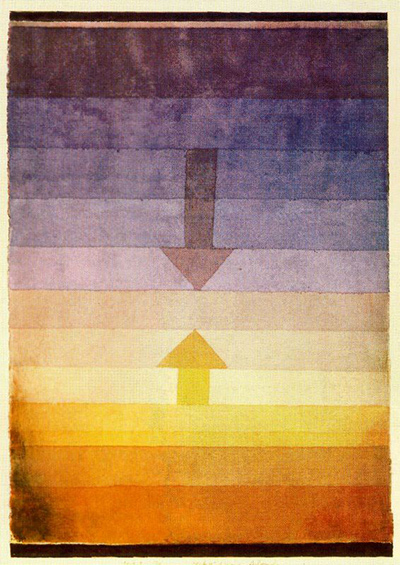
Two arrows move toward one another across a stack of translucent colour bands. The lower arrow rises through warm yellow and orange; the upper arrow descends through blue and violet. They appear poised to meet, but a pale interval keeps them apart. Paul Klee called the watercolour Scheidung Abends, usually rendered in English as Separation in the Evening. The work is dated 1922 and numbered 79 in his annual sequence. It belongs to the Zentrum Paul Klee, Bern, as a Livia Klee donation.[1][2]
The verified medium is watercolour and pencil on paper, bordered at the top and bottom with watercolour and ink and mounted on cardboard. The 2009 Museum of Modern Art Bauhaus exhibition checklist gives the dimensions as 33.5 × 23.2 cm. That fuller description matters: the narrow dark bands at either end and the mounted support are part of the constructed work, not incidental frame decoration. The inherited local article correctly noticed bands and arrows, but its account of personalities, Surrealism and a likely meeting was conjecture presented too confidently. This page starts with the object's documented materials and Klee's actual arrangement of colour and direction.[1]
Looking from dusk to night
The field is vertical, though almost everything in it is horizontal. Broad washes create a ladder of colour from yellow and brown below through a light central passage to cool greys, violet and deep blue above. A nearly black upper band closes the image. Several edges are firm enough to make one wash distinct from the next, but watercolour makes their interiors variable. The same blue or orange does not hold a single value across an entire stripe. Slight feathering and the paper's texture prevent the bands from behaving like printed bars.[1][3]
The arrows interrupt this horizontal order. The lower arrow is yellow-orange, pointed upward; the upper one is darker and pointed downward. Their stems are comparatively short and their heads are emphatic triangles. Neither arrow reaches the other. A greyish interval lies between the tips, close to the visual centre. The eye alternates between movement inward and the stillness of that gap. The title makes the separation charged, but Klee has drawn no people, path or room. Direction and colour carry the event.[3][4]
There is also a wider symmetry that does not quite close. Warmth gathers below; coolness gathers above. Each arrow belongs to the colour zone from which it comes, but each crosses bands on the way toward the other. The darker down arrow presses into a pale field, while the warm up arrow rises through the cooler middle. Their meeting point remains potential rather than depicted. The painting lets a viewer feel an encounter and a parting at once: convergence in the arrows, separation in the untouched space between them.[3][4]
How the colour was built
Marianne Keller Tschirren's University of Bern dissertation studies the connection between Klee's Bauhaus colour teaching and his paintings. Her close reading of Scheidung Abends treats it as an example of a warm-cool contrast, primarily yellow-orange against blue-violet, and stresses that Klee did not apply colour rules mechanically. She reads the low orange as a sinking sun and the upper blue as the advance of night. That is a scholarly interpretation of the visual sequence, not an inscription on the artwork. It is persuasive because the transitions, title and arrows work together, but the image remains more open than a literal sunset scene.[3]
Marie Kakinuma, writing in a publication of the Japanese Society for German Studies, goes further into the layering. She describes thin applications of blue-violet and yellow-orange across the sheet, with a neutral grey formed where the opposing colours meet. From the central region, warmer layers accumulate toward the lower edge while cooler layers strengthen toward the upper edge. Her account explains why the middle does not look like a simple stripe inserted between two blocks: it is a result of overlapping and thinning washes. She reads the opposing arrows as a sign of the gradual passage from light to dark.[4]
These two readings agree on the important point that the work is neither a diagram of complementary colour nor a straightforward landscape. Klee could organise temperature contrasts with great care while retaining irregularities in the actual washes. The apparent bands are built through transparent layers and tonal shifts, so the surface keeps revealing the hand that made it. Keller Tschirren cites Klee's own insistence that underlying laws should allow a work to flower rather than appear as rigid rules. Scheidung Abends gives a compact instance of that relation between structure and variation.[3][4]
A Bauhaus work, not an exercise sheet
Klee made the painting during his Bauhaus years in Weimar. MoMA included it in its 2009 exhibition Bauhaus 1919–1933: Workshops for Modernity, placing it among works by the Bauhaus master and describing its border construction and Livia Klee provenance. The institutional checklist does not label it a student exercise. The temptation to do so arises because its colour transitions can be analysed in relation to his teaching. Keller Tschirren's dissertation takes that relation seriously but also emphasizes how far the finished image moves beyond a regular application of a rule.[1][3]
The work's number, 1922, 79, is repeated in the MoMA checklist, German scholarly literature and a gallery survey linked to the Zentrum Paul Klee. That agreement gives a secure identity across languages. It also protects against confusion with other Klee pictures that use horizontal bands, arrows or evening titles. The Centre owns this particular watercolour; the date, annual number, 33.5 × 23.2 cm dimensions and paper-on-cardboard construction belong to it.[1][2][3]
The title's German word Scheidung can mean separation, division or parting; in other contexts it can mean divorce. The visual evidence here supports an act of division, but does not identify a couple or a personal divorce. The second word, Abends, anchors it in evening, when daylight separates from night. Kakinuma's account gives the colour shift a physical meaning as light changes, while Keller Tschirren sees the same shift as a warm-cool pictorial contrast. Those readings can be held together without claiming access to Klee's private motives.[3][4]
The image in circulation
Reproductions of this work vary in colour. The image here shows the opposing arrows, lower artist notation and border, but cannot settle subtle colour or physical paint texture.[5]
Looking at the full colour field makes clear why a single short paraphrase of the work is insufficient. The arrows head inward, yet the hues at either end pull apart. The colour bands suggest a setting or passage of time, yet they remain visibly worked watercolour on paper. Klee's title names separation, and the composition makes separation perceptible through an unclosed interval rather than through a narrated scene. Its economy depends on exact relations of colour, direction and blank space—relations that the manuscript can describe while leaving the image's emotional story open.[1][3][4]
Related artworks
Explore eight other Klee works from the researched artwork cluster.
Red Balloon
1922
Senecio
1922
Twittering Machine
1922
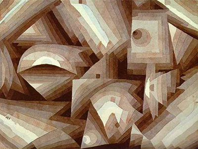
Crystal Gradation
1921
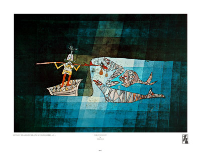
Sinbad the Sailor
1923
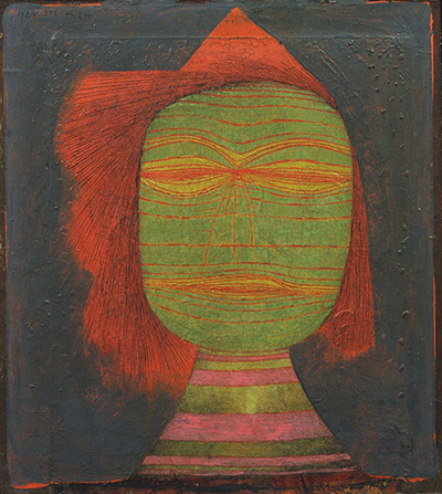
Actor's Mask
1924
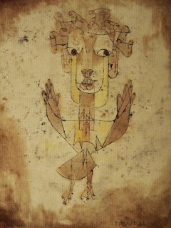
Angelus Novus
1920
Ancient Harmony
1925
References
- Museum of Modern Art, Bauhaus 1919–1933: Workshops for Modernity exhibition checklist, p. 44, Scheidung Abends, 1922, dimensions, support, border and Livia Klee donation; accessed 27 September 2026, View source.
- David Zwirner, Klee artwork record for Scheidung Abends, 1922, 79, identifies the Zentrum Paul Klee holding; accessed 27 September 2026, View source.
- Marianne Keller Tschirren, Dreieck, Kreis, Kugel: Farbenordnungen im Unterricht von Paul Klee am Bauhaus, University of Bern dissertation (2011/12), esp. pp. 151–52 and image list p. 193; accessed 27 September 2026, View source.
- Marie Kakinuma, “Bild, Musik, Text und Textur,” in Bild, Text, Textur bei Paul Klee und Robert Walser, Japanese Society for German Studies series 153, pp. 52–53; accessed 27 September 2026, View source.
- Wikimedia Commons, Scheidung Abends, Paul Klee (1922).jpg, image origin, dimensions, file history and public-domain statement; accessed 27 September 2026, View source.
.jpg)