


 by Tom Gurney
Tom Gurney BSc (Hons) is an art history expert with over 20 years experience
Published on June 19, 2020 / Updated on September 27, 2026
Email: tomgurney1@gmail.com / Phone: +44 7429 011000
Affected Place: an arrow and an uncertain place
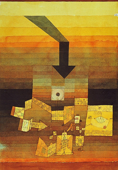
Paul Klee's betroffener Ort is translated by the Zentrum Paul Klee as Affected Place. He made it in 1922 and entered it in his annual work list as 1922, 109. The Bern museum identifies ink, pencil and watercolour on paper mounted on cardboard, measuring 30.7 × 23.1 cm. Its modest paper support holds an unusually forceful image: a dark arrow descends through bands of warm colour toward a small, complicated place below.[1]
The upper portion of the sheet is made of yellow, orange, red-brown and darker horizontal bands. They can be read as a sky deepening toward a horizon, but they are also fields of colour laid across the picture. A sharply angled, dark form begins above and becomes a vertical arrow. Its tip points toward a lighter rectangle filled with lines and marks. Below that are small walls, patterned planes and diagram-like fragments. A reader may see a village, a courtyard or a miniature map. Klee makes that “place” less certain than the arrow that seems to address it.[1][2][3]
Looking from above to below
The arrow is the most immediate visual event. It is large compared with the shapes beneath and almost black against the lighter bands. Its bent upper section gives it a sense of movement from a distant upper-left point into a front-facing downward shaft. The tip seems to press into, or aim at, the crowded lower half. This can make the scene feel threatening. But neither a collision nor a destroyed settlement is actually pictured as a completed event. The work holds direction and consequence in suspension.[2][3]
In the Zentrum Paul Klee's digital guide, curator Dieter Roelstraete proposes several possibilities for the “affected place”: a deserted square, a garden or a psychological site. He likens the arrow to lightning or the sword of Damocles. These comparisons help convey the menace one may sense, but they are offered as suggestions. The German title does not say who or what is affected, and the image does not identify a particular town. Roelstraete's interpretive language is useful precisely where it leaves alternatives open.[2]
The lower motifs reward a slower look. Light-coloured strips seem to fold into walls or low structures, while fine strokes form tiny patterned areas. Near the middle is a pale square with a dark circular mark. Some shapes look architectural; others resemble notation or marks on a plan. The dark bands behind them can become ground, shadow or another plane. Klee does not provide a single stable viewpoint from which to read the whole. The place is both a recognizable cluster and an arrangement of graphic signs.[2][3]
The palette participates in that instability. The upper bands move through light yellow and orange into brown. Their horizontal order invites a landscape reading, perhaps a sunset. Yet the arrow's precise, flat silhouette cuts across that soft progression. In the lower section, pale yellow fragments and dark areas coexist at a different scale. The eye alternates between the broad atmospheric layers and small, almost coded details. Visual pressure arises through that scale shift as much as through the arrow alone.[2][3]
The arrow as form and idea
Klee drew and wrote extensively about arrows in his teaching. A 2020 Bridges mathematics-and-art paper by Martin Skrodzki and Henriette-Sophie Lipschütz compares Affected Place with the 1922 work Wavering Balance. They note a bent and a straight arrow in Affected Place and show how Klee's Pedagogical Sketchbook distinguishes a literal arrow from a symbolic one. In the sketchbook, an arrow can connect a direction to an intended effect. The researchers use that material to explore visual direction in mathematics, but their paper does not claim that the artwork is a disguised vector diagram.[4]
The arrow in this sheet is thus a practical sign and a painted shape at once. It tells us where to look, while its dark mass, angle and position organize the picture. The thick shaft appears centered over a light zone. The tip directs attention to the lower forms; the upper bend makes us retrace its route back across the colour bands. The arrow's form helps create a connection between the two halves even if we cannot name an event connecting them. It remains an “attack” only as a possible reading, not a caption supplied by Klee for a particular historical incident.[2][3][4]
Art historian Regine Prange offers a more exact account of this ambiguity in her German study Das Kristalline als Kunstsymbol. She compares the ominous downward arrow with earlier Klee imagery of a threatened town. In Affected Place, however, the enlarged arrow also becomes a carefully organized geometric shape aligned with the image's centre and incorporated into the graded colour field. Its apparent threat can draw the viewer in, then give way to questions about how the arrow, the horizon and the small “place” occupy space. This is Prange's formal and symbolic interpretation; the comparison does not establish that the two works share a narrative.[3]
Prange's point is especially helpful at the meeting of the upper and lower sections. A dark boundary can look like a horizon separating far sky from nearer ground. Yet the middle bands also continue into the light forms below. The place that looks targeted can seem to develop out of the same colour structure as the region from which the arrow comes. The outside and inside of the threat are therefore hard to separate. The image keeps shifting between a scene of an incoming force and a more self-contained play of geometric relations.[3]
Bauhaus context and later readings
Klee made the work in his early Bauhaus years in Weimar. The year places it near his teaching on formal elements, growth and movement. The study of arrows in the Pedagogical Sketchbook offers relevant context, but its publication in 1925 is not proof that Klee used every later printed formulation consciously while making this 1922 sheet. Equally, the picture should not be treated as a literal illustration of a class exercise. It is a finished work whose layered colour and intricate lower motifs exceed a simple teaching diagram.[1][4]
In 2024, the Zentrum Paul Klee used Affected Place in a presentation about Klee's influence on architects, alongside works of buildings and cities. That exhibition setting emphasizes the sheet's unusual architectural suggestion: broad colour planes, tiny structures and a forceful directional mark. The museum's German digital guide also discusses how Klee images have been chosen for later book covers in philosophy and related fields. Such uses reveal the image's ability to invite conceptual readings, but a modern cover cannot be evidence of Klee's original intention.[1][2]
Several kinds of uncertainty should remain visible. The Bern caption fixes the object's title, date, materials and size. The painted arrow and coloured bands are plainly there. Whether the place is a village square, inner state or abstract construction is a question of interpretation. The image can suggest pressure without confirming a single event or outcome.[1][2][3]
Affected Place is powerful because it locates danger without fully locating its object. The arrow gives a clear direction; the place below breaks into many possible signs. Between them, the horizontal colours offer a horizon that can appear, dissolve and reappear. Klee turns a few formal elements into an open question about what it means for somewhere to be affected.[2][3][4]
Related artworks
Explore eight other Klee works from the researched artwork cluster.
Red Balloon
1922
Senecio
1922
Twittering Machine
1922
Crystal Gradation
1921
Sinbad the Sailor
1923
Actor's Mask
1924
Angelus Novus
1920
Ancient Harmony
1925
References
- Zentrum Paul Klee, Kosmos Klee press kit, English, 2024, press image 02: owner caption for betroffener Ort / Affected Place, 1922, 109, ink, pencil and watercolour on paper on cardboard, 30.7 × 23.1 cm. The kit's press-image rights are limited to exhibition coverage and are not a licence for new article reproductions, View source.
- Zentrum Paul Klee digital guide, “Fokus. Cover Star Klee”, German, exhibition conceived by Dieter Roelstraete: interpretive discussion of the arrow and “affected place,” and reception on book covers. Comparisons with a village square, garden, lightning and the sword of Damocles are attributed to the guide, View source.
- Regine Prange, Das Kristalline als Kunstsymbol: Bruno Taut und Paul Klee, German, Olms, 1991, local PDF scan pp. 307–08 and fig. 146: directly read discussion of Betroffener Ort; arrow, horizon, spatial ambiguity and comparison with an earlier threatened-town image. The link is a library catalogue record for the printed study, not its full text, View source.
- Martin Skrodzki and Henriette-Sophie Lipschütz, “Vector Fields and Paul Klee”, Bridges 2020 Conference Proceedings, English, pp. 305–06: Affected Place and Wavering Balance compared, and Klee's real/symbolic arrow distinction in the Pedagogical Sketchbook discussed. Their mathematical teaching application is not treated as Klee's intent for this work, View source.