


 by Tom Gurney
Tom Gurney BSc (Hons) is an art history expert with over 20 years experience
Published on June 19, 2020 / Updated on September 27, 2026
Email: tomgurney1@gmail.com / Phone: +44 7429 011000
Watercolour as experiment
Paul Klee used watercolour to test dark and light, to set colours beside and over one another, and to turn a sheet of paper into something more complex than a painted rectangle. Transparent layers could allow earlier decisions to remain visible; a dense wash could stop the eye; a strip left pale by the way the paper was held could become part of the composition. His most celebrated 1914 Tunisian watercolours are a turning point, but the medium had a history before that journey and continued to change through the Bauhaus and later years.[1][2]
A watercolour by Klee may also contain graphite, pen, gouache, paste paint or oil-transfer marks. Its paper may be glued to a card he selected and inscribed. The catalogue line for each object matters. The Zentrum Paul Klee’s statement that roughly 80% of his oeuvre consists of works on paper cannot be converted into a claim that 80% are watercolours. This guide follows named works and museum records to show what the medium actually did in his hands.[3][4]
Contents
- When did Klee begin to use watercolour?
- What changed in Tunisia in 1914?
- What happened after the journey?
- How did the Bauhaus change the medium?
- Why does the mount matter?
- Do later Klee works remain watercolours?
- How can a watercolour be read carefully?
When did Klee begin to use watercolour?
The Zentrum Paul Klee’s German exhibition account describes early watercolours built around gradations of grey. Klee was working out how light and dark could be structured before he was confident with a broad range of coloured washes. The same account places his sustained engagement with coloured watercolour at around 1910. This corrects the idea that the medium suddenly arrived in 1914, though it does not make every earlier sheet a prototype of Tunisia.[1]
The museum describes transparent colour laid adjacent to and over other colour, sometimes with diluted paint applied to paper already moistened. Those are related but different operations. Adjacent washes divide a sheet into fields; overlapping ones make a new tone from what remains visible below. Water on the surface changes how a mark spreads and how crisp its edge can be. Drying matters when a later layer is meant to remain separate rather than dissolve the earlier one. These are technical possibilities in the museum’s account, not a claim that every Klee aquarelle used precisely the same sequence.[1]
Two letters excerpted by the Zentrum Paul Klee show that he kept returning to the medium. In November 1916 he told Lily that he wanted to paint watercolours again after time with oil. In April 1921 he spoke of building the tonality of recent watercolours more strictly on two colours. Their immediate context needs checking in a critical correspondence edition before using them as a detailed account of the works named here. Even in excerpt, they show experimentation after the supposed single moment of “discovery” in Tunisia.[1]
The German museum account compares layered washes with Japanese ink painting. That is a curatorial comparison of handling, not evidence that a particular Klee sheet copied a specific Japanese work. Watercolour is a method with many possible sources and effects. A chronological argument becomes stronger when it moves from such broad description to securely identified objects.[1]
What changed in Tunisia in 1914?
Klee travelled in April 1914 with August Macke and Louis Moilliet. The journey produced small watercolours in which places, architecture and vegetation are registered through colour planes as well as drawn signs. It also became a story he later told about his confidence as a painter. The diary sentence often used to announce that change belongs to a text he subsequently edited; it should not be read as an untouched transcript of a sudden conversion. Nor does the journey erase his earlier colour research or the later work of cutting, mounting and reworking sheets.[2][5]
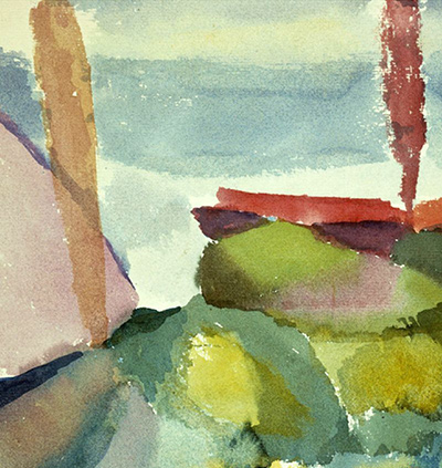
The Centre Pompidou’s St. Germain b. Tunis. Landeinwärts is an especially specific case. The museum records 1914/217, watercolour on paper glued to cardboard, 21.8 × 31.5 cm, inventory AM 81-65-876. The German title names St. Germain near Tunis and a view inland. The object has both an observed place and an artist-given annual position; those anchors make its appearance more useful than a generic claim that Klee “abstracted Tunisia.”[2]
In her French 2008 collection essay, Angela Lampe describes passages of light, transparent colour alternating with denser paint deposited more quickly. She sees a rhythm of squares and intervals through which the landscape remains partly legible. Her account attributes to Wolfgang Kersten the view that Klee painted this sheet before the motif, rather than reconstructing it after returning to Munich. That attribution matters: the object record does not itself provide a dated field note proving the exact moment of execution.[2]
Lampe also draws attention to pale vertical bands produced by elastic straps that held the paper during painting. She argues that Klee incorporated those reserves into the final composition, painting over some and allowing others to act like a frame. The observation is a particularly good lesson in watercolour: an unpainted area need not be an accidental omission. It can be a trace of making that the artist accepts and makes useful. This does not prove that every pale border in every Tunisian sheet came from a strap.[2]
Lampe relates the sheet’s simultaneous colour contrasts to Robert Delaunay and sees a path toward Klee’s later square pictures. The documented meeting and Klee’s translation of Delaunay’s colour essay give historical context. Her exact visual pathway remains a scholarly interpretation. The centre of the work is still the relation between a particular paper sheet, thin and heavier paint, architectural abbreviations and spaces left light.[2]
The Metropolitan Museum’s Hammamet with Its Mosque gives a companion object from the same journey: watercolour and graphite on paper mounted on cardboard, 23.8 × 22.2 cm, accession 1984.315.4. The graphite and colour planes serve different roles in a view made from outside the town walls. The Met’s account proposes a Delaunay comparison for the lower translucent area. That interpretation can help readers notice the independence of the colour fields, but the object’s recorded medium is the more basic fact: it is neither pure watercolour without drawing nor an oil painting because it has strong colour.[4]
For a fuller account of the journey’s locations, mounts and later diary editing, see Klee in Tunisia and Hammamet with Its Mosque. The watercolour question here is narrower: how colour, line, reserve and support cooperate on an individual sheet.[2][4][5]
What happened after the journey?
The years after Tunisia show why the journey cannot be the endpoint of a watercolour history. Lampe discusses 1915 sheets in which a darker, more restricted range lets the building of tone become the principal event. She quotes a 1915 diary passage about successive black watercolour layers drying before the next is added. The original German critical diary edition should be checked before adopting the wording as a direct quotation here, but the case makes clear that Klee did not simply move from grey to bright colour and stay there. He kept testing how layered values could construct a form.[2]
The Zentrum Paul Klee reports that he often turned, overpainted, cut, trimmed and recombined watercolours and oil pictures after the Tunisian trip and into the early 1920s. A sheet seen today may therefore be a later edited object rather than the unchanged surface produced at one sitting. Cutting is not a general rule for every aquarelle. It is a documented practice to investigate when a particular museum record, join, mount or conservation report supports it.[1]
Conservation research gives a striking 1917 example. In the American Institute for Conservation’s 1986 study of mounted Klee works, the conservators describe the watercolour wachsendegras, translated there as Watching the Grass Grow. Klee painted it on one half of the reverse of an earlier intaglio print. A plate-mark indentation from the earlier print darkened where watercolour pooled, and pre-existing foxing was incorporated into grass-like marks. When the sheet was separated from its mount during treatment, a 1903 etching, Weib und Tier I, was revealed on the other side.[6]
That account comes from direct examination, not an imaginative reading of a reproduction. The conservators also reconsidered their intervention: the original assumption that the older mount must be removed for safety was not borne out as a general rule. Their case shows how paper history, two-sided use, water movement and later conservation affect what the public sees. It does not make the reverse automatically more important than the front, or turn all Klee watercolours into reused prints.[6]
How did the Bauhaus change the medium?
During the 1920s, Klee continued to teach and to make watercolours in increasingly varied combinations. The Zentrum Paul Klee describes subtle transparent gradations and more systematic relations between light, dark and colour. Its account says a spray technique used occasionally before 1920 became important at the Bauhaus from 1925: watercolour could be spattered through a sieve with a brush, often in combination with a stencil or screen. That method can produce a clouded field or a defined shape. It should not be inferred from every soft edge; a named object or technical examination is needed.[1]
It is particularly important not to call all spattered Klee works watercolours. The Met’s In the Manner of a Leather Tapestry of 1925, for example, is recorded as brush and black ink and spattered tempera on paper mounted on board, 1981.503. An early Met publication associates it with spray or spatter methods, but the present medium line says tempera, not watercolour. The work clarifies the method while guarding against a false label. Its current museum page restricts image enlargement and download, so it is used as a textual comparison only.[7]
The Cleveland Museum of Art’s Carnival in the Snow is a different, securely labelled Bauhaus-period example: 1923, watercolour on beige laid paper mounted on beige wove paper, sheet 24 × 23.5 cm and secondary support 34.5 × 29.3 cm, accession 1969.46. The work layers muted pinks and greys with sharp blue, red and black accents. Pale areas and multiple overlapping forms allow circus figures to emerge gradually as the eye moves across the image. Cleveland describes two jugglers sharing a face and torso. That is an owner’s visual reading, not a record of the order in which Klee painted the forms.[8]
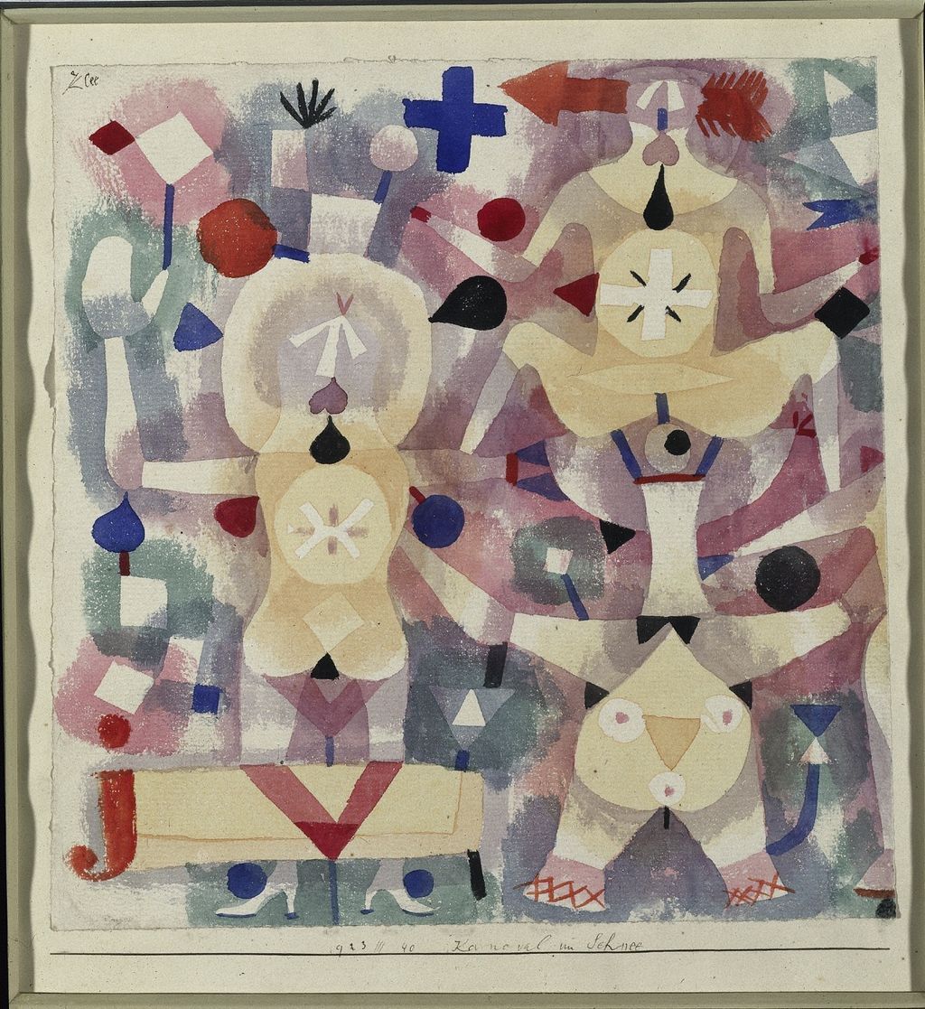
This picture shows how transparency and arrangement can let a subject emerge without proving the museum’s broader claim that Klee always began with no subject. It also shows why a cropped detail of only the central figures would be a poorer introduction to the physical work. The mount, pale surrounding field, title line and the proportions of the combined object contribute to what a viewer receives.[8][9]
Why does the mount matter?
Klee frequently fixed works on paper to a second sheet or card that he chose. The 1986 conservation study treats these as compound works: image sheet and mount are physically joined and often aesthetically related. The mount could provide space for date, work number and title; its proportions shape the image’s presentation. Cutting it away in a reproduction can conceal those decisions. The authors examined multiple works and Felix Klee’s recollections rather than assuming that every card was disposable framing material.[6]
Conservators at Moderna Museet later found examples where subsequent framing had folded or cut Klee’s mounts. In their 2016 account, they describe how such alterations obscure his inscriptions and chosen proportions. They also discuss a hidden alternative title discovered on the mount of a 1938 work during conservation. This is a general warning for watercolours and drawings alike: the border may preserve historical information even when it appears visually quiet.[9]
The conservators disagree with the automatic assumption that older mounting material must be removed as soon as it is found. In the 1986 study, local adhesive tensions had damaged particular sheets, but the authors concluded that routine dismantling could erase part of Klee’s finished construction. That is a treatment judgement about examined objects, not a public instruction to handle fragile sheets. For a reader, the practical lesson is to look for both sheet and mount measurements and to ask whether the image shown has been cropped.[6][9]
Nina Quabeck’s examination of the Kunstsammlung Nordrhein-Westfalen’s Klee collection gives a particularly clear reason to keep the border in view. In Löwen, man beachte sie! (Lions, Attention Please!), 1923,155, Klee combined an oil-transfer drawing, pencil and watercolour, then bordered the sheet with bands of watercolour and ink. He wrote the title and date in the pale blue band beneath the image. A reproduction cropped to the central scene would remove both colour Klee applied to the mount and part of his own record of the work. Quabeck also found that later owners and framers had trimmed or toned mounts in the Düsseldorf collection. A margin visible now may therefore be Klee’s design, a later alteration, or a mixture that calls for an object-specific record.[13]
Do later Klee works remain watercolours?
Yes, but a later colourful surface is not necessarily one. An official Zentrum Paul Klee caption identifies Segelschiffe, 1927,225, as pencil and watercolour on paper mounted on cardboard, 22.8 × 30.2 cm. A separate 1935 caption calls das licht und die Schärfen, 1935,102, watercolour and pencil on paper mounted on cardboard, 32 × 48 cm. These dated objects show continued use of watercolour with line well beyond the Tunisian journey and the first Bauhaus years.[10]
Other later works require more compound labels. The same Bern material describes Landschaft mit Accenten as combining paste colour, gouache and watercolour. The watercolour component is real, but calling the whole work simply a watercolour would conceal the other binders and their possible difference in opacity and texture. Klee’s catalogue often records such mixtures with care. A public guide should preserve that complexity rather than sorting by whichever medium seems most familiar.[10]
Quabeck documents a more radical late example: Zwischenzeit gegen Ostern, 1938,342, has watercolour on a chalk-and-paste ground on jute. It is now backed by canvas and stretched, yet a fragment of its earlier card mount carrying Klee’s title and date survives on the reverse. Quabeck compared that fragment and an archival photograph with the catalogue entry to establish that the work’s presentation format had changed. This is a watercolour component on textile and prepared ground, not an ordinary watercolour sheet; the current stretcher does not by itself describe how Klee originally presented it. Quabeck read the printed catalogue for this case. The present manuscript relies on her conservation account and has not independently inspected that catalogue entry.[13]
The old page used Insula dulcamara and Cat and Bird as watercolour examples. Their owners record different media: the former is oil and paste paint on newsprint on jute, the latter oil and ink on gessoed canvas mounted on wood. Colour can appear thin or wash-like in a photograph without changing what a verified object record says. They belong in other discussions, and their exclusion here gives the actual watercolours room to be understood.[11][12]
How can a watercolour be read carefully?
First identify the object: original title, year and annual number, current owner, sheet and mount, and every medium named in the record. Next follow the visible decisions: a translucent layer against a denser one, a pencil line across colour, a reserved pale strip, a stain that occupies an earlier print’s indentation. Only then ask what those relations do for the image. A scholarly comparison with Delaunay or Japanese ink painting can illuminate the result, but it should be attributed and tested against the work.[1][2][4][6][8]
Klee’s watercolours are varied because he repeatedly reconsidered what a sheet could hold: grey values, the light and architecture of Tunisia, circus figures, mixed media, a trimmed edge or the reverse of an older print. The medium’s history is therefore a history of layers and objects, not one anecdote about finding colour in 1914. Continue with Klee’s drawings, his colour practice, the Tunisia journey and materials and techniques for those related questions.[1][2][3][6][8][9]
Discussion
Klee’s watercolours range from grey tonal studies to layered colour on worked paper.
The support and mount can tell us as much as a cropped reproduction of the image.
Reader Insights
Where does a reserved pale area help build the composition?
How do colour and drawn line divide the work in a Tunisian sheet?
Which object record changes how you understand a work's medium?
Join the Conversation
Share the work and the source behind your reading.
References
- Zentrum Paul Klee, “Ich bin Maler” exhibition account, German, sections on early greys, colour around 1910, transparent and damp-paper work, Bauhaus refinement, spray technique and post-Tunisia cutting; excerpts of 1916/1921 Lily letters require context in a critical edition, View source.
- Centre Pompidou, St. Germain b. Tunis. Landeinwärts, AM 81-65-876, French owner record and Angela Lampe’s 2008 catalogue essay. The Kersten on-site claim and Delaunay/later-squares reading are attributed; the photograph is credited to Philippe Migeat/RMN, not cleared for new use here, View source.
- Zentrum Paul Klee, English collection overview, with German, French and Italian versions; approximately 80% works on paper is not an exact watercolour share. The versions are one institutional source family.
- Metropolitan Museum of Art, Hammamet with Its Mosque, 1984.315.4, 1914 object record, medium, size and curatorial colour comparison; the owner states that its image cannot be downloaded and carries ARS rights, View source.
- Paul Klee Tunisia research packet, local dossier and referenced public manuscript, for the source history of the diary, journey chronology and material edits; the present page does not quote the diary as an unedited 1914 record.
- Elizabeth Kaiser Schulte, Margaret Holben Ellis and Antoinette King, “An Approach to the Conservation Treatment of Paul Klee Drawings”, Book and Paper Group Annual 5 (1986), pp. 19–32, directly read. Met-based examination of artist mounts and the 1917 wachsendegras case; the paper explicitly reconsiders routine dismantling, View source.
- Metropolitan Museum of Art, In the Manner of a Leather Tapestry, 1981.503, current medium as ink and spattered tempera, not watercolour; 1981–82 notable acquisitions essay, p. 63 discusses its spray/spatter and Bauhaus context. No image reused because current owner page restricts download.
- Cleveland Museum of Art, Carnival in the Snow, 1969.46, own-object medium, sheet/mount measures and visual interpretation; official metadata and image API marks the 1,536 × 1,676-pixel print file CC0. The staged local figure is a 1024 × 1117-pixel, 144 dpi, JPEG-quality-80 derivative.
- Moderna Museet, Tora Hederus and Alison Norton, “The conservation and re-framing of Paul Klees works of art on paper”, 2016, first-hand conservation account of mounts, inscriptions, altered frames and treatment decisions, View source.
- Zentrum Paul Klee, Kosmos Klee musikalisch media dossier, German, p. 7 object captions for Segelschiffe, das licht und die Schärfen and mixed-media comparisons. Its reproduction grant is tied to exhibition coverage, so it is used only as research, View source.
- Zentrum Paul Klee, foundation object description of Insula dulcamara, oil and paste paint on newsprint on jute; the dedicated local manuscript records owner evidence and limitations.
- Museum of Modern Art, Cat and Bird, 300.1975, oil and ink on gessoed canvas mounted on wood, rather than a watercolour, View source.
- Nina Quabeck, “Change the Frame and You Change the Game? Research and Reevaluation of the Presentation Formats of the Kunstsammlung Nordrhein-Westfalen’s Paul Klee Collection”, Book and Paper Group Annual 31 (2012), pp. 69–80, directly read conservation study. The Löwen, man beachte sie! mount and the altered Zwischenzeit gegen Ostern support are examined object cases; the printed catalogue raisonné Quabeck consulted has not been independently read for this manuscript, View source.