


 by Tom Gurney
Tom Gurney BSc (Hons) is an art history expert with over 20 years experience
Published on June 19, 2020 / Updated on September 27, 2026
Email: tomgurney1@gmail.com / Phone: +44 7429 011000
Paul Klee’s The Sublime Side
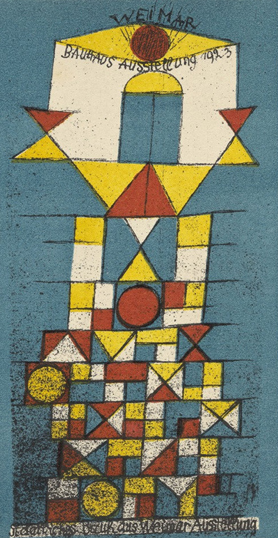
The Sublime Side is the familiar English name for Paul Klee’s Die erhabene Seite, made for the 1923 Bauhaus exhibition in Weimar. The image belongs to a printed postcard, not an oil painting. MoMA catalogues its impression as a lithograph published by the Staatliches Bauhaus and printed by von Reineck & Klein, Weimar. The Centre Pompidou describes its impression in French as a lithographie en couleur and places it within a set of 20 postcard-format lithographs, 17 of them in colour. Their different inventory numbers and measurements refer to separate collection impressions of the design.[1][2]
A small public image
The work carries its occasion in the picture itself. At the top are the handwritten-looking words WEIMAR and BAUHAUS AUSSTELLUNG 1923. A central tower or figure stacks blue, yellow, white and red geometric forms above a dense base of squares and triangles. Circles appear at different heights. The design is vertical and compact, made to register quickly at postcard size. It can evoke architecture, a standing body or a ceremonial sign without the viewer having to settle on one object behind every shape.[1][2]
The lower edge also contains lettering. Those words, and the announcement at the top, make the image part of exhibition communication. The older article’s description of an abstract “painting” overlooks that printed function. Klee used familiar Bauhaus geometry here, but its effect is not exhausted by calling the colours emotional or the circles symbolic. The combination of image, text and format is the first thing a reader should notice.[1][2]
MoMA gives the lithographed composition as 14.3 × 7.4 cm and its postcard sheet as 15 × 10.5 cm. The Pompidou impression measures 15.1 × 10.3 cm. These are close but not identical measurements of separate sheets and, in MoMA’s case, separate image and paper dimensions. They should not be averaged into a fictional “original canvas” size. SFMOMA records another colour lithograph impression under T1995.475, also classified as a print. Three institutions therefore agree on the object type even though their particular sheets and catalogue practices differ.[1][2][3]
The 1923 exhibition and the Bauhaus
The Bauhaus-Archiv describes Klee as a teacher active at the school from 1920 to 1931, working across bookbinding, stained glass and mural-painting workshops. The school’s 1923 Weimar exhibition was an occasion to present its work publicly. Klee’s design could circulate as a postcard beyond the gallery and classroom. MoMA’s publisher and printer fields identify the organized production behind that circulation. The original print was an editioned communication object, not merely an image later adapted into merchandise.[1][4]
Pompidou records its copy as part of an inseparable group of invitation cards received in the 1981 Nina Kandinsky bequest, inventory AM 81-65-1059 (4). MoMA’s copy is 336.1942, acquired separately. That provenance distinction matters when readers encounter images online with different margins, print textures or colour balance. The site’s small reproduction identifies the design in broad visual terms; it does not prove that its pixels came from either museum’s sheet. A source record should be attached before any new large or annotated reproduction is made.[1][2]
The postcard invites several kinds of looking at once. Its coloured pattern rises like a façade; lettering and a circular top act almost like an emblem; the repetition of small units makes the printed surface feel made rather than spontaneous. These are observations from the visible design. No owner record consulted here says Klee meant the tower to represent a specific building or that each shape has a fixed hidden meaning. The “sublime” of the translated title is therefore a question for interpretation, not a licence to invent an architectural programme.[1][2]
Where the work belongs on this site
The T–Z image directory remains a broad legacy route called “paintings,” though it also contains works on paper and prints. This postcard can stay as a linked artwork there if its caption and article make its type clear. The prints guide is the more precise route for understanding how a lithograph is produced and circulated. The established /paul-klee/sublime-side/ URL stays because it already leads to this distinctive Klee design; changing the URL would not improve the object identification.[1][2]
Related artworks
Explore eight other Klee works from the researched artwork cluster.
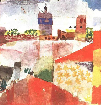
Hammamet with Mosque
1914
Flower Myth
1918
Angelus Novus
1920
Crystal Gradation
1921
Red Balloon
1922
References
- Museum of Modern Art, The Sublime Side postcard for “Bauhaus Exhibition Weimar 1923”, 1923 lithograph, object 336.1942, publisher, printer, image/sheet dimensions and rights statement, View source.
- Centre Pompidou, Postkarte zur Bauhaus Ausstellung “Die erhabene Seite”, French owner record, colour lithograph, postcard ensemble, dimensions, inventory and image credit, View source.
- San Francisco Museum of Modern Art, Postcard for the Bauhaus exhibition “The Sublime Aspect”, 1923 colour lithograph impression, accession and image-access notice, View source.
- Bauhaus-Archiv, Klee’s teaching and work at the Bauhaus, English institutional overview; Bauhaus music and the 1923 public exhibition, German institutional overview.